Tag: animal subject
-
Pet Memorial Name Plaques
For people wanting to make a portrait of their furry friend, I wrote an article on pet memorial mosaics using April Costigan’s work as illustrations of what is possible in terms of capturing likeness. The problem is that for many people, the task of rendering a realistic portrait of their pet is beyond their current…
-
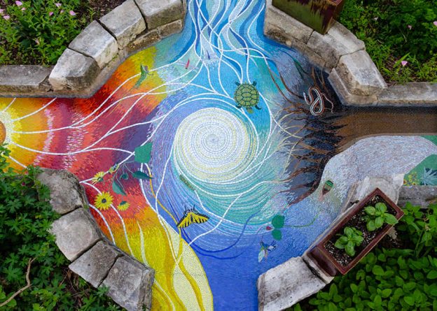
Four Elements Garden Mosaic
“Amateur” artist Tobin recently completed his Four Elements garden mosaic, and it is amazing for several reasons, the least of which is the fact that it was created over a span of six years with the artist getting up at 5 am to spend 45 minutes on it before leaving for his day job in corporate…
-
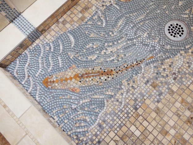
Figurative Mosaic Composition Integrated With Shower Tiling
Artist Jen Vollmer recently completed a shower mosaic which features fish and flowing water executed in the same colors as the surrounding mosaic tiling. Jen says that in retrospect, she wishes she would have used a darker grey grout and blue/green glass tiles instead of the light blue, which would have increased the contrast. I’m…
-
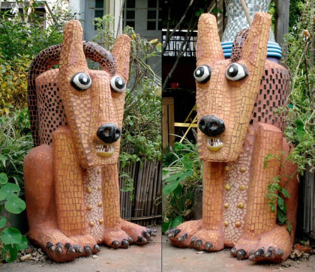
Mosaic Lawn Sculptures
Artist Marilyn Keating has some mosaic lawn sculptures of animals that are very much worth seeing, especially if you are considering making some yourself. Rather than trying to make her animals as naturalistic as possible, Marilyn wisely chose to make her animals stylized and whimsical, almost like three-dimensional cartoons come to life. I used the…
-
Protected: Mosaic Art Supply Organizational Chart
There is no excerpt because this is a protected post.
-
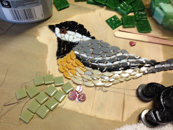
Choosing Mosaic Colors Based On Contrast
Recently artist Jill Miller emailed me wanting some advice about choosing colors for a mosaic table top she was making, and the design she was a chickadee bird with holly leaves and berries. From her photos and a description of the colors she wanted to use for the border of the round table top, it was…
-
Stained Glass as Mosaic Tile: A Question of Styles
In my article Stained Glass Mosaic Art, I explained how stained glass can be cut up into small pieces and used like conventional tesserae or cut larger and used to define entire elements as is done in a stained glass window. In the window mode of working, one single piece of variegated glass is used to render…
-
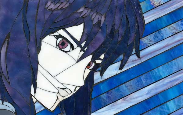
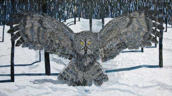
Stained Glass Mosaic Art
Artist and MAS employee Natalija Moss has recently completed a series of mosaics made from stained glass, and they are definitely worth seeing and discussing for several reasons. Natalija’s other artwork and video game plugins can be seen at her Lady Natalya website. “Erza” Stained Glass Mosaic by artist and MAS employee Natalija Moss. Note…
-
How To Choose A Mosaic Background Color
The background in a work of mosaic art serves two purposes: contrast the colors of the figures in the foreground. suggest motion by arranging the tile in contours around figures. The first point is obvious, but the second is often overlooked even though it can make the difference between a great mosaic and a mediocre…