Tag: pixelated mosaics
-
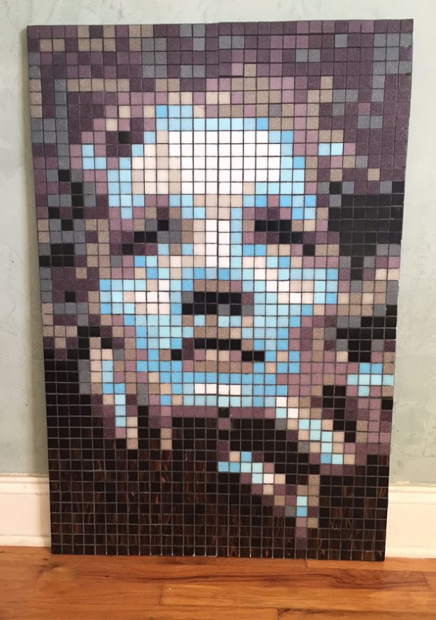
Inspiring Mosaic Portraits Using A Grid Pattern
David Armstrong has created some inspiring mosaic portraits, and he did it using whole tiles arranged in a grid instead of irregular pieces cut and fit as needed. Normally, I dislike mosaic designs based on grids because they lack the extra visual element provided by tile arrangement (andamento), but David’s work has tons of visual interest that more than compensates for this.
-
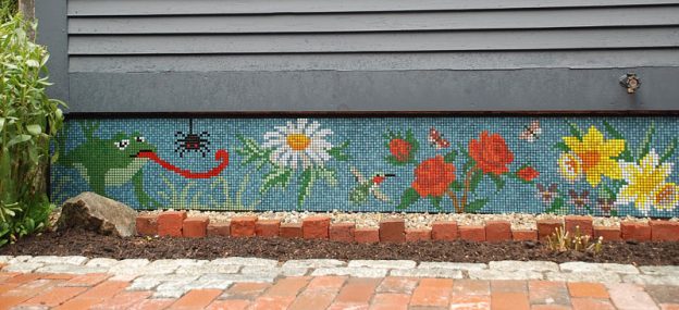
Patio Mosaic Alternatives
Patios are excellent locations for mosaics, but the patio floor itself is not as good a surface for a mosaic as a surrounding wall or brick planter would be. The main reason is simple: metal patio furniture will crack and crush glass tile, and glass is the preferred material because it is frost proof, economical, and comes in many colors. Also, the floor of the patio is not as visible as a nearby vertical surface is likely to be, especially when furniture, grills, and the usual patio accessories are present.
Recently artist Lisa Jones emailed me some photos of her patio mosaic, and I was taken with it in spite of my preference for designs that use free-form placement of pieces of tile instead of gridded patterns of whole tile.
Lisa Jones Patio Mosaic right side continues with the garden theme and flower and bee motifs. -
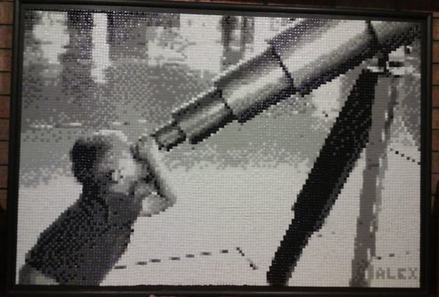
Black and White Photorealistic Mosaic Art
Black and White Telescope Mosaic. Mark’s grandson gazes at the stars. Stylized or Photorealistic?
Mosaic is usually used to make stylized images, meaning images that are simplified in certain ways, and that is done because the constraints of working with tile that only comes in certain colors and can only be cut so small forces the artist to simplify the details. Think about how ancient Roman mosaic faces and figures are outlined like cartoons and how scenes are composed of 6 to 8 colors, and you will know what I mean. I strongly prefer this type of art because it is a dialog between the symbolic and visual aspects of the artist’s mind, and it produces a lot of quirky and interesting details that would never be possible in mere realism.
BUT, it is important to remember that you can use mosaic to render images in a naturalistic or photorealistic way even if you can’t find tile in all the colors you think you need. First, you can use two colors in place of one. For example, if the teal color you think you need is not available, use small pieces of blue and green tile positioned closely together and rely on the eye blending the two colors together.
Another means of working photorealistically is to make a monochomatic mosaic or a black and white mosaic, such as Mark did using our 8mm recycled glass mosaic tile when he made the mosaic of his grandson peering through a telescope.
Note that Mark’s mosaic doesn’t use concentric rows of tiles to convey a sense of motion such as seen in the andamento of most stylized mosaics. Rather, the tiles are treated as pixels in a grid, which is how most though not all photorealistic mosaics are made. The alternative to gridded pixels is to use large irregularly-shaped pieces in a mode similar to stained glass artwork.
Patterns For Mosaics Made From PhotosI didn’t ask Mark how he made the pattern for his mosaic, but I know how I would do it:
I would take the photograph I wanted to use and convert it to a black and white image using Photoshop or another photo-editing software package.
Then I would enlarge it to the actual size I needed and print it out in sections, and then tape these together on my work table.
Then I would would cover this pattern with clear contact paper, WITH THE STICKY SIDE STICKING UP.
Then it just a matter of positioning tiles over the pattern and filling in the design.
The only question is: Do I put the tile right side up or upside down?
Upside-Down TileIf the mosaic is relatively small. I can spread adhesive on the backer and then press the backer onto the mosaic. In that case, I would want to position the tile upside down. Of course, this reverses the mosaic design from left to right as if in a mirror. Complete instructions for working in this way are given in my blog article Using Contact Paper To Transfer A Mosaic Design.
TIP: If you don’t want the above method to reverse your design from left to right, then reverse your pattern from left to right in the photo-editing software that you use to make the pattern.
Right-Side-Up TileIf I would like to work with my tile right side up so that the mosaic is not reversed, then I can use clear mounting tape or opaque mounting paper to pick the mosaic off the contact paper and then press it onto an adhesive-covered backer. This method is commonly used for laying up large mosaics such as murals. Instructions for this method are given in my blog article Mounting A Mosaic On Clear Adhesive Film.
To Grout Or Not To Grout?Grouting can totally change the look and feel of a mosaic, and so this question can be critical for photorealistic work depending on the colors and grout gap used. You can minimize the visual impact of grout by making sure that your grout gap isn’t too large. For most mosaic tile, the recommended grout gap is 1/16 inch, but for 8mm and 10mm tiles, use a grout gap of 1/32 inch.
For dry indoor mosaic, you can mount the tiles so closely together that they touch and simply not grout the finished mosaic.
You should also test grout colors before you apply them to the mosaic. The “test” can be as simple as taking some of your tile to the building material store and holding them next to different color swatches in the grout aisle.
For his mosaic, Mark did exactly what I recommend: he glued some of his tile to a scrap piece of plywood and grouted them with different grout colors to see what they looked like in situ.
The visual impact of grout color on a mosaic can be evaluated by gluing some tile on a scrap piece of backer and grouting it.If that seems like a lot of extra work, the simple truth is that it isn’t. An experiment like that can be done in 15 minutes of gluing one night and 15 minutes of grouting the next, and what is that compared to the amount of time spent on the mosaic itself? Before you dump concrete on something you spent a month creating, make sure you are using the right color concrete.
-
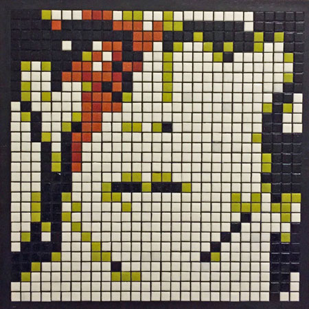
David Bowie, Springsteen, Strummer, Waits Mosaic Portraits
Fredrik Tigerstrom (“T29ART” on Instagram) has made some impressive mosaic portraits of rock icons David Bowie, Bruce Springsteen, Joe Strummer, and Tom Waits. These mosaics are worth sharing for several reasons, and not merely because they are faithful renderings of famous people. Yes, these mosaics are “accurate” in terms of capturing individual likeness, and that is an accomplishment most any artist would be proud of, but what makes them noteworthy is that the artist was able to achieve this verisimilitude in spite of using arbitrary colors (not flesh tones) and using whole uncut tiles in a rigid grid pattern. Also, the total number of tiles in each mosaic is relatively low (29 x 29)! To fully appreciate how successful these mosaics are, look at them at a distance or at low resolution.
David Bowie Aladdin Sane Mosaic David Bowie Aladdin Sane Mosaic Portrait by Fredrik Tigerstrom is shown uninstalled and still in the black plastic mounting grid used to lay up the design.A mosaic design laid up in a plastic mounting grid can be picked up using mounting paper or mounting tape (or clear packing tape if you are on a budget). All of these portraits were made with 10mm (3/8 inch) glass mosaic tile.
Joe Strummer Mosaic Joe Strummer Mosaic Portrait was made without a grout gap, but note the white shining through from the backer which illustrates an important point: Tiles cannot be placed so closely that no gap exists. That is why you should leave a usable gap that can be grouted if you need to seal out water. Yes, this mosaic could be grouted to eliminate the white backer from shining through, but the places where the tiles touch will not seal out water because grout can’t fit between them.The gridded patterns used in Fredrik’s mosaics are the exact opposite of the flowing contours I like to use in my artwork, but they are successful, and there is plenty of visual interest. The gridded patterns are also very hip because they resemble the pixels of digital images, and this calls attention to the fact that these are contemporary interpretations of an ancient medium.
Bruce Springsteen Mosaic Bruce Springsteen Mosaic is still in the mounting grid used to lay out the design, and you can see the mounting tape or contact paper that Fredrik is using to pick up the design and mount it.Note how the black plastic grid lines between the tiles make the colors more vibrant. That is why we recommend medium gray and black grouts instead of white and lighter colors. If you do make a dry indoor mosaic and use a light color grout and are unhappy with it, you can rub artists acrylic paint on the mosaic, which will stick to the porous grout and wipe off the glass tile. Using acrylic paint, you can go from white grout, which makes colors look bleached out, to a dark umber or black, which makes colors look more rich.
Tom Waits Mosaic Tom Waits Mosaic Flesh Tones Required?The mosaics above are successful in spite of not using skin tones, but most portraiture is rendered using natural colors. For that reason, we get many emails from people asking which tile is our best light pink or coffee color for making skin tones, depending on which ethnicity they are trying to portray. My answer usually vexes people because it is not the simple one-color solution they were expecting.
Even if you are trying to work as photorealistically as possible, you don’t need (or want) one color that best approximates a particular person’s skin tone or even their ethnicity in general. The reason you want multiple colors is that uniform color fields are boring, and you want to vary the color to create visual interest and to render light and shadow. The best example we have of this on our website is Harjeet Singh Sandhu’s work at the bottom of our mosaic portraits page. Harjeet’s portraits on that page really are worth studying if you are planning to make a mosaic portrait yourself and have concerns about color accuracy.