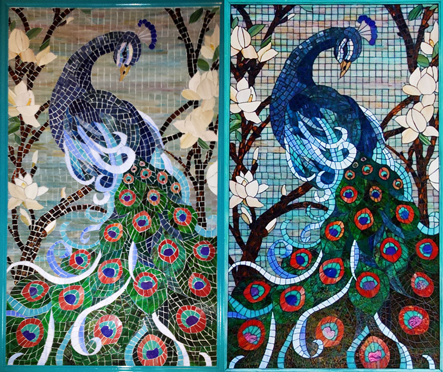
My recent blog post about Lonnie Parson’s Peacock mosaic was a cautionary tale about what can happen when you fail to take at least one definitive photo of your finished mosaic.
I didn’t want that blog post to be about how to photograph your artwork in optimal light with no foreshortening. I wanted the post to be about how good the mosaic was, but since no photo of the finished work existed, the photo issue seemed like the right starting point.
Well, the miracle of Natalija has delivered yet again, and I have a second chance.

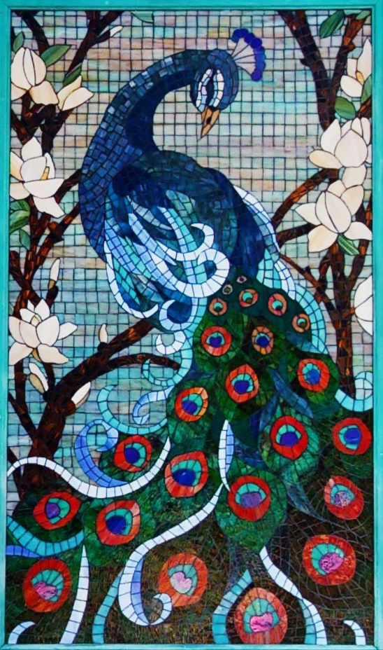
Natalija didn’t have to hack into CIA computers or NSA satellites to get this photograph of Lonnie Parson’s Peacock finished mosaic, but she did have to do some “outside-the-box” searches, and the photo she eventually found was not taken by the artist or for purposes of documenting the artwork.
Note that the photograph is a great improvement over what we had previously, but it is still less than optimal. Specifically, the light used for the photograph wasn’t bright enough, and the tail appears darker than it should.
Anyway, the photograph is good enough, and so now I can talk about all the interesting things happening in the mosaic itself.
Grout Line as Figurative Element

Usually the grout line serves only to keep individual tiles visually distinct so that they look like individual tiles and not like one piece of material.
TIP: If you have ever used light gray grout with sky blue tile, you don’t need me to tell you how bad the results can be when part of your mosaic no longer looks like a mosaic. Make sure your grout color contrasts with all tile colors, either in hue or shade or both.
Grout lines can also serve as visual elements such as the rigging of a sailing ship or the lines separating the scutes (plates) of a turtle’s shell. In Lonnie’s mosaic, grout lines are used to represent the shafts of the feathers in the peacock’s comb.
Grout lines also function as outlines when you work in the stained-glass mode where a single piece of glass represents a complete element.
Mixed Modes
I think this mosaic is genius because it combines different modes of mosaic: grid, concentric andamento, and stained-glass mode.
There is a lot to notice and learn from in this mosaic:
Grid Mode
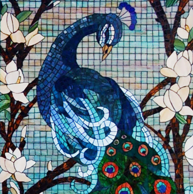
Notice how the rectilinear grid used in the background helps the background remain visually separate from the swirling curved elements in the foreground.
Note how the faint pastel colors of the background also help the sky “fade to the back.” The foreground elements are rendered in intense colors with some being dark, and so the foreground elements “stand out,” meaning they look closer to the viewer.
Stained-Glass Mode
Note how the magnolia blossoms are rendered in a stained-glass mode where each petal is a solid piece of stained glass. Notice how a dark grout line was essential for outlining each petal.
Would anything other than black grout have provided enough contrast? Black grout is the natural choice for creating lines and outlines.
The black grout might not sufficiently contrast the dark browns used in the tree branches so that each tile is distinct (in the photograph at least), but if there is any place in the composition where that really isn’t a problem, it would be in these branches, which are almost like dark silhouettes against the sky.
I suspect that each tile in the branches is visually distinct when the mosaic is viewed in person because each tile is a slightly different shade of brown.
TIP: Using a mix of different shades or hues instead of creating a monochromatic color field is a good way to increase visual interest in your mosaic, but it is also a good way to ensure that your grout color doesn’t too closely match all the tile colors in a particular element.
Concentric Andamento Mode
Look at the long curving feathers of the peacock. A concentric andamento was the natural choice for rendering these elements.
Usually what I like most about using this mode (or opus) of mosaic is making the work lines of the background curve around the figure so that the curves are all concentric. Not so in this mosaic. As discussed above, the gridded background was the perfect contrast to all these long curving feathers.
Notice how the curving magnolia branches emerge on both sides of the mass of tail feathers and continue upward “framing” the composition.
A Natural Artist
Lonnie used three different modes of mosaic in this piece, but more importantly he did so in a seamless way.
If you told me that someone used three different modes in the same mosaic, I would expect the results to look jarring and naive, which is why encourage novices to keep things consistent.
A novice can really mess up an otherwise good composition by trying to be too clever, but Lonnie’s mosaic demonstrates a keen understanding of many concepts.
Lonnie says that he doesn’t really know what he is doing, but I suspect he is a natural artist. I am definitely looking forward to his next work.


Leave a Reply