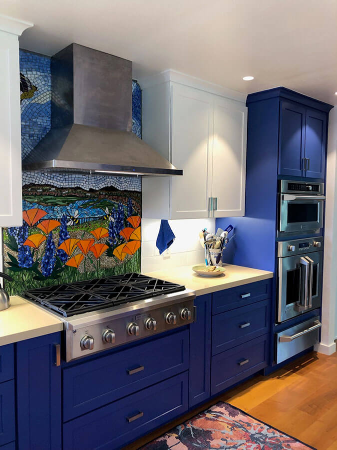
Peggy Pugh’s mosaic backsplash makes me wish the vent hood for the range didn’t have to be installed!
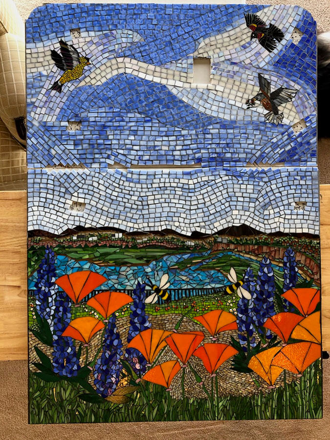
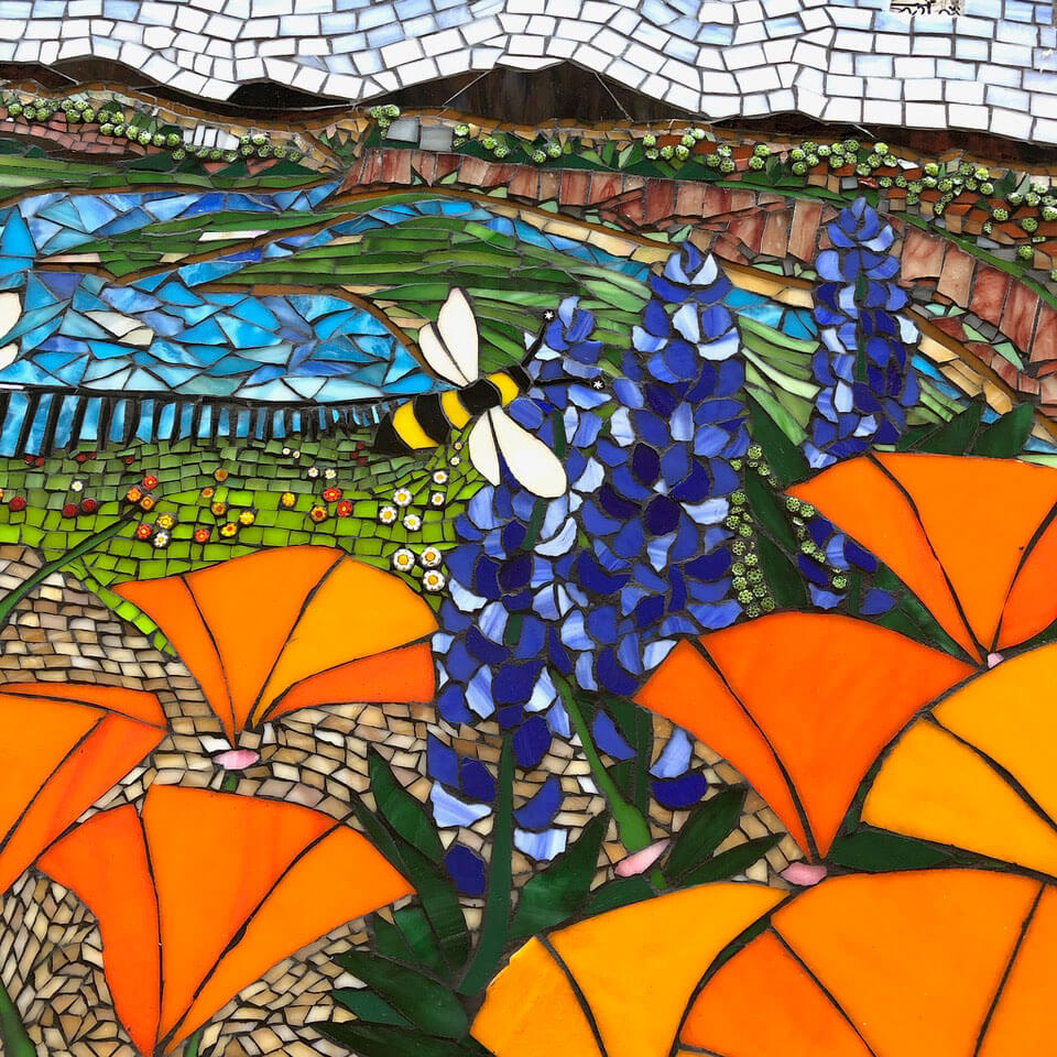
The backsplash design is a mosaic interpretation of the view from the window opposite to it in Peggy’s kitchen. The view is of Peggy’s flower gardens with Upper Back Bay in Newport, California in the background.
Peggy says this about her inspiration and the results of her work:
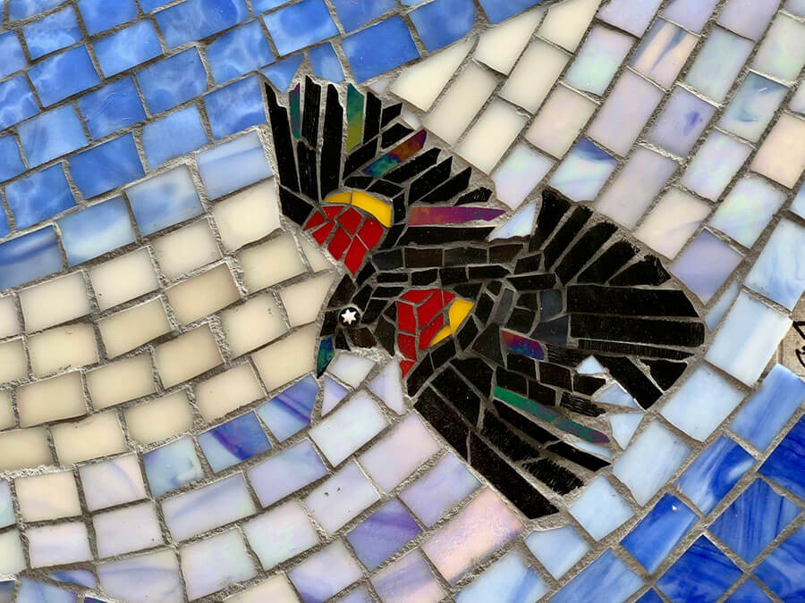
It is a peaceful and everchanging scene of tides, sky, birds and wetlands. The birds are those I see in the yard or the Back Bay, a very inspiring view.
I am thoroughly delighted with the way it turned out. It is not often that my idea of something matches the finished product.
-the artist

The Inspiration
Peggy added birds and bees to a design she created from the above photo.
Peggy says that the initial step of drawing a cartoon based on the inspiration was the slowest part of the process, which it should be for a figurative mosaic of this complexity. She says that after that, things flowed well.
The Essential Cartoon
A mosaic pattern is called a cartoon, and they are the plan for the mosaic. At minimum, it is an outline drawing of all figures and resemble a page in a coloring book. A more thorough cartoon will have notes for colors.
I often sketch a few faint lines to suggest the the flow of the andamento (the direction of the rows of tile), which can be used to suggest motion in the background and is highly recommended.
The cartoon for a mosaic is where at least half of the design process occurs, and it should be where all the composition takes place.
Compositions need to be thoroughly worked out in this stage because during the execution, your attention will be totally consumed with rendering details, which requires a lot of decision making.
Details have to be simplified in some way to be rendered in tile, and each detail is different, even if it is a repetition of a detail rendered elsewhere.
Here is a photo of the cartoon lying on the top corner of mosaic in progress:
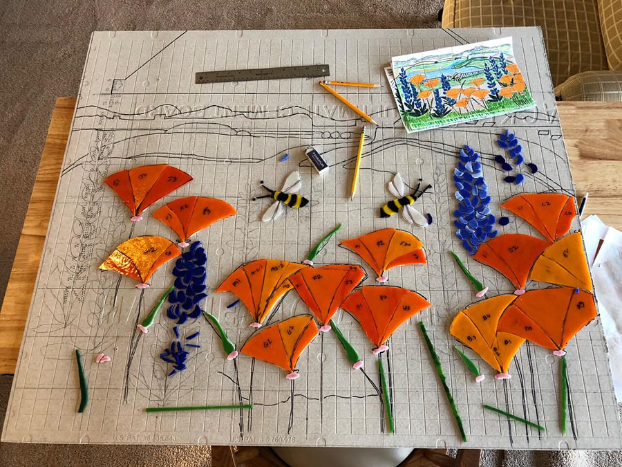
Peggy executed her mosaic by drawing the cartoon directly on the backer and gluing tiles to it one at a time.
Mosaic Backer Board
Hardiebacker brand tile backer board was selected for this mosaic, which is my preferred backer for dry indoor mosaics installed on walls with a stud construction.
Peggy had her contractor cut the backer board to exact size and shape and pre-drill the mounting holes. To accommodate the height of the mosaic, a top piece and a bottom piece required, each with a different shape.
Initially Peggy told the contractor to go ahead and attach the bare backer the wall, but they assessed the complexity of the design Peggy planned to create and wisely recommended a temporary backsplash of plain subway tiles on a duplicate of the backer boards she would use for her mosaic.
Peggy says this was a good decision because it took her two years to actually complete the mosaic.
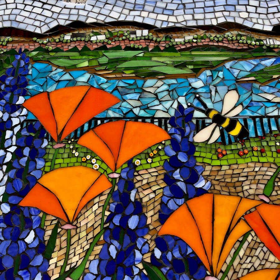
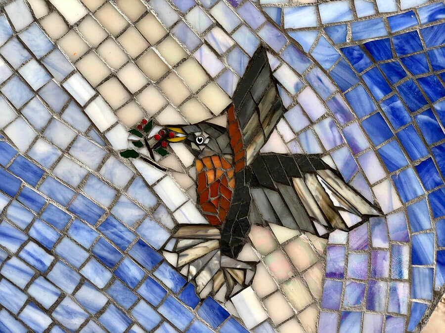
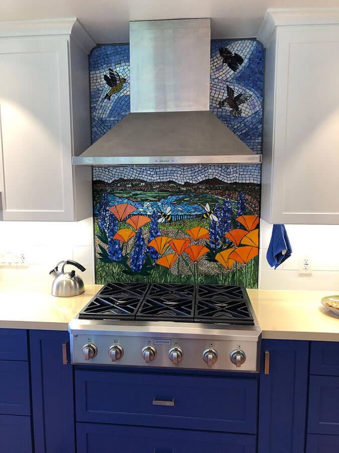
Grout Color Study
This was the largest and most ambitious mosaic Peggy had ever attempted, and so she wisely made some test swatches to evaluate grout color before grouting the actual mosaic.
Test swatches actually make great abstract mosaics that can be used as things like trivets and pads for potted plants on table tops.
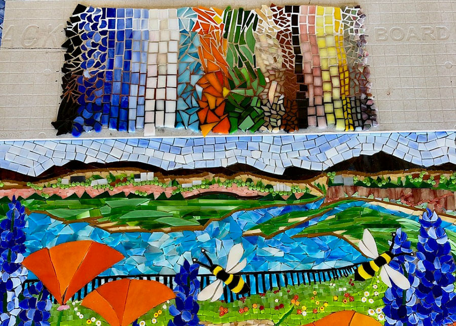
Notice how the white grout in the test swatch would produce a brighter wall but doesn’t help the tiles render the image with verisimilitude.
Most mosaic images look more representational when grouted with a darker grout than they would with lighter grout.
A Pleasant Surprise
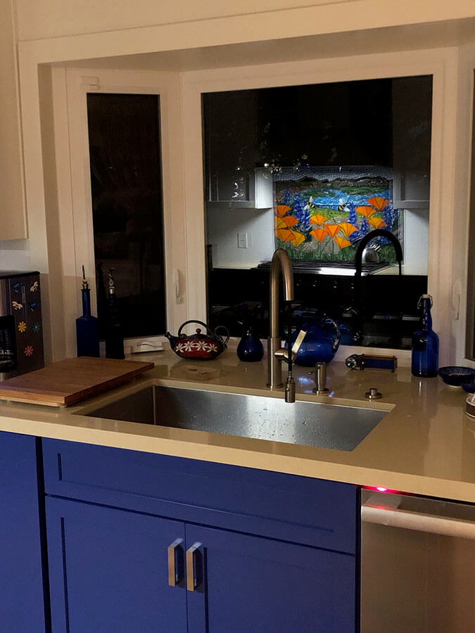
Peggy had a pleasant surprise when she walked into her new kitchen at night:
After it was installed there was an extra unanticipated surprise for me. When I walked into the kitchen at night, I could see the reflection of the mosaic in the window over my sink. It was like a moment of suspended magic before I realized it was a reflection and not another mosaic. Now I enjoy it twice as much at night!
-the artist

Leave a Reply