Category: Improving Your Art
-
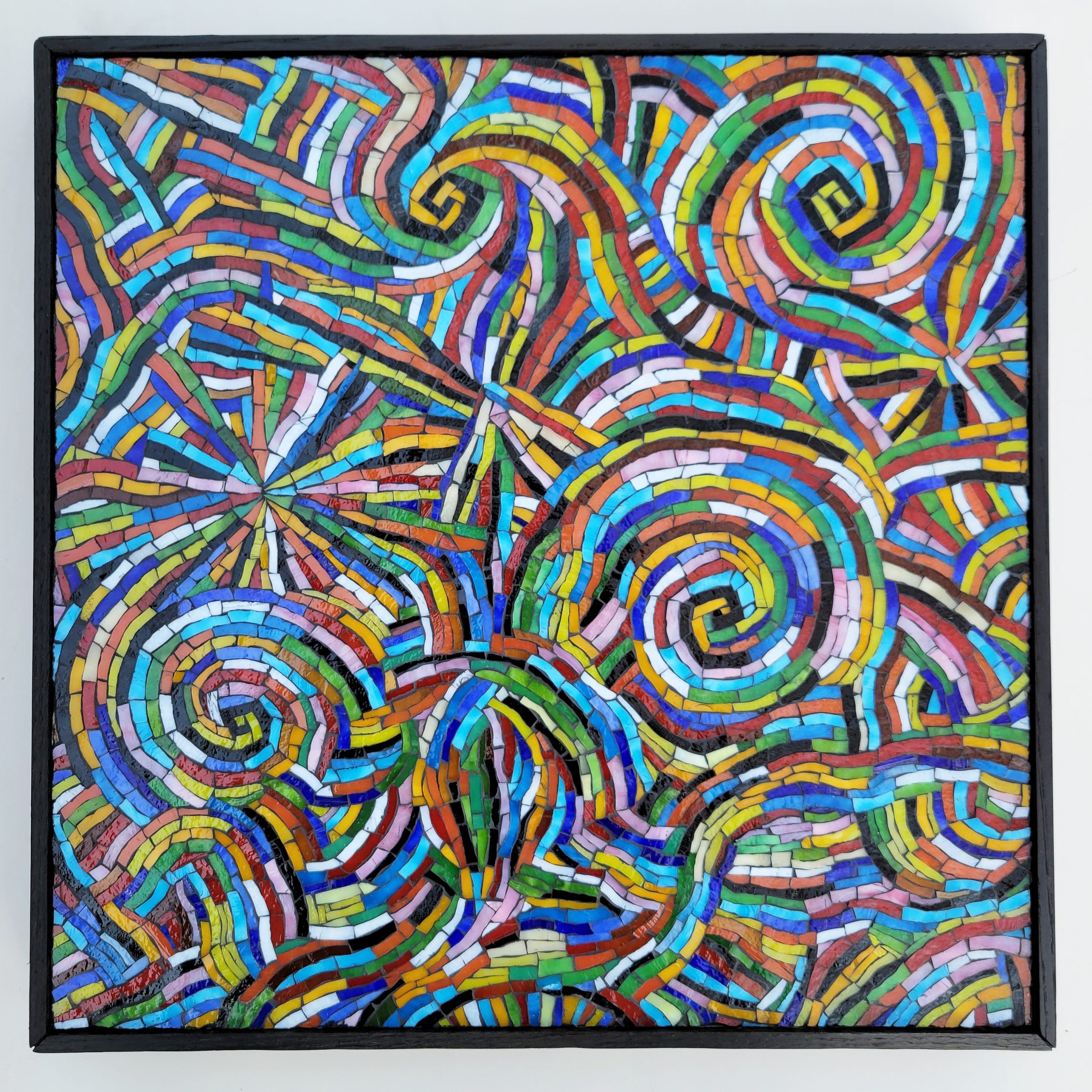
Dancing Color Rhythm Abstract Mosaic
I continue to work on this new series of abstract mosaics, and I am loving it. Dancing Color Rhythm is my latest stained-glass mosaic, and it is also 16 x 16 inches and mounted on 1/2-inch plywood and framed with 1/4-inch oak, painted in black. I’ve developed several improved methods that make the process more…
-
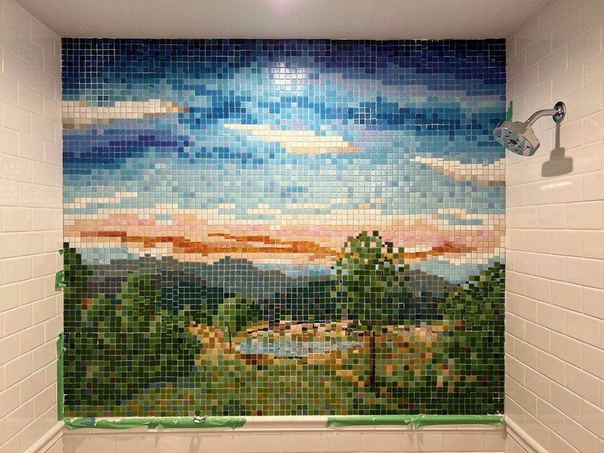
Mosaic Shower Insert
Artist Nona Carr has recently completed a mosaic shower insert for a young child’s bathroom. The concept for the mosaic was an eclectic collection of iconic images rendered in adjacent frames, similar to my Mosaic Door project.
-
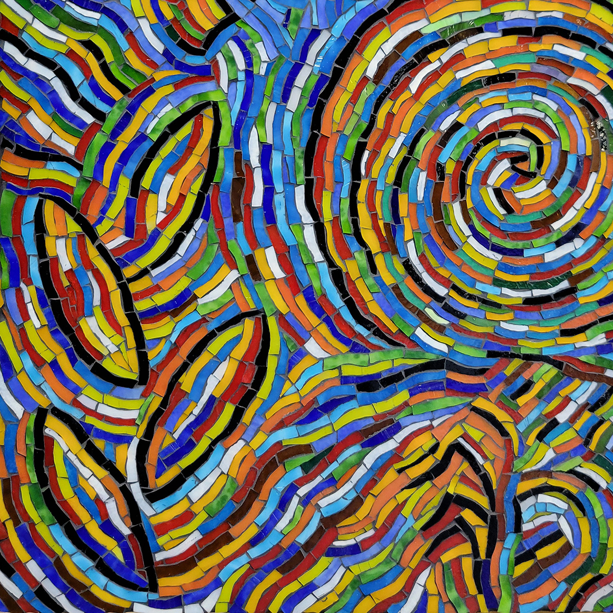
Latin Jazz Abstract Mosaic
I recently completed this abstract mosaic using our American-made stained glass. The title is Latin Jazz, and it is 16 x 16 inches in size and mounted on a plywood backer covered with two plies of fiberglass mesh and PVA adhesive.
-
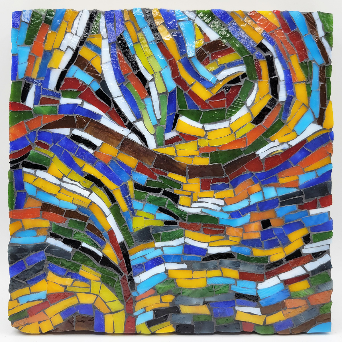
Abstract Stained-Glass Mosaic
I am now obsessed with abstract stained-glass mosaic. I recently completed two small studies on 6×6-inch plywood backers in preparation for some larger compositions. These larger compositions will be semi-abstract with the outlines of figures hidden in Fauvist contours. I am very excited about these coming works because they will make use of contoured andamento,…
-
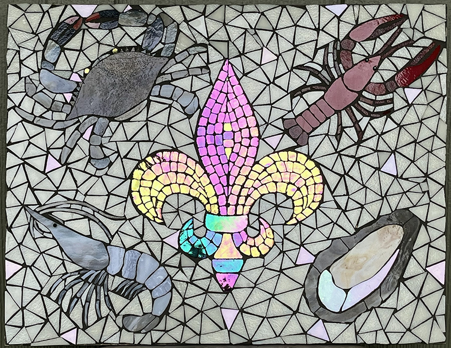
Fleur-de-Louisiana: A Study in Subtle Colors
Artist Sharon Thomassie emailed me a photo of her mosaic in progress and asked for advice about choosing color(s) for the background.
-
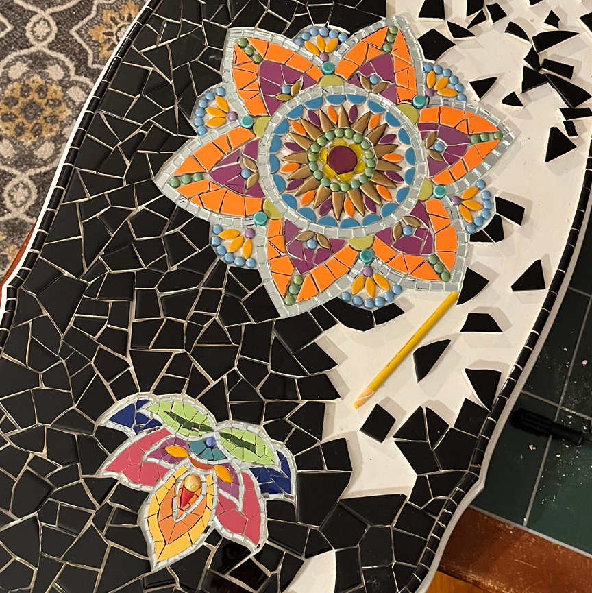
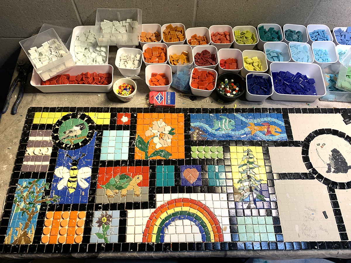
Mosaic Table Insets
Inserting detailed mosaic insets in fields of monochromatic tile is the perfect compromise that allows an artist to make a mosaic table top with original artwork with fine detail without overcommitting time or effort.
-
Mosaic Table Alternative
Mosaic tables are great for quick and easy designs: geometric or abstract or loosely executed fun images. Installing original figurative mosaics on a table is not the best idea for several reasons, especially if your design is very detailed.
-
Online Mosaic Design Tool
To promote mosaic as a fine art, we encourage people to make their own mosaic designs and to choose non-gridded over gridded designs. Nevertheless, there are many situations that call for naturalistic images, and these are most easily made using a gridded design where each tile is treated as a tiny pixel.
-
Partial Taping of In-Process Mosaic
Mosaic Mounting Tape sticks well-enough to whole uncut tile as small as 12mm to allow the sheet to be lifted and dangled and handled without tiles falling off. This is also true of whole uncut tile as small as 8mm, although the sheet can’t be handled as casually. But what about using Mosaic Mounting Tape…
-
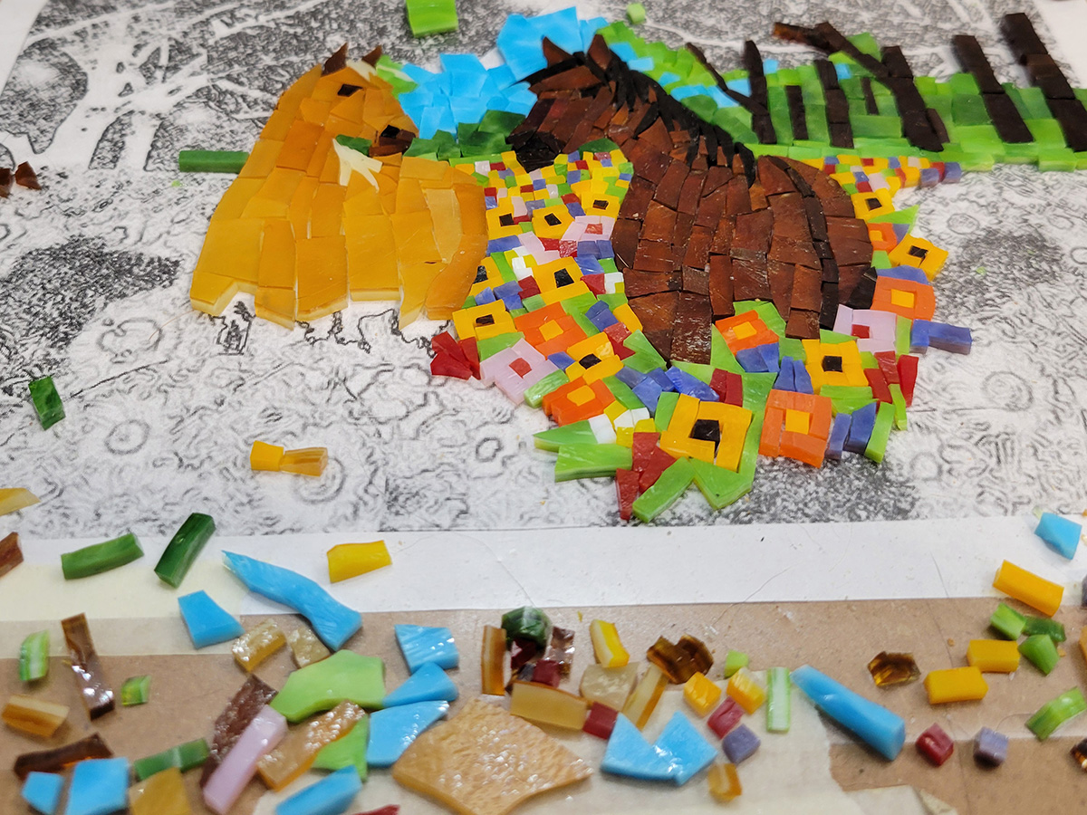
Impressionist Landscape Mosaic Mural
Artist David Hilbertson recently completed his first mosaic and photo-documented the process of making it, which was somewhat of a tour-de-force in terms of using improvisation and working around problems. Even the image itself is more improvised than not, and yet the results are akin to an Impressionist painting or a pixelated photograph.
-
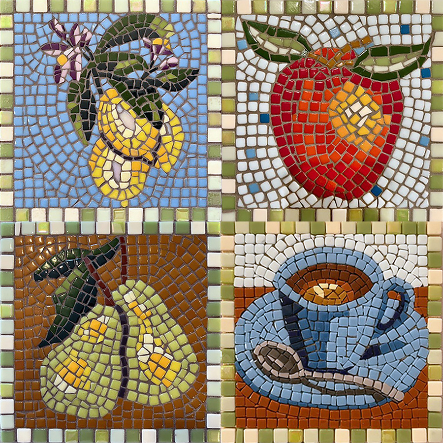
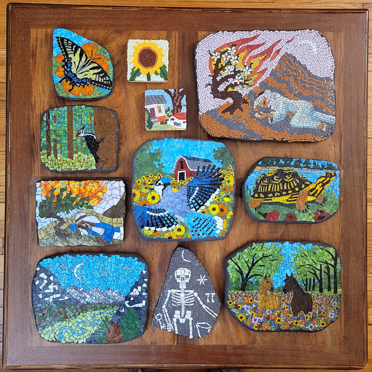
Still Life Mosaic Series
Louise Roberts recently emailed me to say that she has been teaching herself mosaic using our blog and that she followed my recommendation to make a series of small mosaics of the same size. She also attached some photos of her mosaics, and they are impressive. To me, her mosaics are yet more proof that…
-
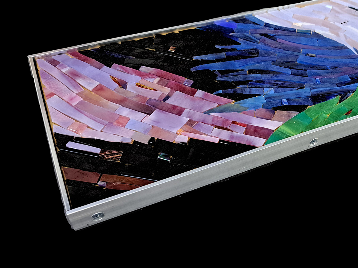
How to Make an Aluminum Mosaic Frame
The aluminum mosaic frame featured in this article was made by artist Natalija Moss from flat bar stock instead of angle stock. Natalija wrote highly-detailed instructions for making a mosaic frame from aluminum angle-stock that should be consulted for step-by-step details and fastener specifications. I wanted to feature her new mosaic in an article because…