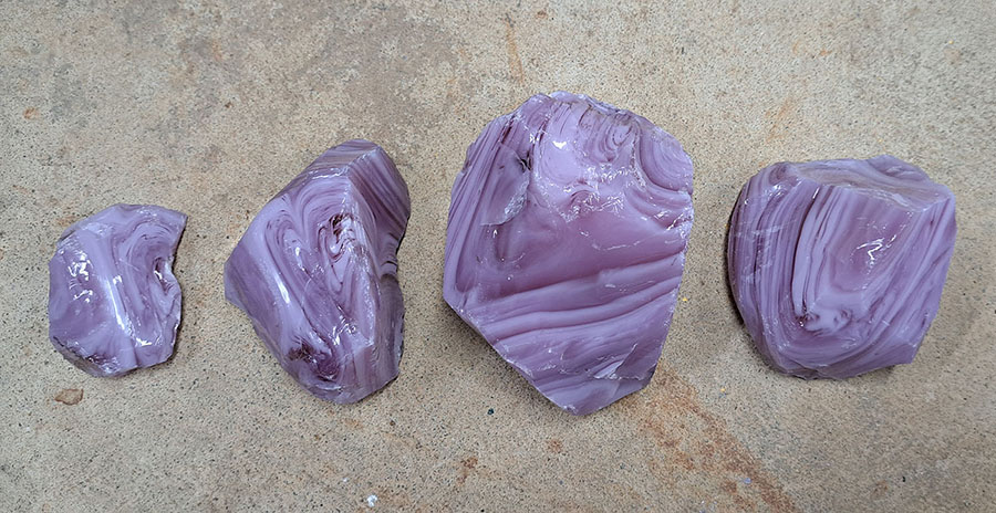
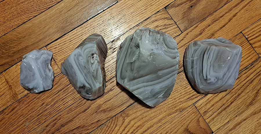
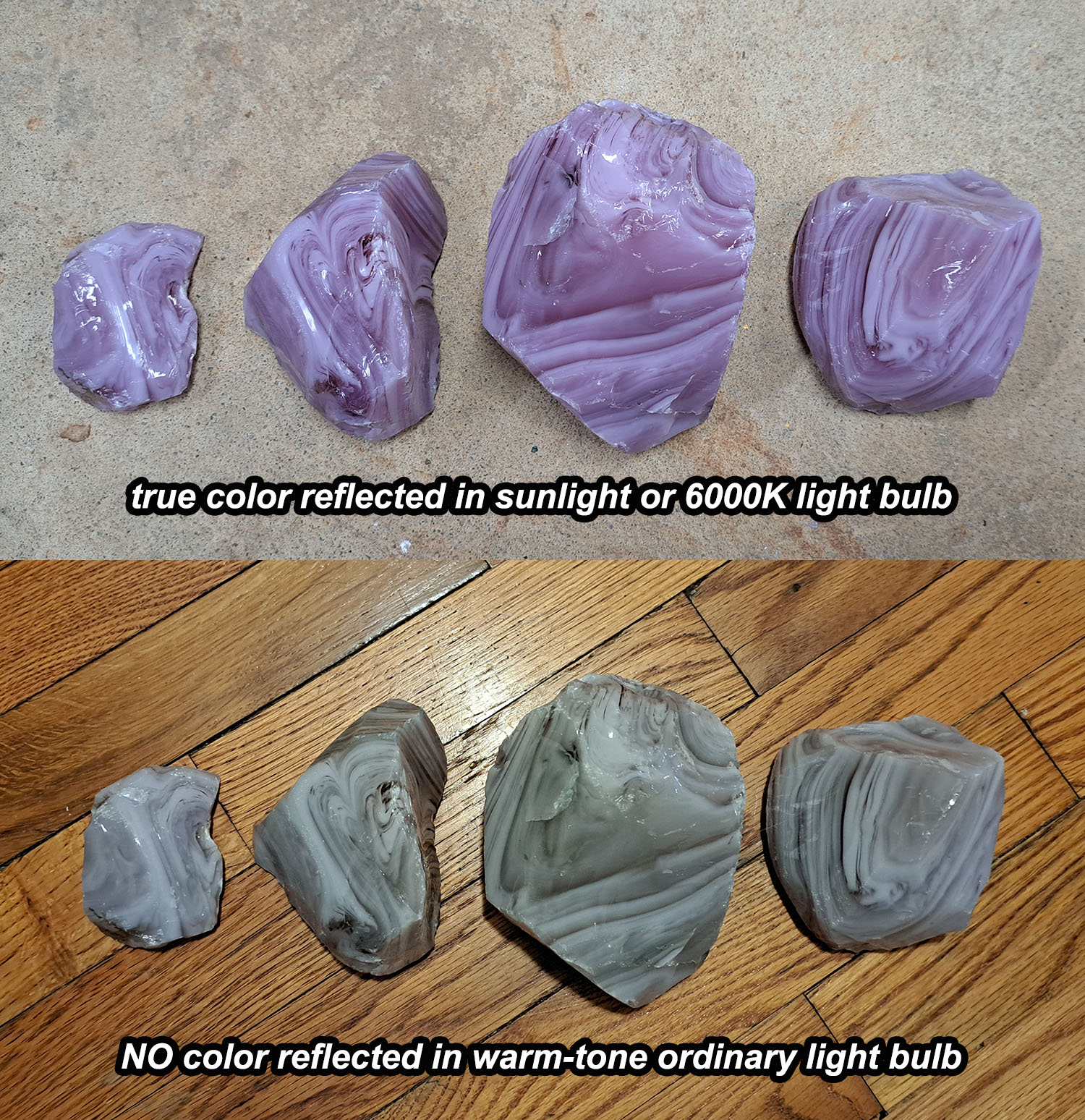
As we know from high school science, the color of an object is only the light it is reflecting while absorbing all the other frequencies (colors) that make up white sunlight.
What this means is that a blue object won’t appear very blue if there isn’t much blue light to reflect, such as the warm-tone light bulbs we commonly use in residential dwellings.
Purple glass seems particularly prone to dullness in typical warm-tone lighting, but all cool-tone hues are affected including greens and teals.
It’s amazing how many people aren’t aware of this issue. We receive quite a few emails from people accusing us of sending them the wrong material, fraud, etc.
All we can do is tell them:
An object can only reflect colors of light used to illuminate it. It can’t be blue or purple if there isn’t blue or purple light in the light source.

Monitor Settings
What a color looks like on a customer’s computer depends very much on their monitor settings and to a lesser extent on their monitor and graphics card combination.
This is a second reason why some people get wrongfully upset with us when the glass doesn’t look as expected.
This is particularly ironic because we are probably the only mosaic supplier with an engineer/scientist on staff, and we are probably the only mosaic supplier using a scientifically-calibrated monitor to create our website photos.

Relevance To You
I’m discussing this issue about color in terms of customer expectations and satisfaction because this can bite you on large architectural commissions.
Lighting is important. It shouldn’t be an afterthought, especially for large murals. Coordinate with the designers and architects. Talk about bulb temperatures and wattage/luminosity. You need to know more than just where the fixtures are positioned.
Be aware that color samples shown to the client need to be physical samples due to the monitor issue discussed above.


Leave a Reply