I’ve explained about the importance of artwork being balanced and harmonious with itself.
I’ve also written about how mixed-media mosaic allows you to incorporate found objects as elements of images otherwise rendered conventionally in mosaic tile.
When do these two modes clash with each other?
Usually when there is just one of two elements that are found objects, and the rest of the mosaic is conventional mosaic.
For some viewers, the one thing that is not like the rest of the artwork distracts from whatever else the art is about.
The Atmospherics of Light at Night
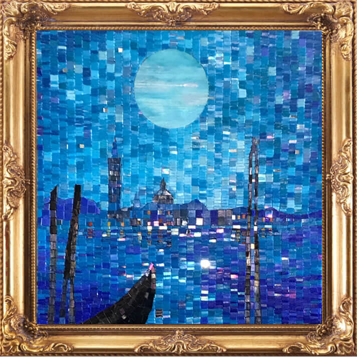
Terry Broderick’s Blue Venice Mosaic has me thinking about these questions because it might be “the exception the proves [challenges] the rule.”
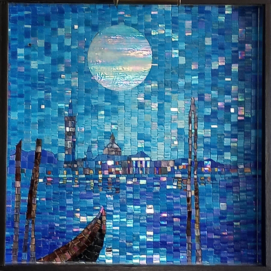
Terry renders the moon in Blue Venice using a circular piece of iridescent stained glass that is much larger than the small tiles used for everything else in the mosaic.
What unifies the image are the iridescent tiles sprinkled throughout the rest of the mosaic.
When the mosaic is viewed from an angle of lighting where the iridescence is minimized, the moon’s difference in construction is more discernable:

For most viewers, this doesn’t pose a problem, but others might wonder why it is the only element executed this way.
I think Terry’s mosaic works very well, but there are two ways to circumvent any potential issue if you are considering something similar in your mosaic:
The first would be to have a few other elements also rendered in solid pieces of stained glass, and I think the prow of the gondola and the mooring posts in the foreground would be good choices since they are mostly silhouettes.
The other means of ensuring harmony would be to cut up the stained glass circle. It could still be large pieces if desired and still convey a sense of being mosaic.
All that being said, some of Terry’s previous work is concerned with depicting the atmospherics of light at night, and I think this mosaic is about the appearance of the moon at night and humid air, and Terry judged that this was best conveyed with one piece of glass.

Don’t Try This At Home Kids
My only concern about sharing Terry’s mosaic with a wider audience in this blog is that it falls under the caveat, “Kids, don’t try this at home. This man is a trained professional.”
Over the years, I have seen a lot of novices more or less ruin what would otherwise be a good first effort when they try to be too clever and include some element that really doesn’t fit aesthetically merely because of a thematic connection.
For example, if you render an undersea scene with naturalistic detail for the fishes and other creatures, don’t include a ceramic turtle that is stylized or cartoonish merely because that is the ceramic turtle you have. If you think that the mosaic needs a ceramic turtle figurine, find one that is rendered in a similar style as your sea creatures, and maybe consider using ceramic figurines for some of them too so that the turtle doesn’t look out of place.
Not all the thematic connection in the world can overcome problems with basic aesthetics, and a lack of balance is usually fatal for a work of art.


Leave a Reply