Artist Beverly Postman has a natural gift for creating visual interest with fauvist colors and variable andamento and mixed materials.
The images she emailed me were low resolution because that was all she had, and so it reminded me yet again of the importance of photographing our artwork and creating a digital portfolio.
More on that later.
There is much to learn from looking at Beverly’s mosaic artwork.
Black Grout
Beverly’s mosaics demonstrate the power of black grout and how it makes colors look more intense.
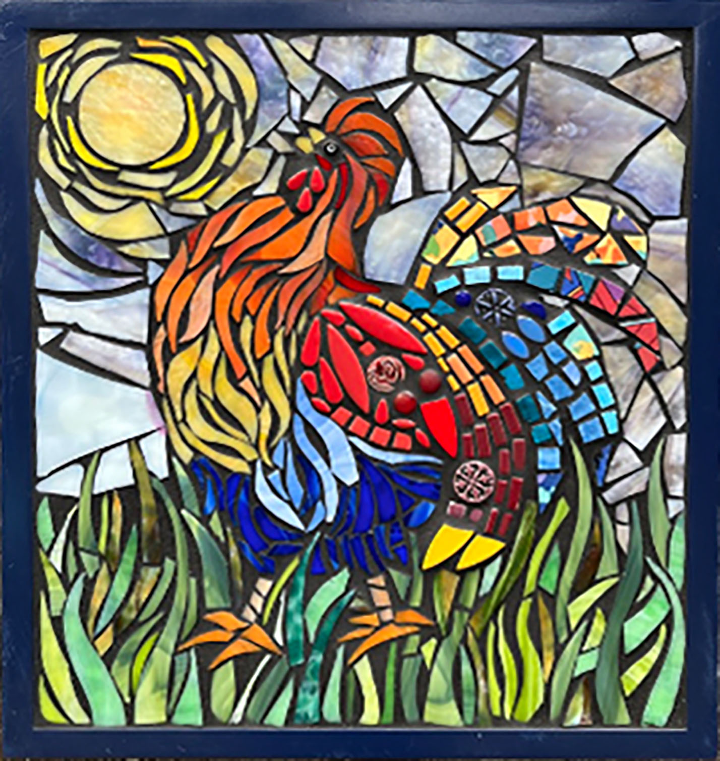
If you like big and chunky grout gaps such as Beverly uses, black grout is the best way to make sure your mosaic’s colors don’t lose a lot of intensity when surrounded by all that concrete.
Note that larger grout gaps are more or less required when incorporating thick and chunky found objects.
Fauvist Color Schemes
Beverly is not constrained by the model or naturalism. While highly informed by models, Beverly’s images go their own way in terms of pattern and color. The goal is to make something exciting to look at not make copies. Beverly gets it.
Fauvist color schemes give us wonderful things like strutting roosters of red, blue, and gold. Hurray!
Strong Design Sense
Look at the rooster’s feet. Notice that Beverly didn’t make the mistake of trying to show the feet partially hidden by blades of grass, such as would most likely been the situation in a natural model.
Blindly following a model in this case would have been a mistake because the feet wouldn’t be as instantly recognizable, and this piece of art as a whole is more coarsely stylized than would allow such detail.
Andamento
The flow of the feathers and the blades of glass are wonderful, but Beverly wasn’t compelled to use the same andamento in other places in the mosaic. The sun and sky are great. The mosaic is more interesting by not being the same throughout.
Value Contrast
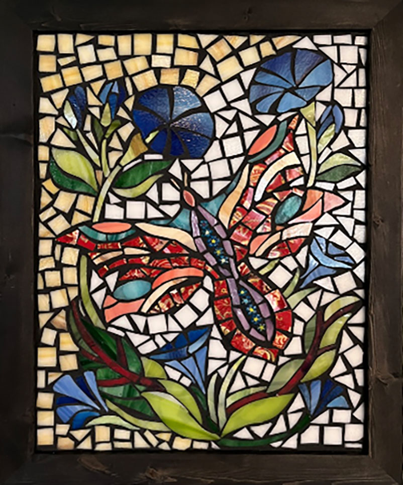
The Dream Moth mosaic above is nothing short of amazing in terms of value contrast (light/dark contrast).
This mosaic looks like it has a light behind it and shining through the glass, but no, this mosaic is on an opaque backer.
The effect is created by excellent use of value contrast.
There is a lot to be learned from looking at these mosaics.
Variation
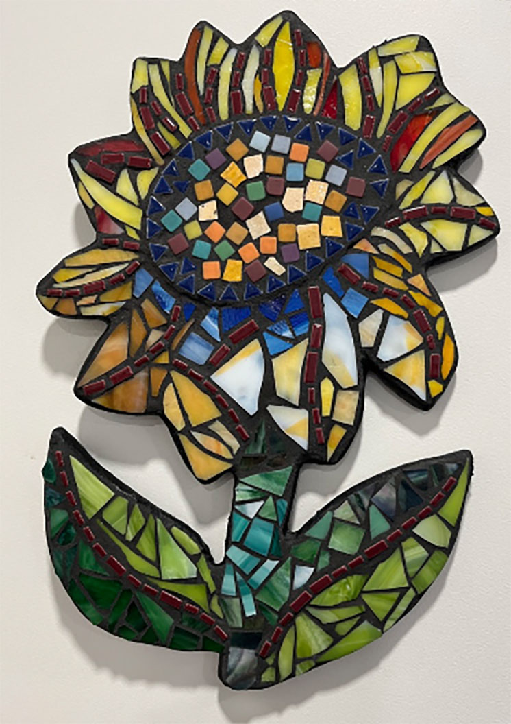
Look at the green of the stem and leaves of the sunflower above. Notice how well the different green colors harmonize and contrast the deep crimson midrib vein of the leaves.
More importantly, notice how none of that was used to suggest a direction of lighting or reinforce other aspects of naturalism.
Notice how the petals of the flower aren’t constrained by symmetry or consistency of pattern.
Most people making a sunflower this stylized and relatively simple would have made a much less interesting version because they are slaves to naturalism.
Photographing Your Mosaics
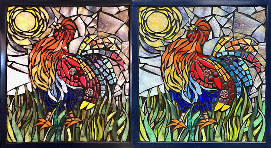
The digital version is how most people with see your artwork, and so high-resolution photos made in diffuse sunlight are critical for promoting your work.
In the composite above, the left photo was made using indoor light, while the right photo was made in diffuse sunlight.
Notice how the indoor light is yellow and deficient in blue light. That is why the green grass on the left looks less intense, as does the sky. Look at how dull the rooster’s lower blue feathers are in that yellow light.
Leave a Reply