Artist Caroline Bommer’s recent Sunset Mosaic is a great example of an exception to the rules of mosaic art that I harp on in all my online content. After seeing the finished mosaic, I actually wanted to title this article, “Don’t Listen to Me. I Don’t Know Anything about Mosaic.”
Exceptions to Rules of Art
I have often written about how much I like exceptions to general rules and how problematic artistic advice can be, especially when dispensed and consumed as a one-size-fits-all way.
First, there are many different styles of art. If you are trying to paint in a loose Impressionistic style, then following advice about how to paint in the French Academic style with all its crisp rendering will leave you farther from your goal.
I would caution anyone reading different art instruction books to keep that in mind.
I even recommend that you avoid reading some content out of idle curiosity when you know the style being discussed is different from what you are trying to do.
The reason I say that is in creating art, there are many decisions that are made in a less-than-fully-conscious way.
When learning something new and complex, the last thing you need is to cloud your judgment with too many conflicting ideas in the back of your mind. At least that has been my experience.

A No Good Very Bad Day
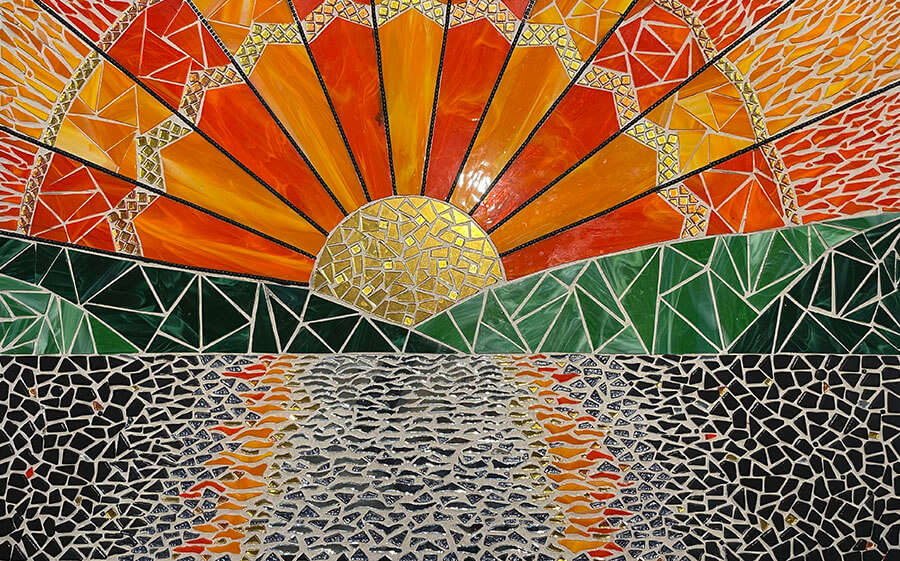
Caroline emailed me a photo of her un-grouted mosaic for advice on grout color as a lot of people do, but the day she happened to email me was a very bad day at the warehouse, and so I was more blunt in my response than I normally am.
Since the start of the pandemic and Trump’s China tariffs, running a retail business and importing goods and shipping packages has been extraordinarily difficult with all sorts of complications and extra tasks and expenses, but that day was different.
The day Caroline emailed, I think we set an all-time record in terms of petty nonsense and serious problems all coming on the same day.
Anyway, I receive a ton of emails from mosaic novices with photos of first-time mosaics with very wide grout gaps, and they all look bad after grouting, and so my spirit sank when I saw Caroline’s mosaic.
I told her that unless she reworked some of the areas by prying up tiles and setting them more closely together, the mosaic would not look good after grouting.
I didn’t even make my usual recommendation to use dark grout if she chose to go ahead and grout it without reworking it, which is a good indication of how negative my mood was that day.
A Pleasant Surprise
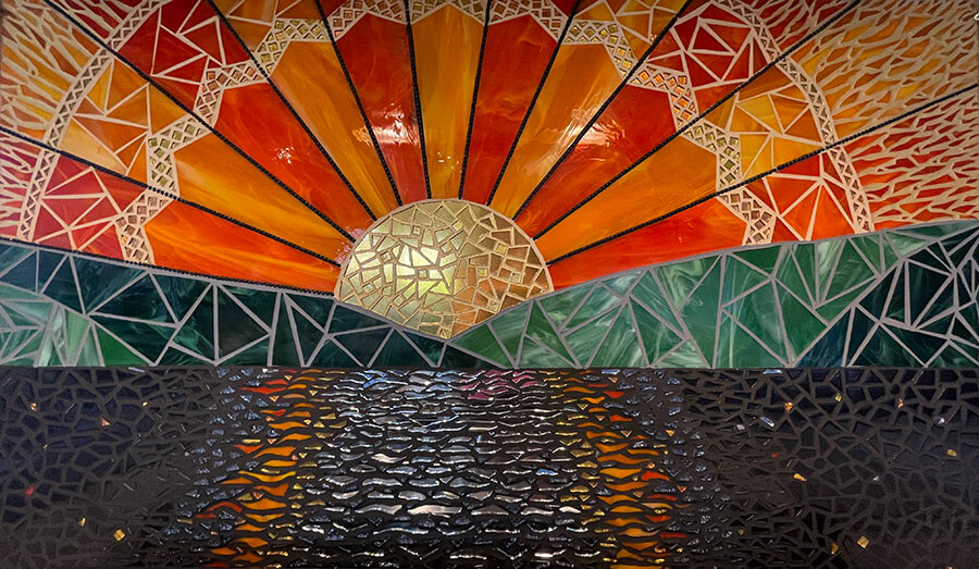
Thankfully Caroline didn’t let my email get her down. She also used a dark-colored grout, which was key to making her mosaic work.
I think the main reason wide gaps make novice mosaics look so bad is that novices tend to use white grout as if they were tiling a bathroom instead of rendering an image.
TIP: Our eyes see cracks between objects as black lines not white, and so using white grout is a surefire way to destroy any verisimilitude your image might have had otherwise and should be avoided -unless you are deliberately trying to make something that looks “crafty” or stylized.
Caroline’s mosaic not only looked a lot better than I thought it could, the part of the mosaic with the widest gaps actually turned out looking the best!
It had me wondering, “Did I know anything about mosaic?”
BUT, look at how this is a special case.
Black Grout
Note that wide gaps in the center of the water don’t look problematic because Caroline used black grout, which not only avoided the problem of white grout, but it also served a visual purpose: dark water between reflecting waves.
All that being said, I am not recommending novices use that as a model. If you need black water between reflecting tiles, use black tile to render it and avoid wide gaps.
The reason I say that is because wide gaps in other places in your mosaic are likely to be problematic.
This is one of the few mosaics I have seen where a wide grout gap didn’t have a absolutely fatal impact on the image being rendered:

TIP: Concerned that dark grout will make your mosaic look dark? Simply make your grout gaps narrow, and it is not an issue. Don’t try to rationalize wide gaps or light grout based on theme or subject if your goal is to make an image that looks like real life.
Installed Mosaic
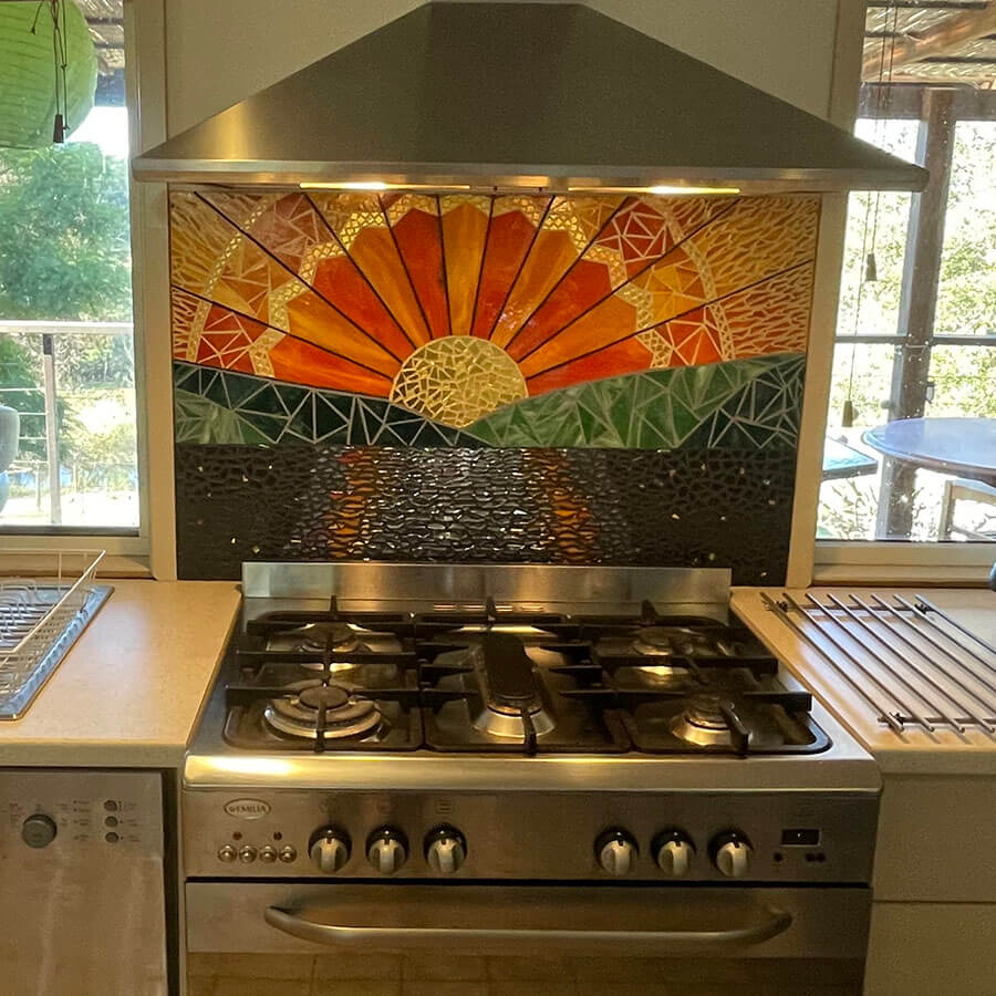
I think that the installed mosaic looks good.
Looking at the dark lines in the sunrays, I think I would have liked it if the mosaic had used the same dark/black grout in the sunrise and land areas.


Leave a Reply