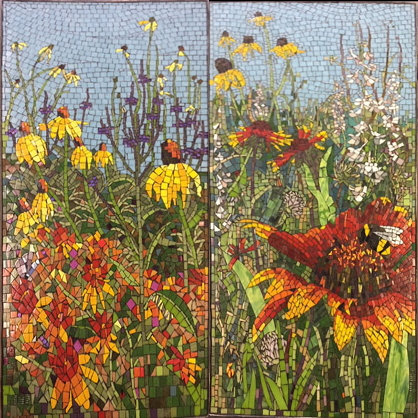
Prairie Diptych Mosaic, 4 ft x 2 ft

River and Prairie Mosaics

Artist Janet Flom used some of our vitreous tile in some pubic space mosaics in 2016-17 that are photorealistic and well-executed, and I wanted to show them off as inspiration. The subjects of the mosaics are prairie wildflower patches and landscapes of the upper Mississippi River.

Andamento

I say Janet’s mosaics are well-executed because the tiles are arranged in lines that correspond to the shape being rendered instead of being placed in a grid where each tile is nothing more than a pixel.

I greatly prefer mosaics that have this added element of visual interest and think it is worth the extra effort.

Using an andamento that follows the shapes being rendered also allows you to capture smaller details with larger pieces.

For example, if Janet had wanted to capture the same level of detail using tile in a grid, the size of the tile would have to be less than one forth the size she actually used. Instead, she made details like a leaning flower stalk from a row of tile that ran along the direction of the stalk.

The following mosaics of prairie wildflower patches were installed in the main lobby of Sanford Hospital in Fargo, ND.
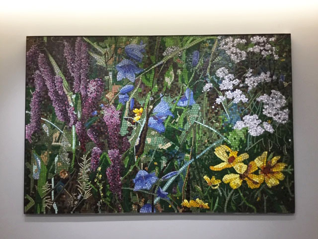
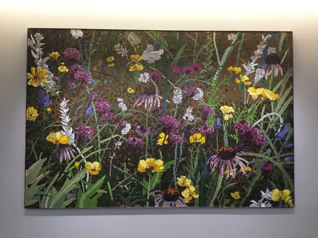
Prairie I (Bluebell) Mosaic, 6 ft x 9 ft
Prairie II (Coneflower) Mosaic, 6 ft x 9 ft
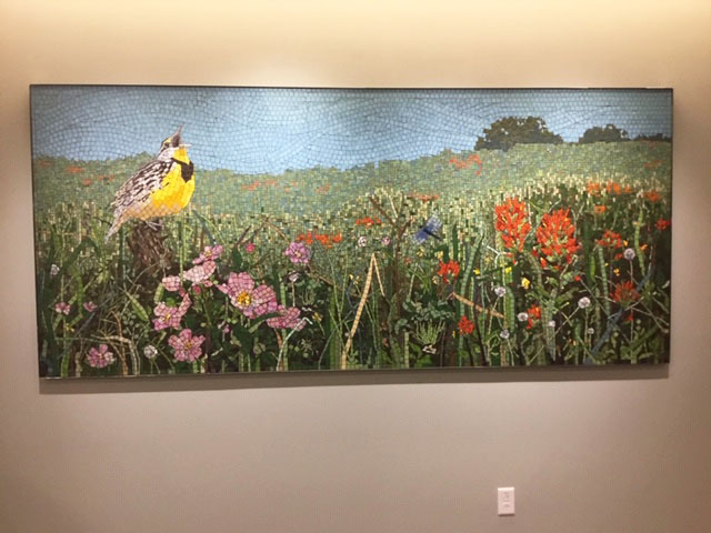
Prairie III (Meadowlark) Mosaic, 4 ft x 9 ft


Mosaic River Landscapes

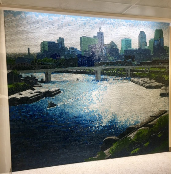
The following mosaics are Mississippi River scenes on walls at the Minneapolis-St. Paul International Airport, Gates C4-7:
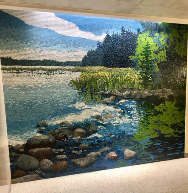
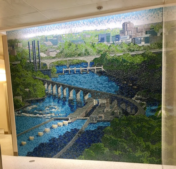
One Mississippi (Headwaters), 9.6 ft x 11.5 ft
Two Mississippi (St. Anthony Falls), 9.6 ft  x 10.5 ft
Two Mississippi (St. Anthony Falls), 9.6 ft x 10.5 ft
Three Mississippi (St. Paul), 9.6 ft x 10.5 ft


2)


Posted

in

,

by

Tags:

Comments

6 responses to “River and Prairie Mosaics”

  1. Candy Avatar
    Candy

    This artwork is unimaginably beautiful! The grout in these pieces seems almost invisible. When I create mosaic pieces, the grout is obvious, although thin lines. How does she accomplish this technique?

  2. Karen Avatar
    Karen

    I’d like to know this too! Were different color grouts used as well?

    1. Joe Moorman Avatar
      Joe Moorman

      Hi Karen,
      I think the mosaics were all grouted with one-color grout.
      Thanks,
      Joe

  3. jacqueline Ross Avatar
    jacqueline Ross

    These works are stunningly beautiful. They are what I aspire to.

  4. Janet Flom Avatar

    Thanks, Candy ( and to Joe for his kind post). Thin grout lines were accomplished unintentionally by failing to leave appropriate space between vitreous tiles. This proved to be a good thing because I had lots of help from others and it was more uniform to all be doing the same thing.

  5. Janet Flom Avatar
    Janet Flom

    Thanks Candy. The grout lines are thin because I had a lot of help (all of these large pieces were completed in the same six-month timeframe) and it was decided to just go for no spaces. I knew from experience that the grout would still grab enough to give a thin line.

Leave a Reply

Your email address will not be published. Required fields are marked *

This site uses Akismet to reduce spam. Learn how your comment data is processed.