Tag: andamento
-
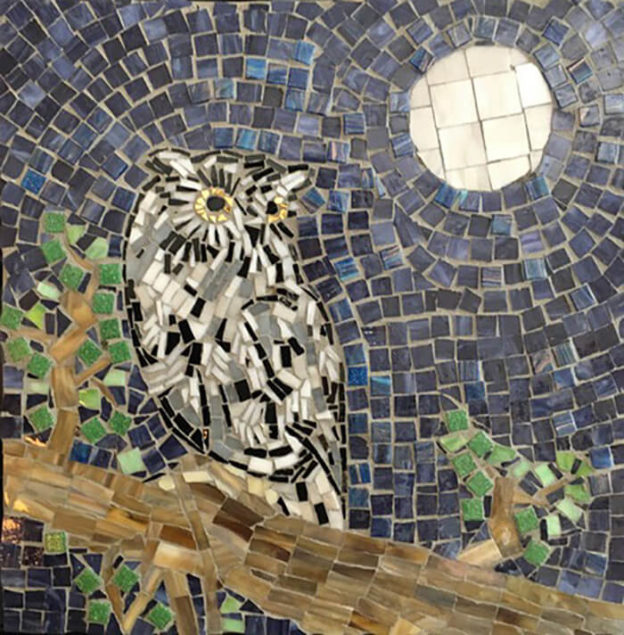
Owl Mosaics and The Importance of Andamento
Linda Lawton emailed me some pics of her recent owl mosaics, and one of them had an issue that made it a good teaching example about the importance of andamento. That mosaic also became a case study for how to mosaic on top of part of an existing mosaic if you want to rework a…
-
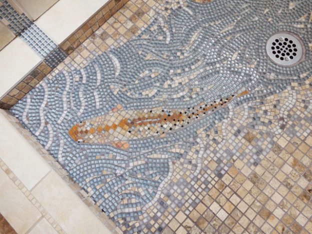
Figurative Mosaic Composition Integrated With Shower Tiling
Artist Jen Vollmer recently completed a shower mosaic which features fish and flowing water executed in the same colors as the surrounding mosaic tiling. Jen says that in retrospect, she wishes she would have used a darker grey grout and blue/green glass tiles instead of the light blue, which would have increased the contrast. I’m…
-
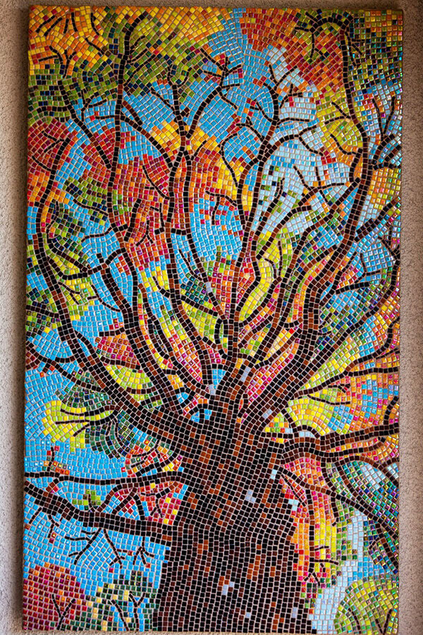
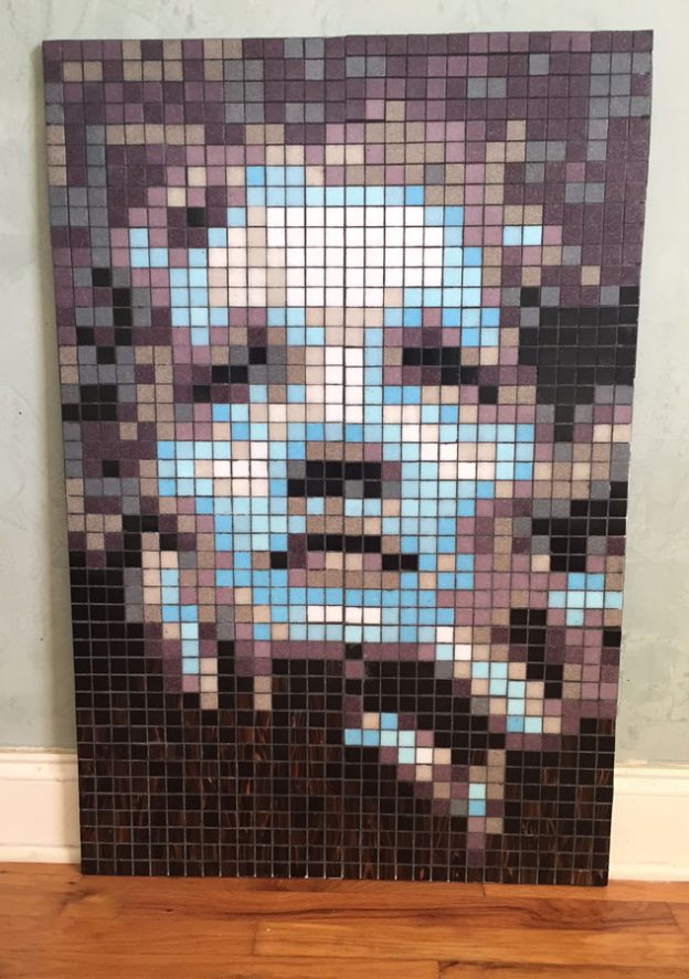
Making Detailed Mosaic Images Using Whole Uncut Tile
To make detailed mosaic images using whole uncut tile, you need to use a tiny brand, such as the 8mm Recycled Glass Mosaic Tile by Morjo™ that we sell. You also need to make sure the image is large enough to accommodate the level of detail. The Tree Mosaic recently completed by artist Robert Friedlander…
-
Creating Motion Using Curved Andamento
Artists can create a sense of motion in their mosaics by using concentric curved rows of tile, especially in the background around figures. To me this use of andamento* is one of the most interesting aspects of mosaic, and it is an easy way for novices to make art that really engages the eye. I…
-
Consistent Grout Gaps
In my recent blog article about black and white grout, I wrote the following tip for minimizing the width of grout gaps and working a little faster at the same time: If tiles only touch at points but not along the length of their sides, then tiles can be positioned very closely and yet still…
-
How To Choose Mosaic Background Colors and Patterns
Background colors for mosaics should be chosen based on how well they contrast with the colors used in figures. For this reason, most mosaic artists will tile their figures first and then choose their background colors by a trial-and-error process of placing tiles on the mosaic backer and just seeing how they look. The same approach…
-
Inspiring Mosaic Portraits Using A Grid Pattern
David Armstrong has created some inspiring mosaic portraits, and he did it using whole tiles arranged in a grid instead of irregular pieces cut and fit as needed. Normally, I dislike mosaic designs based on grids because they lack the extra visual element provided by tile arrangement (andamento), but David’s work has tons of visual interest that more…
-
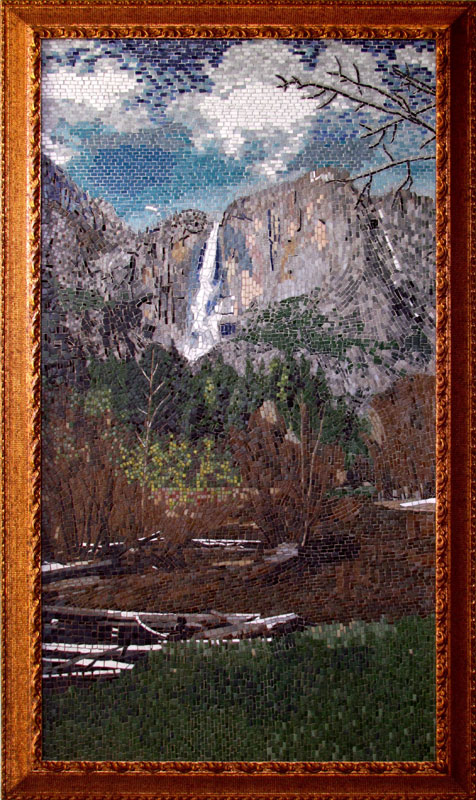
Photorealistic Mosaic Landscape
Yosemite Mosaic Landscape Yosemite Mosaic landscape by Jim Price. Limitations of the Grid and Tile as Pixels Jim Price’s Yosemite Mosaic is an excellent example of how photorealistic mosaic art does NOT have to be rendered in a uniform grid of pixels. For an example of a gridded mosaic where tiles are used as pixel, look…
-
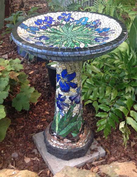
Mosaic Bird Bath
Artist Lyn Richards sent me some pictures of the mosaic bird bath she made this past summer, and it is worth showing off. The floral design and the colors used in the mosaic were inspired by Van Gogh’s painting “Irises.” Mosaic bird bath by artist Lyn Richards makes good use of contrasting colors and a…
-
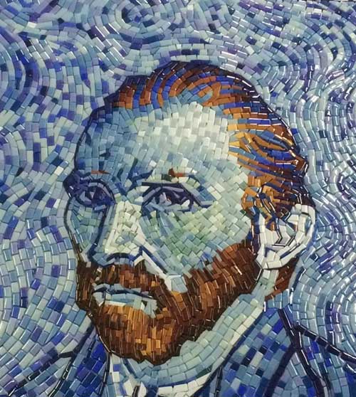
Van Gogh Self-Portrait Mosaic
Recently Doug Harris of Elementile sent me some photos of a mosaic rendering of Vincent Van Gogh’s 1889 self-portrait, and it is definitely worth seeing. I think some of the best examples of how to use adamento in mosaic to convey a sense of motion are actually demonstrated in Van Gogh’s painting, and this self-portrait was a natural choice for mosaic…
-
How To Choose A Mosaic Background Color
The background in a work of mosaic art serves two purposes: contrast the colors of the figures in the foreground. suggest motion by arranging the tile in contours around figures. The first point is obvious, but the second is often overlooked even though it can make the difference between a great mosaic and a mediocre…