Tag: design considerations
-
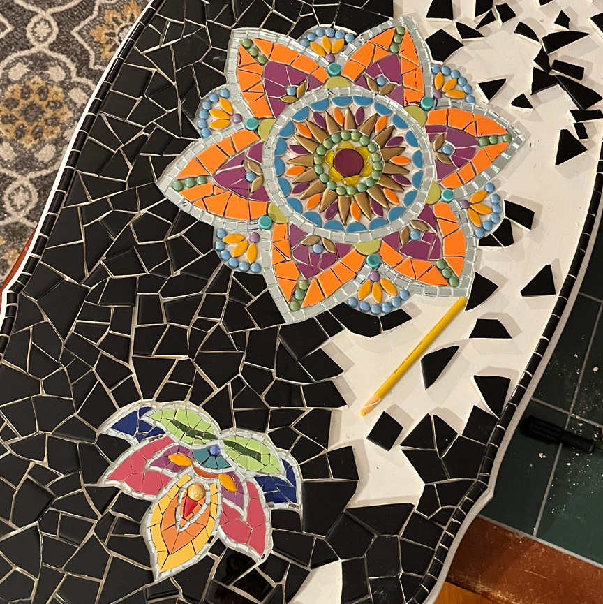
Mosaic Table Insets
Inserting detailed mosaic insets in fields of monochromatic tile is the perfect compromise that allows an artist to make a mosaic table top with original artwork with fine detail without overcommitting time or effort.
-
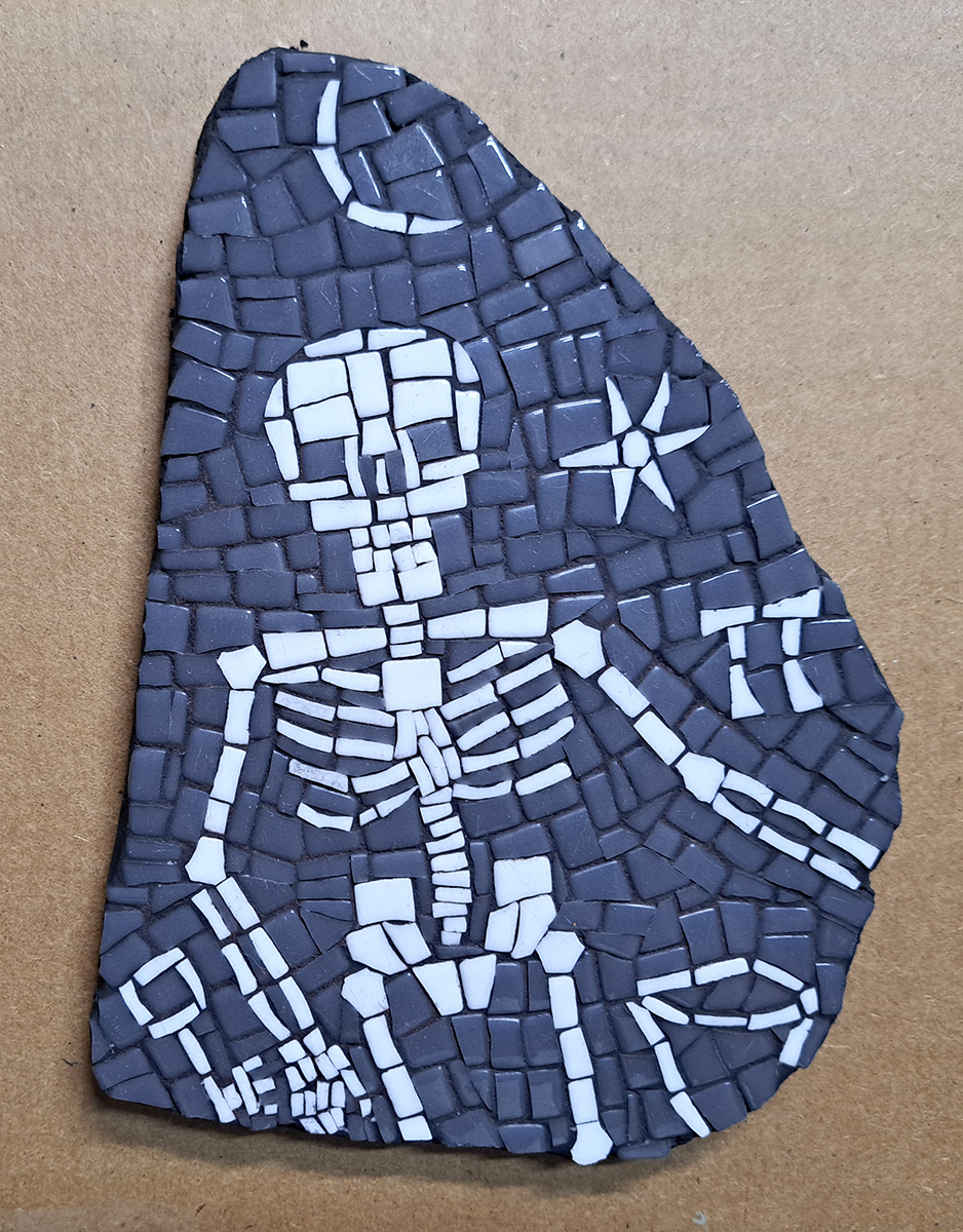
Skeleton’s Rib: How to Mosaic Easily
What does a skeleton’s rib teach us about how to make mosaic more easily? It teaches us only one lesson, but that lesson is probably the biggest tip I have for how to make mosaics more easily and with less tedium and frustration.
-
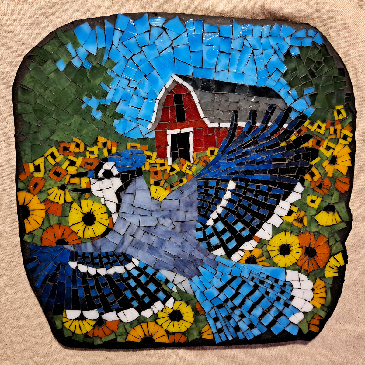
Blue Jay Mosaic
My most recent mosaic Blue Jay is 10 x 10 inches and made from our American-made stained glass on a mortar stone. This mosaic was made by improvising over a pattern.
-
Sizing Your Mosaic
Once you have a design you would like to create in mosaic, the next step is to determine how large to make it. The minimum size a mosaic can be is determined by the finest detail to be depicted in the image. I recommend trying to render that one finest detail first to determine if…
-
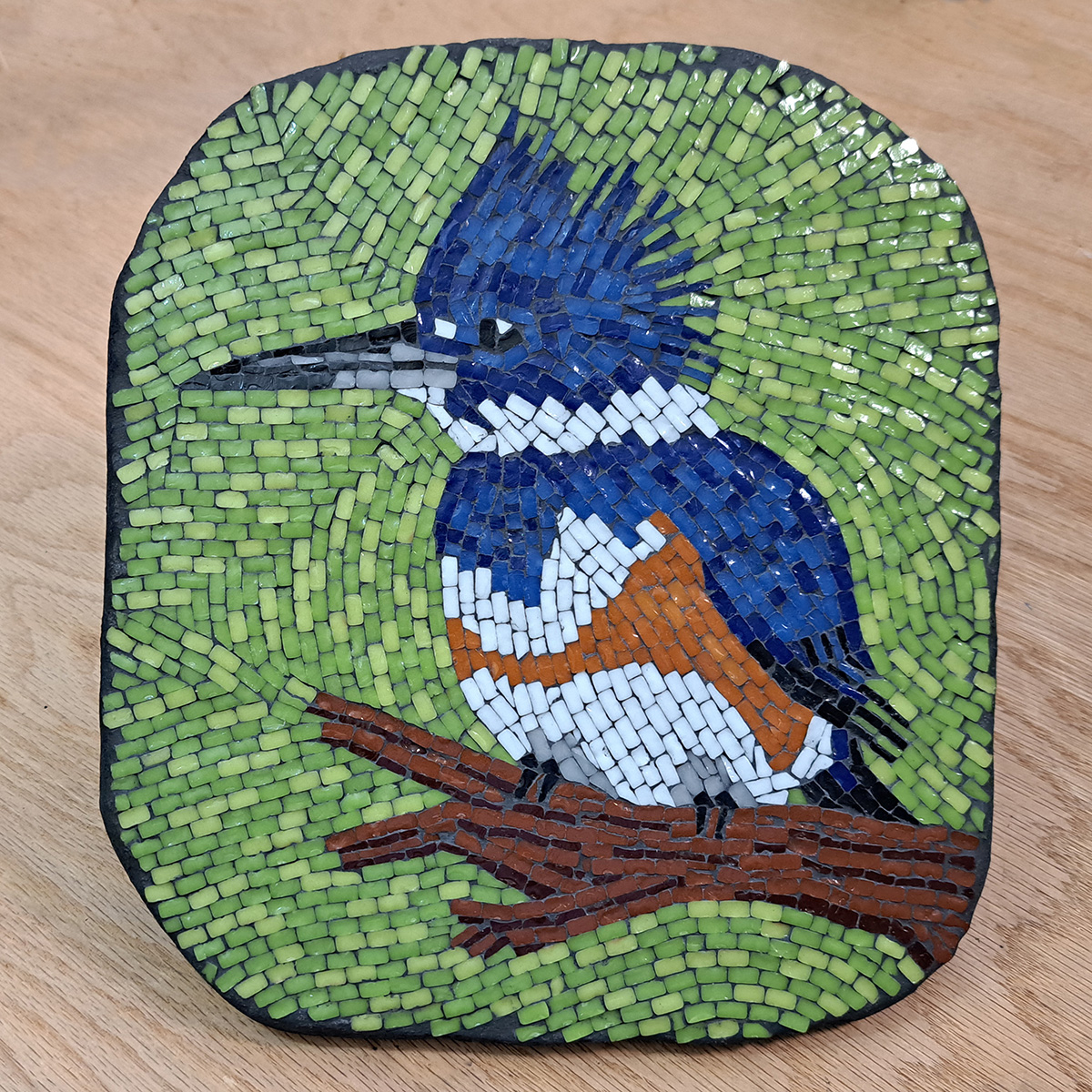
Kingfisher Mosaic: Improvising over a Pattern
I made a video that shows how to translate an image into mosaic by improvising loosely over a pattern. The pattern I used for this demonstration was the pattern I created quickly using Photoshop for a friend.
-
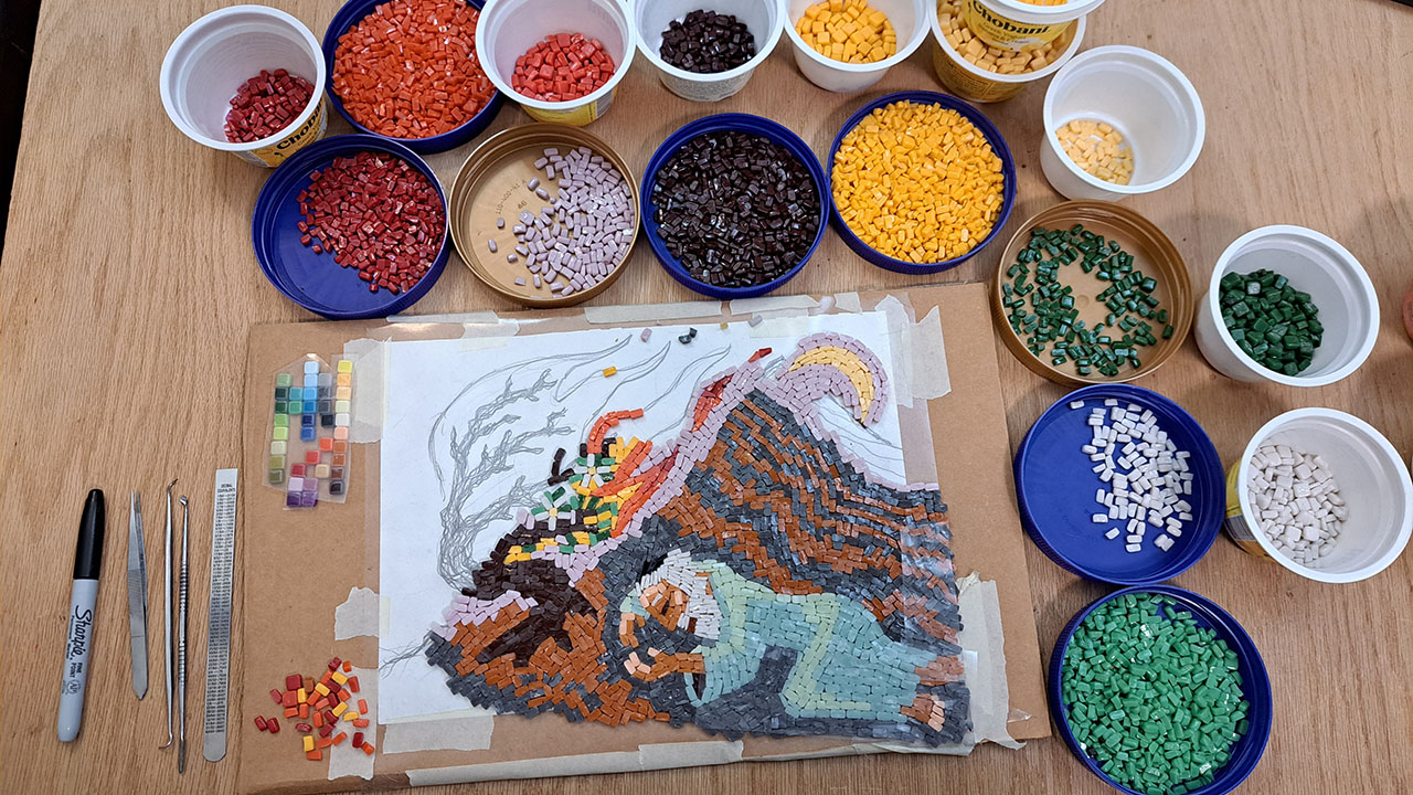
Mosaic Design Evolves During Implementation
I make imaginative artwork using a trial-and-error process, and my compositions evolve during implementation. I study models, but I don’t render from a particular model. I try to capture the archetype, iconic essence.
-
Getting Mosaic Artwork Right
Many artists are plagued with self-doubt, including some of the great ones, but there are several ways to overcome these fears and make better art: The first of these are quick, small studies and sketches which can be made before a particular detail in the main work is executed. In mosaic, a “sketch” can be…
-
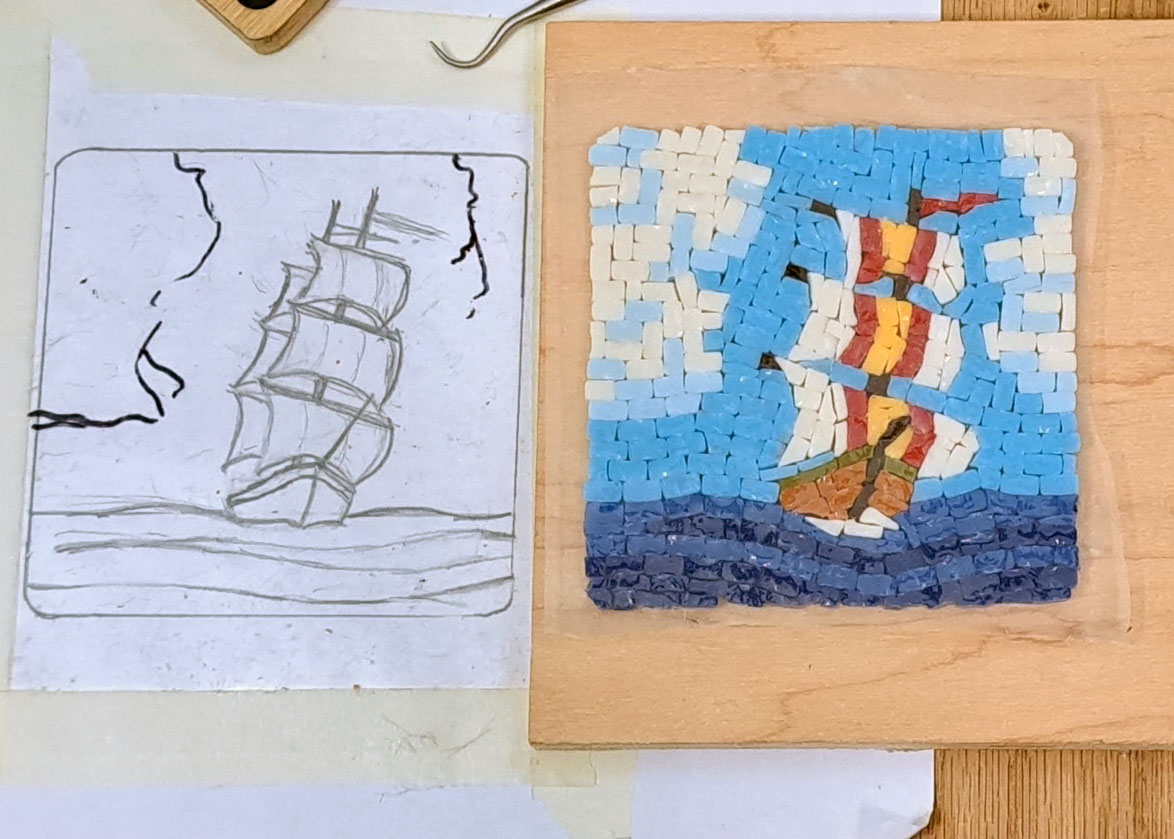
Pattern to Mosaic: Design Evolution
I thought I would share this particular studio photo because it shows the evolution of an improvised mosaic design, in this case a sailing ship. It also showed ad hoc changes to the pattern after it was already taped beneath clear contact paper. A mosaic is not a drawing, and we call rendering an existing…
-
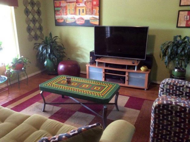
Mosaic Tables and Interior Design
Artist RJ Spurr recently completed two mosaic tables for his home, and I wanted to share them because the level of craft work is excellent, and the designs are integrated with the color schemes of rooms where they were installed. The great thing about dry indoor mosaics is that you can use wood as a…
-
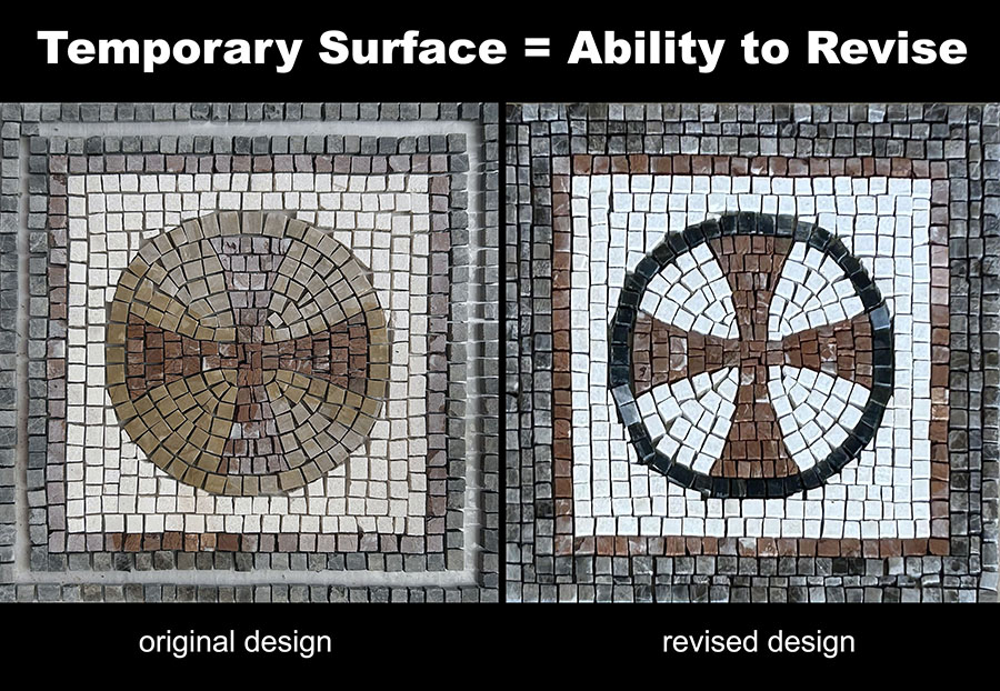
Choosing Grout Color Using Tile Test Swatches
Tracy Kaplan recently emailed us a picture of her FIRST mosaic, and it is nice solid work, impressive even, especially considering that her instructor gave her some problematic advice concerning the grout color. Tracy’s teacher had recommended a chocolate or nutmeg colored grout, but Tracy wisely considered how a dark brown might cause adjacent tree…
-
Repeating Motifs and Abstract Mosaics
Repeating simple designs or motifs is an effective way to make iconic compositions that catch the eye, and you can take this technique to its extreme to produce abstract art where the pattern itself becomes the subject of the art and not just a tool for rendering figures. Karla Conmy’s River Meanders mosaic is a…
-
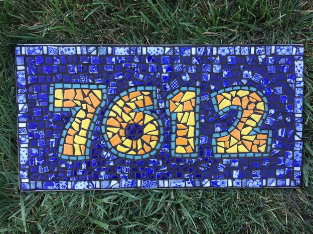
Mosaic Letters and Numerals
You can make mosaic street numbers and signs using a grid, but mosaics made from irregular shapes of non-gridded tesserae are more interesting, especially if you use concentric andamento for the background surrounding the figures. Sara Sommers emailed us some pictures of her mosaic street number plaque, and it is made from cut pieces of…