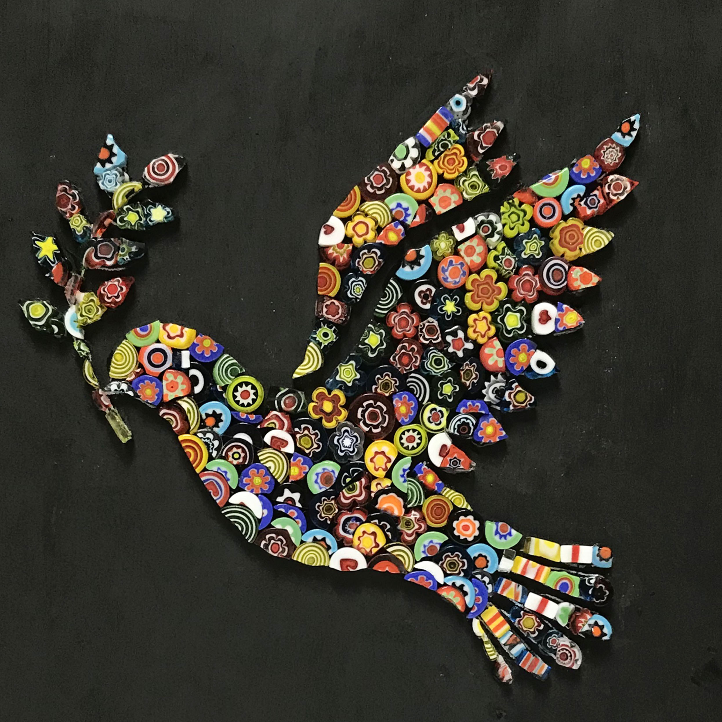
Artist Harry Belkowitz’s millefiori mosaic Dove of Peace is a mixed-media piece of artwork with a black painted background surrounding the central mosaic figure.
The rainbow silhouette of dove with olive branch might be a little aspirational right now, but I figured we all could use a little hope and beauty.
The Dove of Peace also serves as a good starting point for discussing grout gaps and how to minimize the color impact of grouting.
Many novices are disappointed or even disturbed by the appearance of their first mosaics after grouting.
There are several reasons for this:
Why Underestimated?
Some novices “start off with bad directions” and use standard grout gap widths, which are meant for whole tile used in a grid to make an architectural surface that can withstand water.
These standard gap widths are less than desirable for artistic mosaics made from whole tile and downright disastrous for mosaics made from cut pieces of tile.
Second, novices tend to underestimate the width of their grout gaps because the sides of the tiles are showing and making the gap look wider and more colorful than it will when filled with grout.
Novices also ignore the few places where the gaps are wider than the rest, hoping that “grouting will tie it all together.”
Nope.
All grouting does it put dull matte-finish concrete in the same surface that was previously all shiny colorful glass.
If you look closely at Harry’s design, you can see that he put the circular and flower-shaped millefiori so close together that they touch in places, but there are still gaps between them because of their shapes:
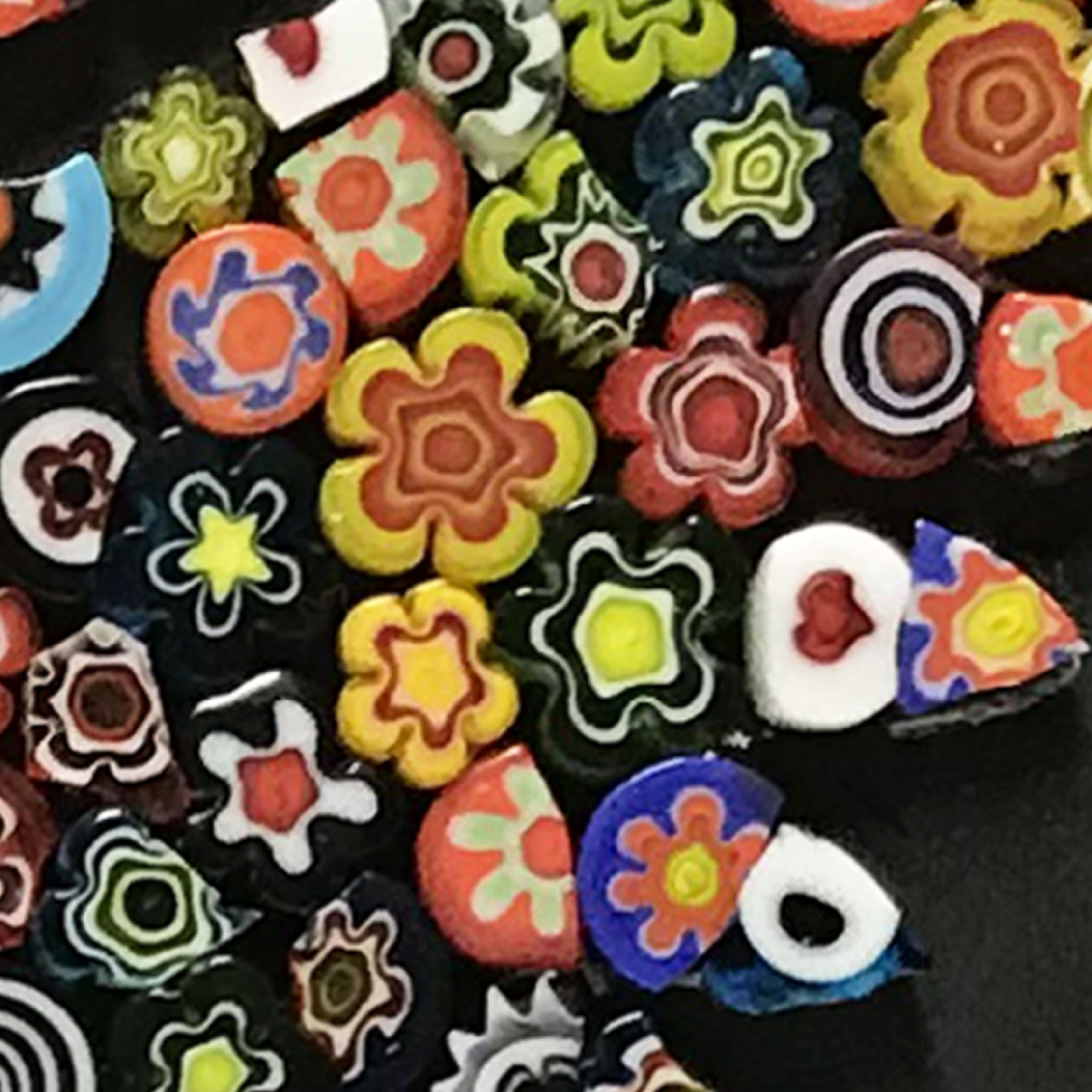
These empty places where the shapes don’t fit together are unobtrusive because they are a rich black and do not distract from colors.
But what if they were suddenly filled with a light colored grout, and so now all the millefiori colors are competing with dull whitish light reflected from the same surface?
The colors won’t look as intensely colorful.
Some people will tell you that white makes the tile colors look brighter to them, but what I think they are liking and trying to describe is that the overall composition is brighter.
That may be true, but jewelers spread colorful stones on black velvet not white for a reason.
This truth about black is basic biopsychology, which is a real field. I was once in a numerical analysis class with this other graduate student. He was in biopsychology and dissected newt brains as part of his thesis research on vision. I didn’t envy him. At a party I watched him get shot down by a woman who told him, “Poor newts. A few hundred years ago, they burned people like you at the stake.”
Anyway, I digress.

Materials and Methods
Of course, a mixed-media mosaic made in this manner is an indoor art object but would not be suitable for outdoors, especially where freezing precipitation was possible.
However, you could replace the black paint with black tile and embed the millefiori in mortar dyed black, and then you would have something that could withstand the outdoors even in cold climates.
Our Mud-Turtle Mosaic™ brand millefiori is made in a glass bead factory and is flame polished for smooth edges after it is machine cut to a more uniform thickness.
It’s important to note that most brands of millefiori are rough cut and sharp and not cut in uniform thicknesses.
I don’t think the dove silhouette design would look as good if it were executed in rough pieces like that. The texture of the surface would compete with the crispness of the outline in detailed areas, which is critical for the design being instantly recognizable.
Keep in mind that color and pattern are doing a lot as far as creating visual interest but nothing in the role of defining details of the figures being depicted.
Leave a Reply