I forgot to write about some of the teaching points from Peggy Pugh’s mosaic backsplash.
Variegated and mottled colors create more visual interest in mosaic artwork than monochromatic color fields.
However, there is a limit to how much variation you can put into an area of color and still render an element as a distinct element and make it look separate from the background.

Background
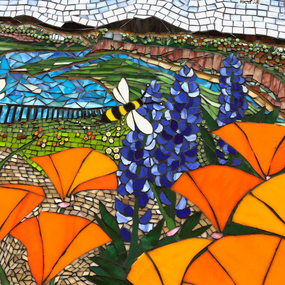
The blue wildflowers and the green meadow in the background are a good example of a situation where extra care was required.
Both elements are variegated with very light tints of their hues which don’t contrast each other very well. (The lightest green looks not much different from the lightest blue.)
Similarly, the deep midnight blue and the very deep green wouldn’t make a good contrast with each other.
Peggy navigated this hazard by using a contrast of light and dark.
Notice that the green meadow in the background nearest the blue flowers is all light and medium tints of green, while the blue flowers includes petals of the deepest blue.
Small Figures
Small figures are especially limited and virtually no variegation can be used in many of these cases simply because their aren’t that many tiles involved.
There are also situations where you might not want to cut the pieces smaller to be able to include more color variation.
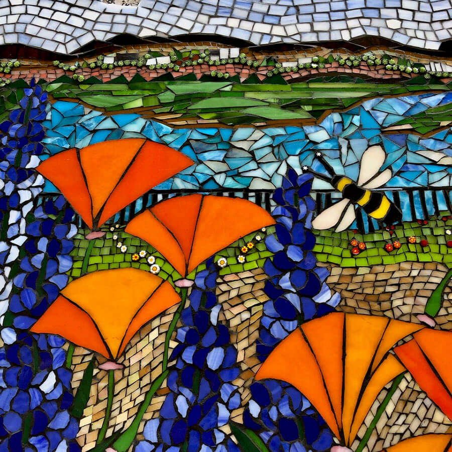
The bee in the foreground is a good example of this point.
Of course the bee could be made from smaller pieces, but the bold cut-out construction of the bee makes it stand out better from the background.
It also helps unify the composition as a whole by being in harmony with the bold construction of the golden orange flowers dominating the foreground.
Contrasting Colors
The contrast of warm golden orange and cool blues and greens in this mosaic is beautiful. The lower portion of the mosaic is a strong composition all by itself thanks to this contrast.
No Opportunity Wasted
“But wait, there’s more…”

Real artists don’t miss opportunities to make their art more interesting.
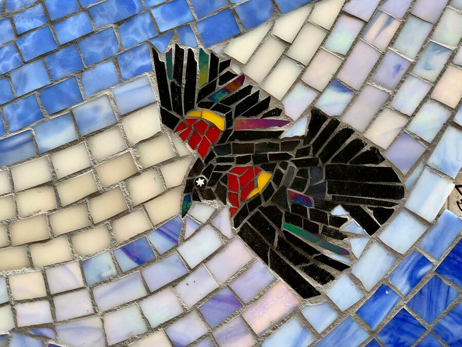
This blackbird is just a small part of the mosaic, but it is amazing.
The restrained use of iridescent glass for a few of the wing feathers does a great job of depicting the subtle iridescence of blackbird plumage.
And don’t get me started about how much I like the use of the star millefiori for the bird’s eye.
Normally when I see a found object used instead of tiles to render eyes, I don’t like the results. It always seems to look out of place. Here, it looks inspired.


Leave a Reply