Randy Evans emailed me a photo of his stone mosaic backsplash and asked for advice in choosing a grout color.
Even though this project isn’t figurative mosaic, and the grout gaps have the width of masonry joints (much larger than the gaps recommended for small glass mosaic tiles), it still makes a good teaching example about how to choose a grout color for your own mosaic for these reasons.
- Randy worked through the decision in a thorough way using basic methods BEFORE testing colors in hidden places in the backsplash.
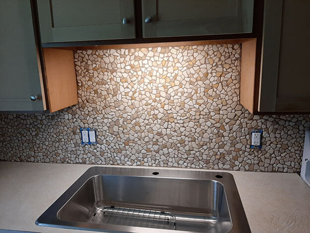
- Randy took some good photos of his experiments, plus one of the installation as a whole that shows the importance of hue in making a backsplash work with the room’s color scheme.
You could use the same approach for picking out the color mortar you wanted to use for a stone or masonry surface.
TIP: You can minimize the color impact of grouting glass mosaic by using smaller grout gaps. It also makes grouting easier. Highly recommended.
CAUTION: A grout gap is needed in architectural mosaics because the grout is needed to seal out water, which can’t be sealed out merely by making the tiles touch each other.
My Default Recommendation
The purpose of grout color in a mosaic made from different colored tiles is to adequately contrast each of those tile colors. Otherwise, the “mosaic effect” can be lost visually in areas of the mosaic where the grout matches the tiles.
My default recommendation for grout color for a mosaic made from small glass tiles is to use a medium gray, meaning a medium between black and white without any particular hue, unless there is a light cyan blue area in the mosaic, such as for a sky or water .
An Important Caveat
If there is an area of light cyan blue in the mosaic, I point out you have to make sure the gray is dark enough to contrast the blue. I also point out that you can also also get enough contrast by using a grout that has a warm hue, something like a dull brown or muted terracotta.
The brightness should still be a medium, especially if you want to avoid the grout standing out too prominently in areas of the mosaic that are darker or lighter than the rest.
Of course the default to a neutral gray of medium brightness is based on the assumption that the grout gap is relatively small and not a significant source of color.
And you wouldn’t want to use a neutral gray on a mosaic of a southwestern landscape at sunset because the “neutral” gray might actually look bluish against all that warm red earth tones and flaming sky.
Hue and Architectural Mosaic
In polychromatic mosaic art, grout color is about adequately contrasting all the tile colors.
For architectural installations, the grout color has to take into account the color scheme of the room, especially if the grout gaps are as large as masonry joints and the tiles are small, which was the case in Randy’s project.
In Randy’s project, the grout is as much a source of color as the tile itself, and its hue will be based on harmony with the room as much as it is based on tile contrast.
The rest of this article are standard methods/tips illustrated with Randy’s photos.
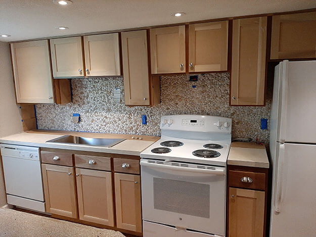
Look from Afar or at Photo
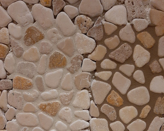
TIP: If you look at a photo of a small-gap mosaic before it is grouted, you can often see what the mosaic would look like with a medium gray grout, meaning a medium between black and white because the shadows in the narrow gaps are about that gray.
If you look at Randy’s ungrouted mosaic above, you can see that the shadows in the gaps between the stones are about a medium gray.
But the grey in this photo are not a neutral gray because the photo was made in a room where the light was tinted by the room’s warm brown color scheme.
That means the usual “medium gray” is in this case more of a medium brown.
Esoterica: In painting, an infinite number of “grays” can be made by mixing a single pair of contrasting hues (say orange and blue) plus white. These grays can look like different types of dark mud when the hues are relatively balanced or like muddy versions of either hue when only a tiny amount of the other hue is mixed in. And then the amount of white can be varied to create an infinite number of tints.
IMO, I think mosaics look best when the grout color is more like a mud than a muddy version of a color.
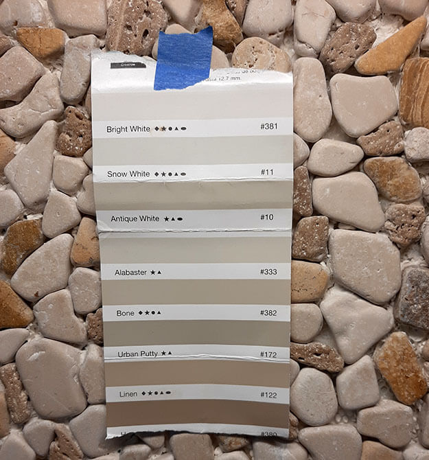
Paper Color Swatch
Get a paper swatch of grout colors from a building material store and hold it up against your ungrouted mosaic.
Make Some Grout Biscuits
If you aren’t convinced by a paper color swatch held against your mosaic, you can always make some slugs of grout or grout biscuits. Everyone loves the concrete biscuits that grandma used to make using grout.
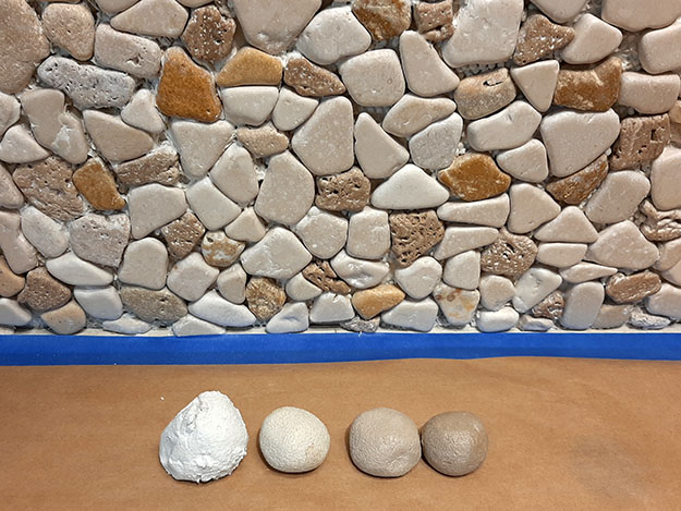
Note that a color looks different based on the colors around them, and so the grout biscuits above shouldn’t be evaluated side by side or laying on a brown kraft paper surface. Instead, they should be held one at a time up against the ungrouted mosaic.
TIP. More useful that grout biscuits are grouted test swatches, Get a scrap piece of mosaic mounted to a scrap piece of plywood and grout it with a couple of grout colors.
Test In Hidden Spot
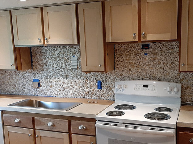
For an architectural coverings, you can grout in a spot that would be hidden or covered, such as behind a stove as Randy did below. You can also make a small test plaque on a scrap piece of plywood.
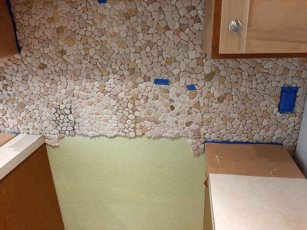
Grouted Backsplash

Leave a Reply