Category: Improving Your Art
-
Value Contrast in Mosaic
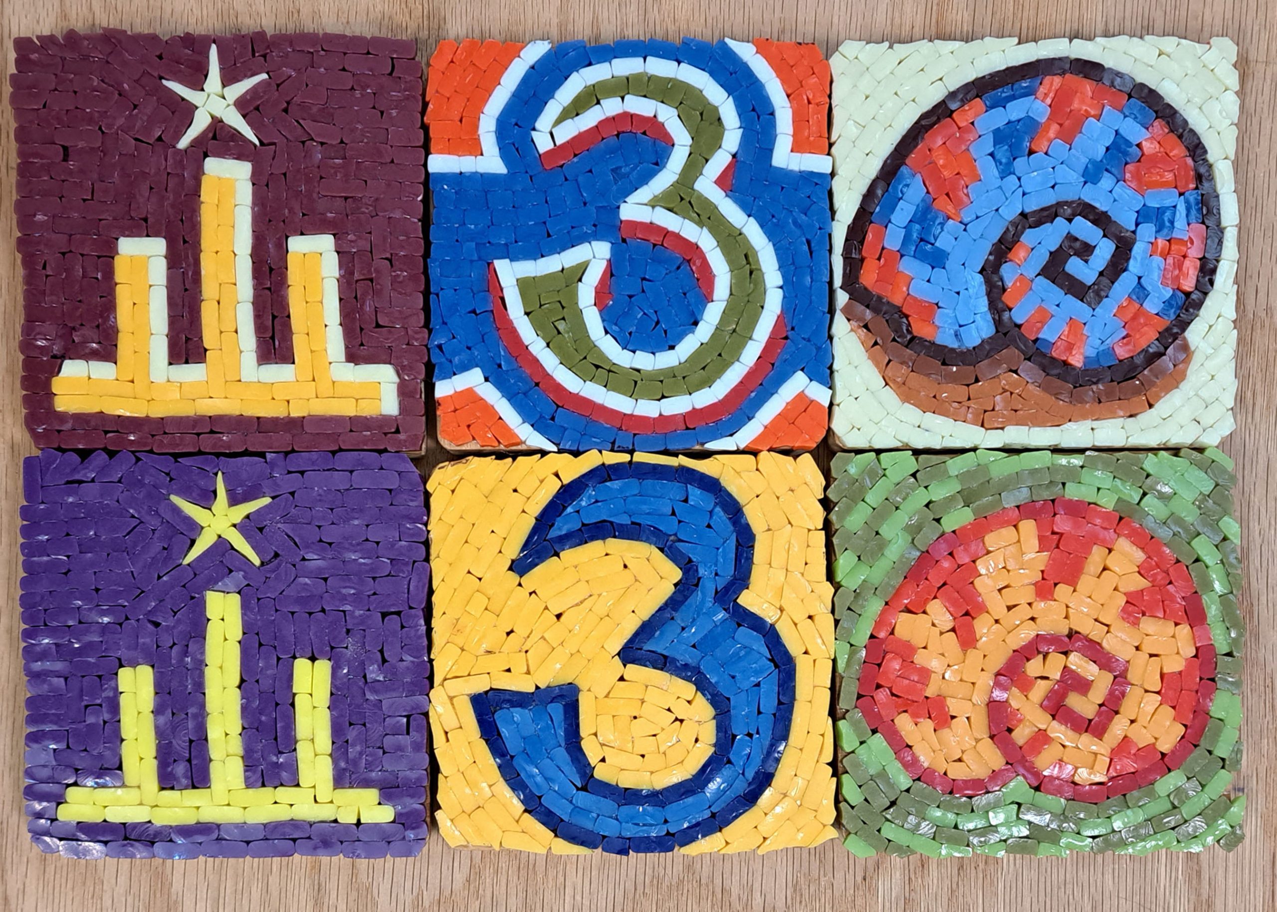
There’s a reason art instructors recommend working in monochrome or black and white before working in color. The reason is that contrast in value (light versus dark) is more important than contrast in hues, and it is easier to learn mastery of value contrast before you complicate the process with different hues. I am self-taught,…
-
Pattern to Mosaic: Design Evolution
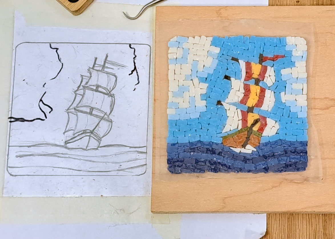
I thought I would share this particular studio photo because it shows the evolution of an improvised mosaic design, in this case a sailing ship. It also showed ad hoc changes to the pattern after it was already taped beneath clear contact paper. A mosaic is not a drawing, and we call rendering an existing…
-
Mosaic Door Progress
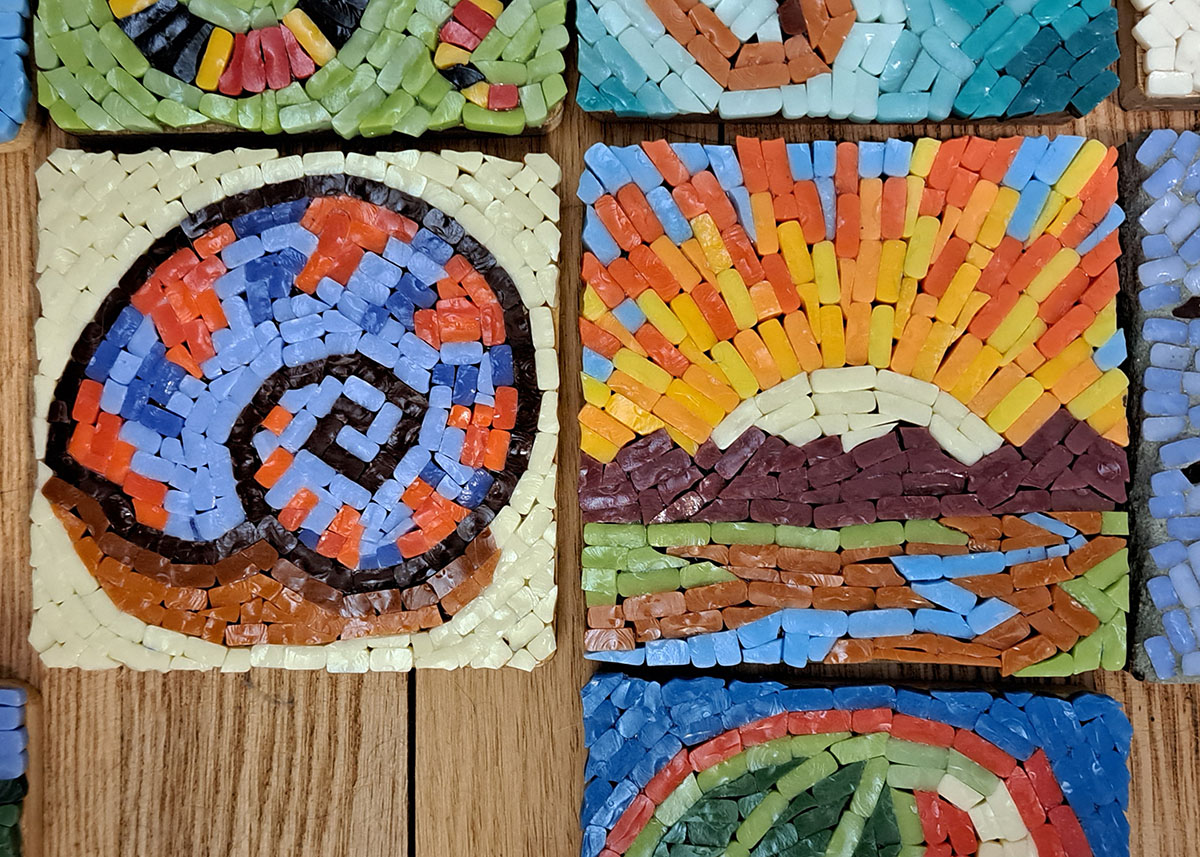
This is an update on my Mosaic Door project built from a “series of smalls“, which is the most effective way to improve artistic confidence and ability. A “series of smalls” is more than a simplistic example of practice makes perfect. You can practice by painting works of all sizes and painting many different types…
-
Subtle Color Variegation
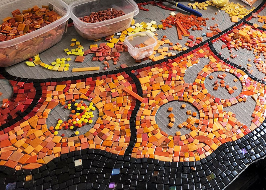
I wanted to share more photos of Jill Gatwood’s Mosaic Butterfly commission because it is a good example of subtle use of color variegation when fairly uniform color fields are desired. I often recommend using color variegation (a mix of related hues or shades of a particular hue) as an alternative to monochromatic areas of…
-
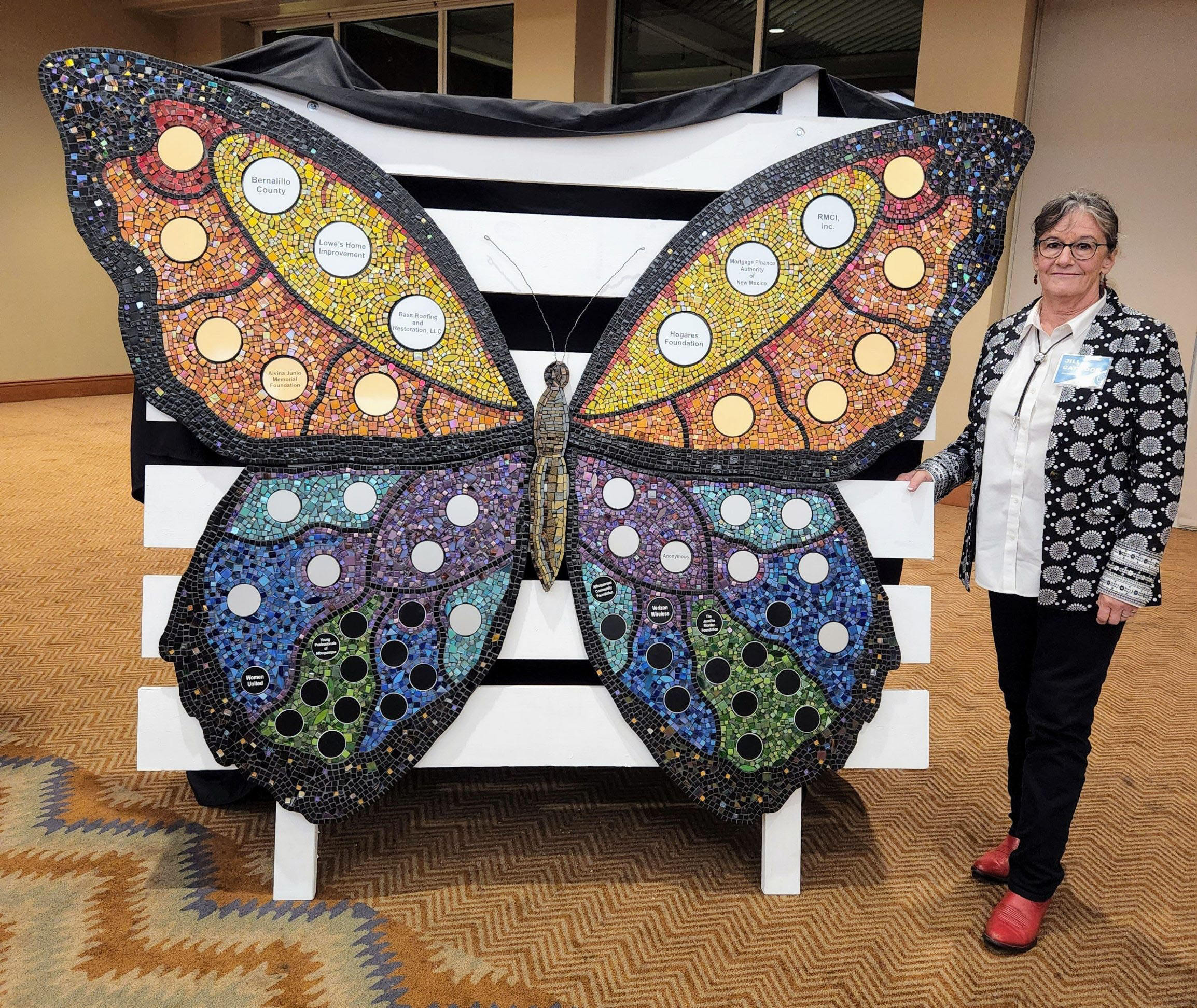
Amazing Commission
I have survived the stress of managing the supply business during the pandemic/supply crisis so far only by allowing myself periods when I get very slack in responding to non-crisis emails. I tell myself I will get back to them eventually, but sometimes eventually is a long time. Most emails that can be ignored for…
-
Mosaic Restoration Video
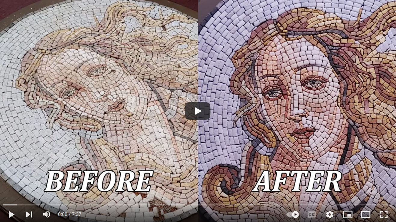
Natalija made a video of her work with artist Angela Bortone in the restoration of a marble mosaic. The mosaic was a reproduction of a detail of Botticelli’s painting The Birth of Venus, and it was covered in grime and missing tiles. It also needed to be transferred to a new backer. There was a…
-
Imperfection as Grout Gap
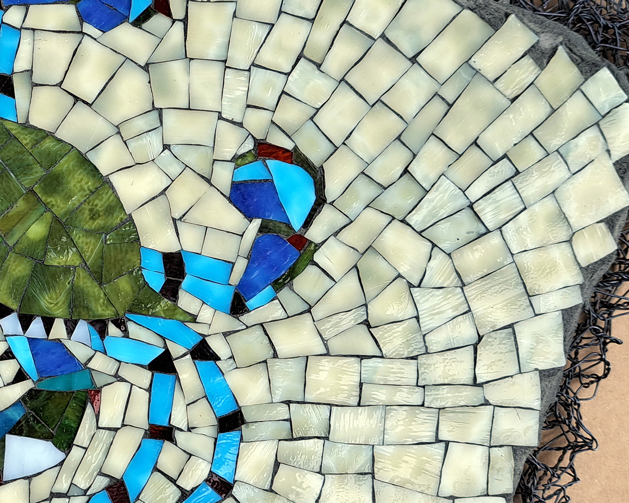
The Blue Crab mosaic I recently completed is a good example of how to create a grout gap by making use of imperfect cuts instead of spacing the tiles intentionally. The “imperfect cut” method makes the process of creating a mosaic faster, easier, and less tedious -first in the cutting and placing of tiles but…
-
Mosaic Grout Rules
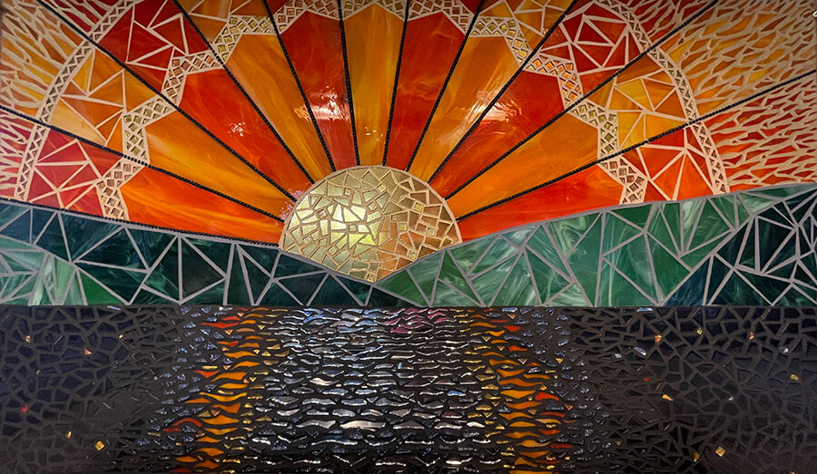
Artist Caroline Bommer’s recent Sunset Mosaic is a great example of an exception to the rules of mosaic art that I harp on in all my online content. After seeing the finished mosaic, I actually wanted to title this article, “Don’t Listen to Me. I Don’t Know Anything about Mosaic.” Exceptions to Rules of Art…
-
Grid Mosaic Teaching Tool
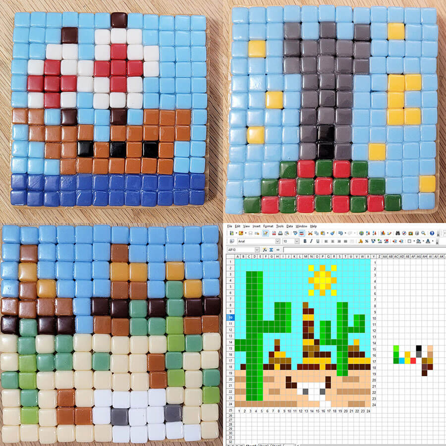
My 13-year-old son made some mosaics on our 4-inch bamboo coasters with me. His designs are also figurative and iconic, but unlike the mosaics I have been making, his designs use whole uncut tiles. My son’s designs are all Minecraft-inspired images, and so the blocky nature of uncut square 8-mm tiles was perfect: Minecraft-Inspired Mosaics…
-
Mosaic Backgrounds & Variegation
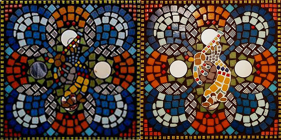
In my previous post, I wrote about Peggy Pugh’s excellent use of color variegation and the potential for this technique to cause figures to lose definition when there is variegation in both the figure and the background. In response, artist Jill Gatwood emailed me photos of a student’s work where the problem had caused the…
-
Variegated and Mottled Colors for Better Mosaics
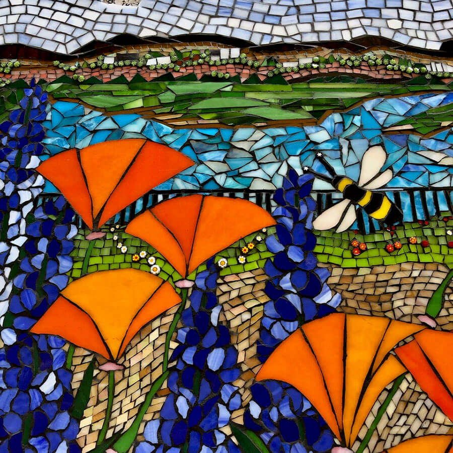
I forgot to write about some of the teaching points from Peggy Pugh’s mosaic backsplash. Variegated and mottled colors create more visual interest in mosaic artwork than monochromatic color fields. However, there is a limit to how much variation you can put into an area of color and still render an element as a distinct…
-
Mosaic Backsplash for Stove with Hood
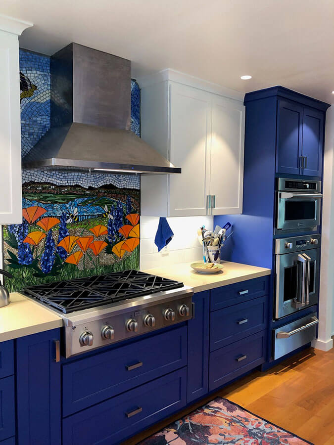
Peggy Pugh’s mosaic backsplash makes me wish the vent hood for the range didn’t have to be installed! The backsplash design is a mosaic interpretation of the view from the window opposite to it in Peggy’s kitchen. The view is of Peggy’s flower gardens with Upper Back Bay in Newport, California in the background. Peggy…
