Contrast is a good way to create visual interest in your mosaic, and when contrast comes in the form of highlights and shadows, it also creates verisimilitude (the appearance of being real). Highlights and shadows can be as simple as shading the edges of a figure and leaving the center lighter so that the figure looks rounded instead of flat. Or you can be more ambitious and model the folds of fabric and clothing using contrasting regions of light and dark tile.
Highlights On Garment Folds
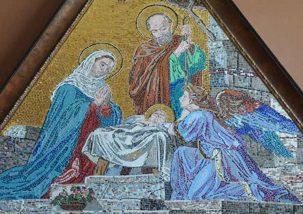
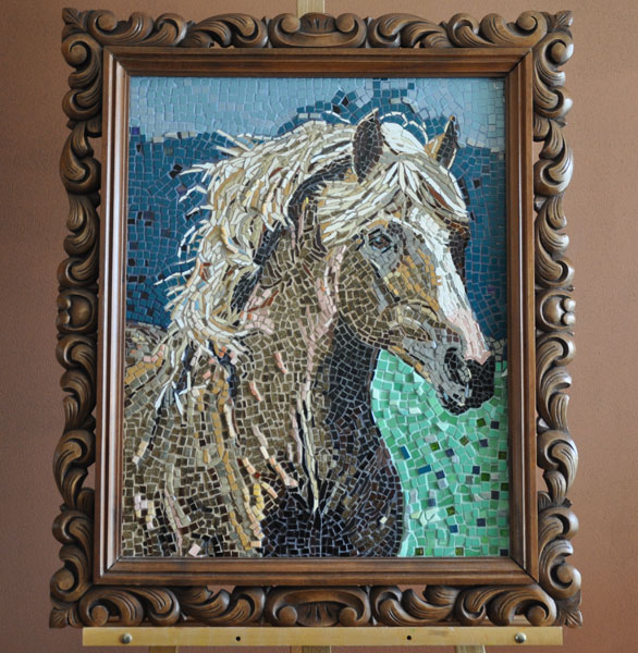
Artist Claudia Benavente’s mosaics are a great example of making images more “real” and visually interesting using highlights on folds of garments and hair. The gold background of the nativity scene below was made using our silver leaf imitation gold mosaic glass.

Texture From Mottled Colors
Notice how the stone blocks in the above mosaic are not made from one gray color or even two grays. Instead, the artist uses perhaps six or seven different colors so that the blocks have texture. Think about how much more interesting these blocks are with their mottled colors than if they were made from one color.
Hair and Vegetation

Hair and vegetation are also opportunities to breath life into your work. Instead of making monochromatic shapes or silhouettes to represent these elements, show the internal details.
Light and Dark / Warm and Cool

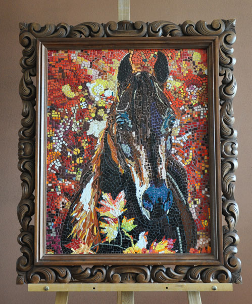
In my opinion, the Guggenheim museum owns several billion dollars in abstract paintings that aren’t nearly as interesting as the background of this mosaic. Just look at it, and you want to touch it and feel the texture created by the mottling of warm colors with light and dark colors. Notice how the cool blues and indigos of the horse’s nose and eyes contrast with the fiery red background. Notice how this mosaic looks more intensely red with the other colors mixed in than it would have if it were solid red. Contrast is the key to many aspects of visual art, including color intensity.

Leave a Reply