Recently I wrote about The Stylistic Range of Mosaic Art and mentioned that I am still being surprised by the different styles that artists are able to execute in the medium, especially those with formal training.
I meant formal training in art when I first wrote that, and I was thinking about how technical innovation is easier for someone who has studied the nuts and bolts of different mediums.
Later I got to thinking about the extent to which art is fertilized by study of other disciplines, and not just the example of how Renaissance artists studied mathematical perspective and anatomy.
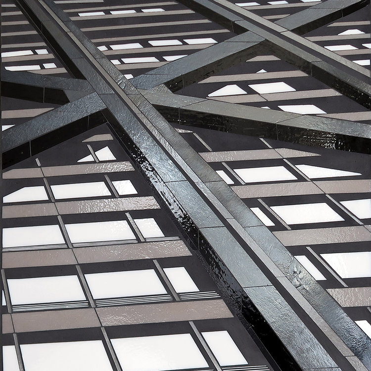
The focus of the art is a reflection of the artist’s experiences and perspective, including careers and degrees that might be completely unrelated to art and aesthetics.
I think the fact that so many mosaic artists are self-taught as artists but have degrees in things like biology or mathematics or literature is a big reason why they produce so many fresh compositions and interesting stylistic experiments.
To be honest, I think some public art might be dull precisely because it was made by someone who was essentially a jaded art student instead of someone inspired and informed by other fields of study.
Heather’s Artwork
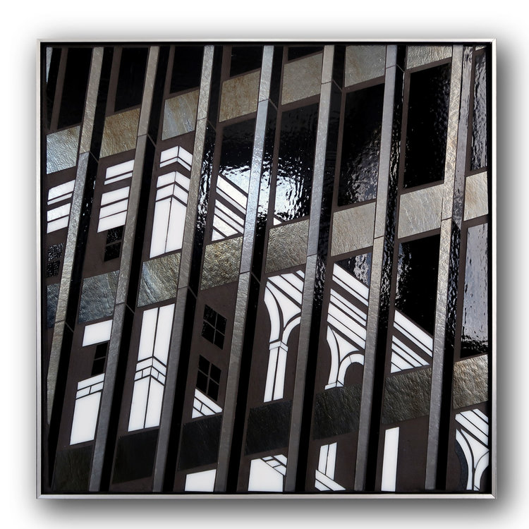
Artist Heather Hancock describes her artwork as “mixed media with glass” instead of “mosaic,” and her mode of rendering isn’t what I describe as mosaic.
Heather renders in the mode commonly used in stained glass artwork, where 1 visual element = 1 piece of glass cut to the shape of the element. She does not use the mosaic mode, where visual elements are built up from multiple tesserae (pieces of tile).
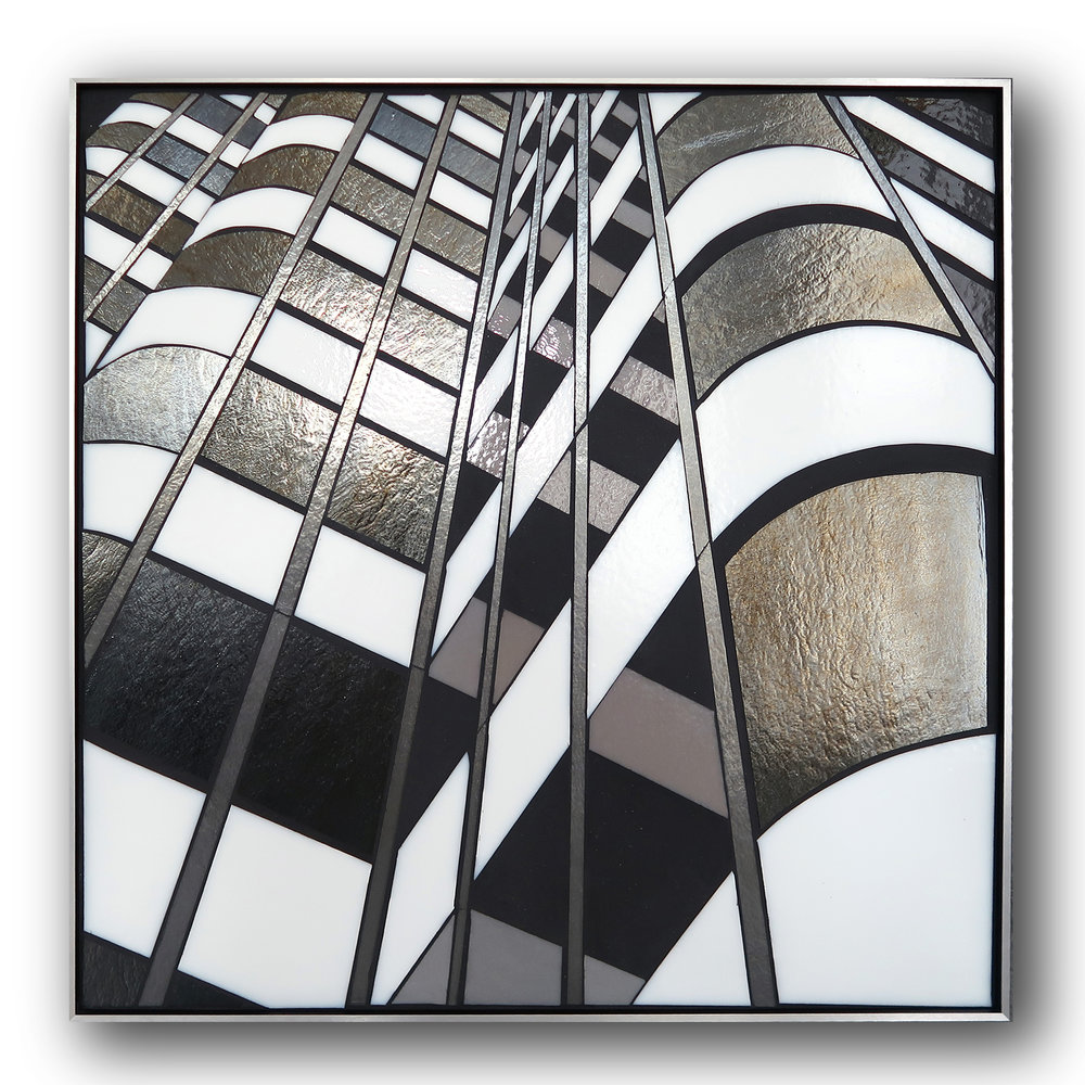
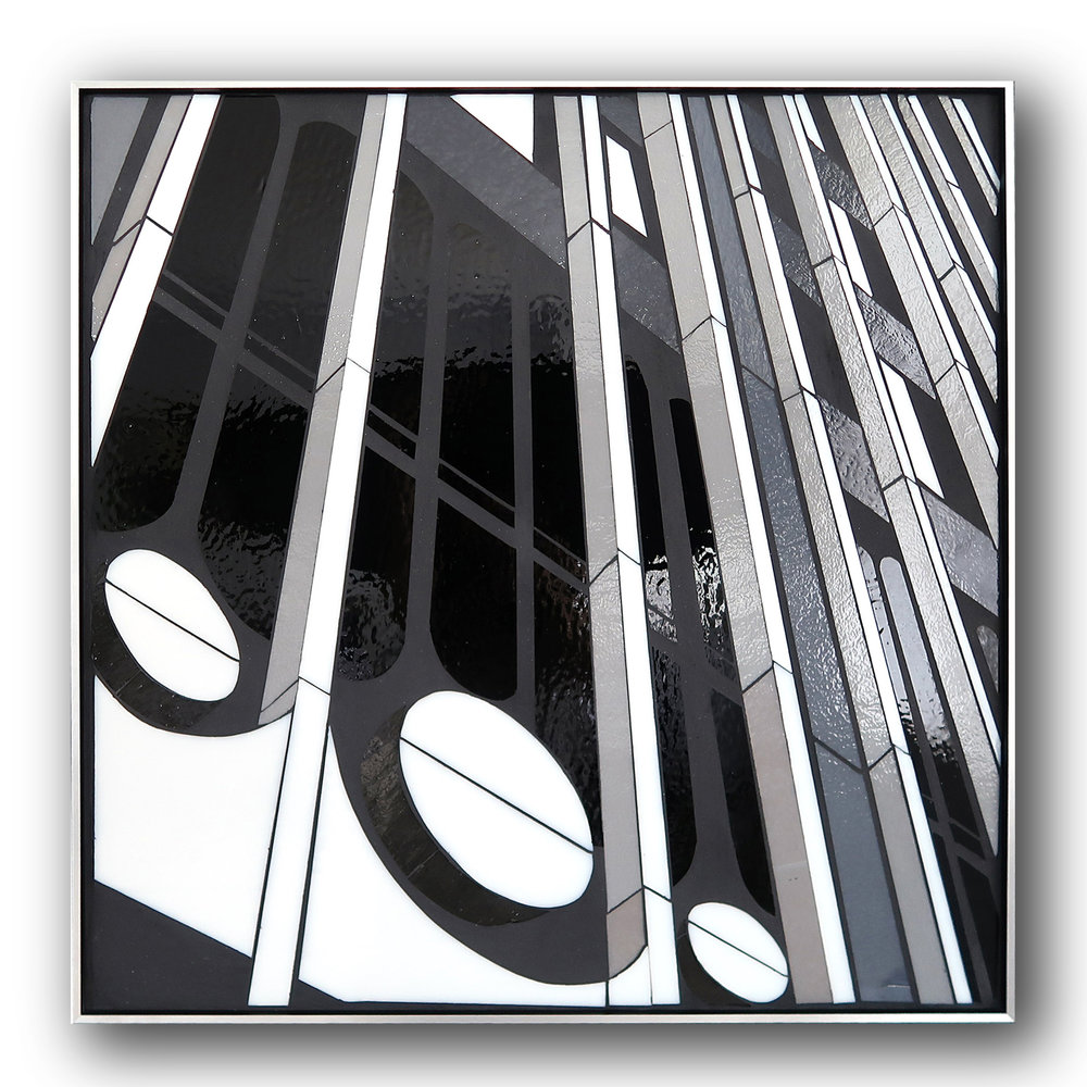
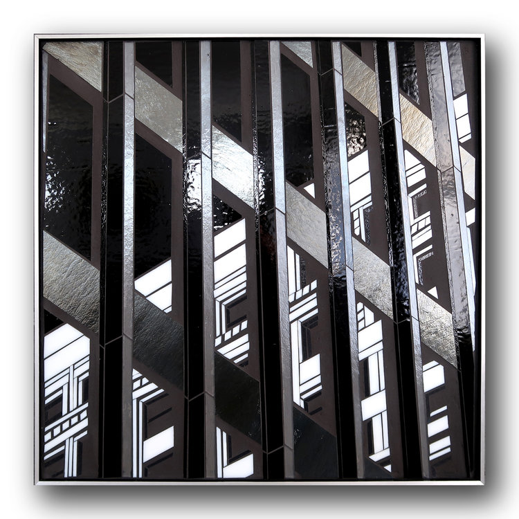
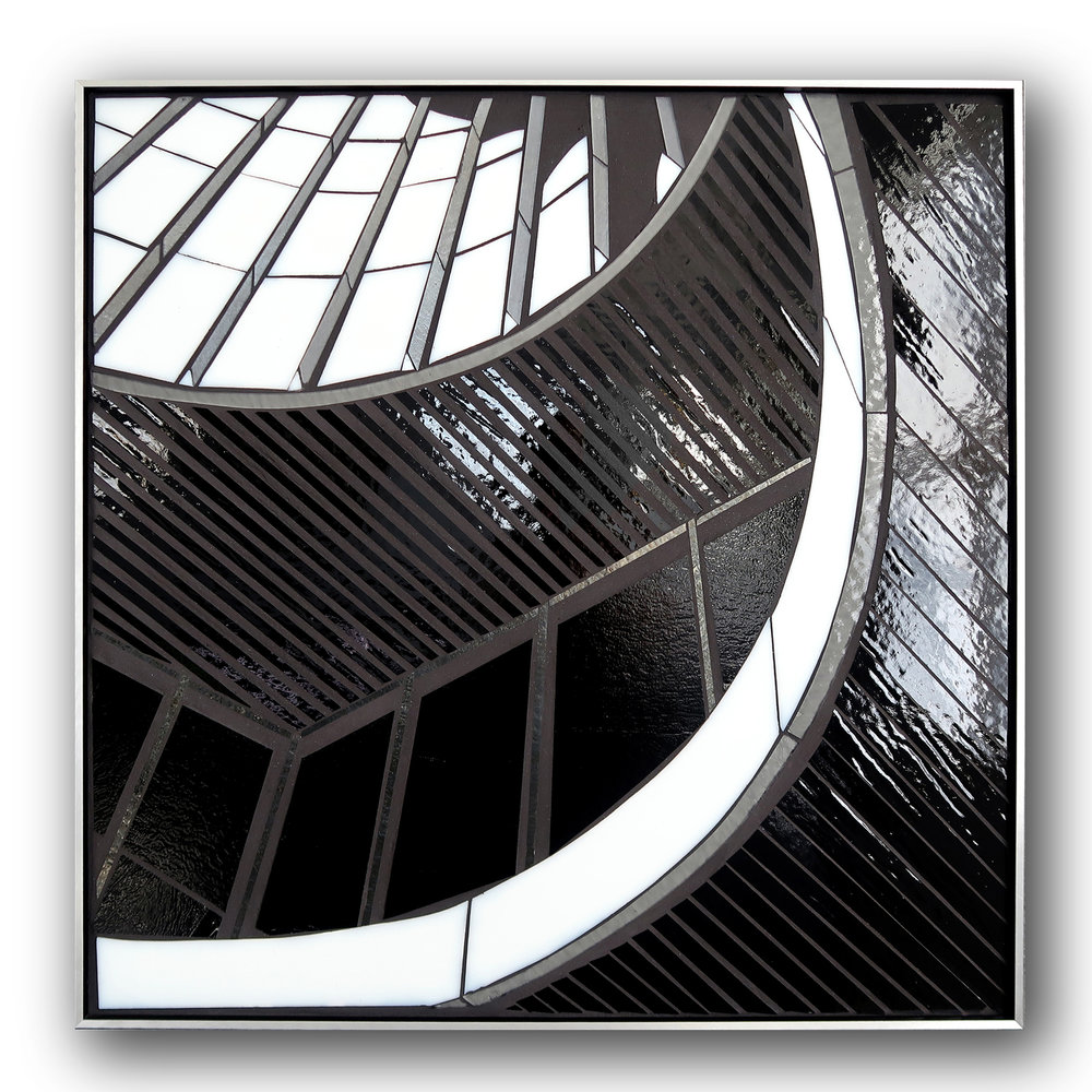
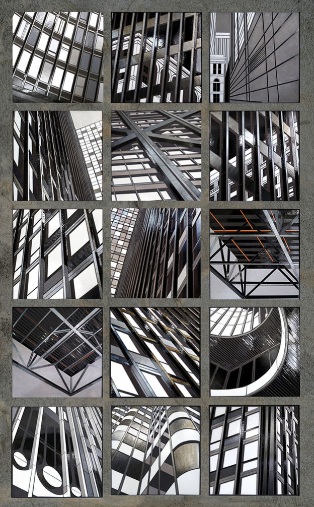
Heather’s fine art portfolio includes a large series of related studies that are truly impressive both in concept and execution.
These are black-and-white renderings of the exteriors of skyscrapers (mostly), but they are cropped closely so that the repeating windows, beams, and other rectilinear elements almost become an abstract geometric study. Heather leaves just enough context for the subject to be perceived for what it is, and each piece is a great example of creating the appearance of depth on a flat surface.
Professional Art
Heather’s artwork is professional, and I am not referring merely to how tightly executed the work is or its commercial success.
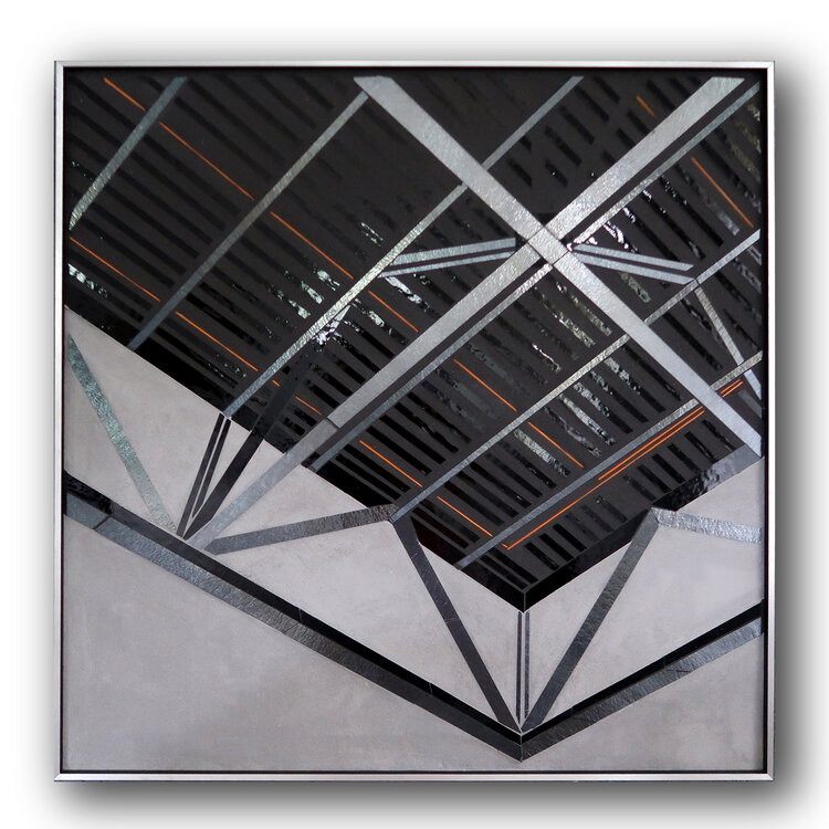
Heather’s work is long series that explores a theme with variations. To me, that is the best indication that someone has spent years thinking deeply about what they are doing and that they are working at the level of a professional with formal training in theory and method.
Informed and Engaging
Heather cites the Master Class at Orsoni Studio in Venice, Italy as the technical basis for her work, but points out that it was her decade-long career in healthcare and working in Chicago hospitals that gave her “a deep understanding of how engaging environments contribute to well-being.”
I believe it. Heather’s work is the opposite of what I have come to expect for public art in a hospital, and don’t I mean that in the sense of not being something appropriately warm and comforting like a peaceful landscape.
I am talking about the level of engagement and not being boring, meaning the intrinsic visual interest, the amount of time you could look at it and still see something new.
Each time you looked at one of Heather’s pieces from a different angle, even by moving your head slightly, your mind would have to recreate the illusion of depth while at the same time also seeing it was a flat surface of different pieces of glass reflecting the lights in the room.
There are other ways of creating intrinsic visual interest: impressionistic brushstrokes, intricately mottled colors, chiaroscuro, etc., and so I am not talking about what technique or media or theme Heather used in these works. It’s the level of her game that I mean.
I am wondering if she was motivated to create such interesting work by seeing so many negative examples in hospitals.
Hospital Art, A Brief Rant
Why is it that hospitals usually have such bad public art? Why is it so often a dull or poor version of whatever type of art it is supposed to be, even when it is something large or expensive?
Is it merely a matter of administrators and doctors awarding commissions to people they meet socially and the high percentage of nominal artists in their wealthy circle, stay-at-home spouses who went to art school, maybe?
Why is it that the more tragic the focus of a particular hospital ward, the more likely that it will have depressingly bad art, the worst in the building?
Is it because those commissions tend to get awarded to “artists” who play the role of touchy-feely artist, artist with the right story, maybe?
Interesting to Look At
Heather”s artwork is interesting to look at more than once, something that you could study if you were stuck in a room with it, something you wouldn’t resent for being boring after an initial glance. Clearly these are something more than the usual neutral art for public spaces.

Leave a Reply