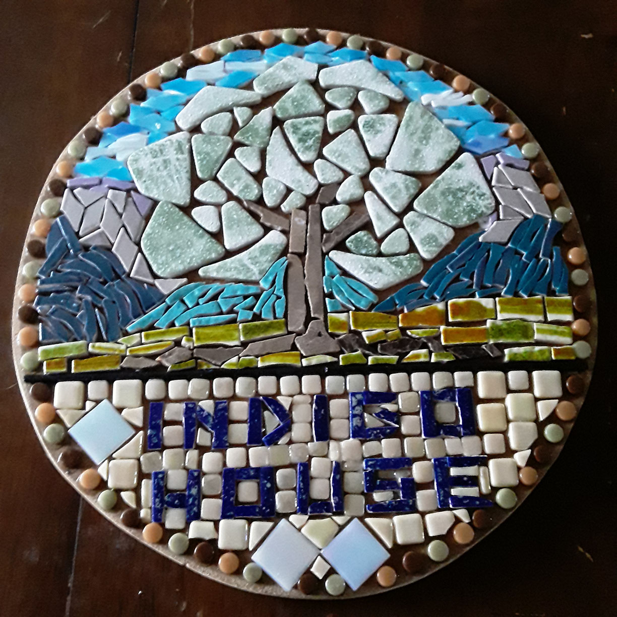
Artist Lorie Beercheck emailed me an in-progress photo of the mixed-media mosaic sign plaque she was making as a housewarming gift for her friends new B&B.
Lorie wanted advice on the grout color.
I was glad to give it because the mosaic was a mixed-media figurative image and so more likely to impacted by the choice of grout color.
There were also some special concerns that made good points of discussion.
Grout Color Impact
In mosaics with tiny grout gaps, the color impact of grouting is minimal, but for all other mosaics, it can have a huge impact in color.
Suddenly there is a lot of dull “concrete” right at the same height as the tile.
This is an issue even when using the standard architectural gap width recommended for a particular size tile, and the phenomenon gets worse the wider the gap.
Mixed-media mosaics tend to use larger tesserae including found objects with irregular shapes, and so the grout gaps tend to be larger.
This situation makes the choice of grout color absolutely critical.
Statistics
About 80% of the panic emails we receive from new artists who have “ruined their mosaic” come from people who used white or light-colored grout.
The others are mainly from people who didn’t wipe off the excess grout when it was still soft or didn’t haze the mosaic sufficiently.
In classrooms, you can consider individual mosaics and situations and give nuanced guidance.
In providing written advice on the Interwebs, you have to make your recommendations as foolproof as possible.
Hence the my Crusade Against White Grout at the end of this article.
Photos and Thumbnails
Painters step back from a painting and squint to get an idea of what the composition looks like as a whole. Thumbnail photos can serve the same purpose.
In mosaic, I have discovered another way that photos can be a great aid for improving visual art.
When people email me asking for advice about which grout color to use for a particular mosaic, the gaps between the tiles in their photos are usually dark due to shadow.
This is fortunate, and because of it, I can point out that the photos give a good idea of what the mosaic would look like with dark grout.
Special Concerns
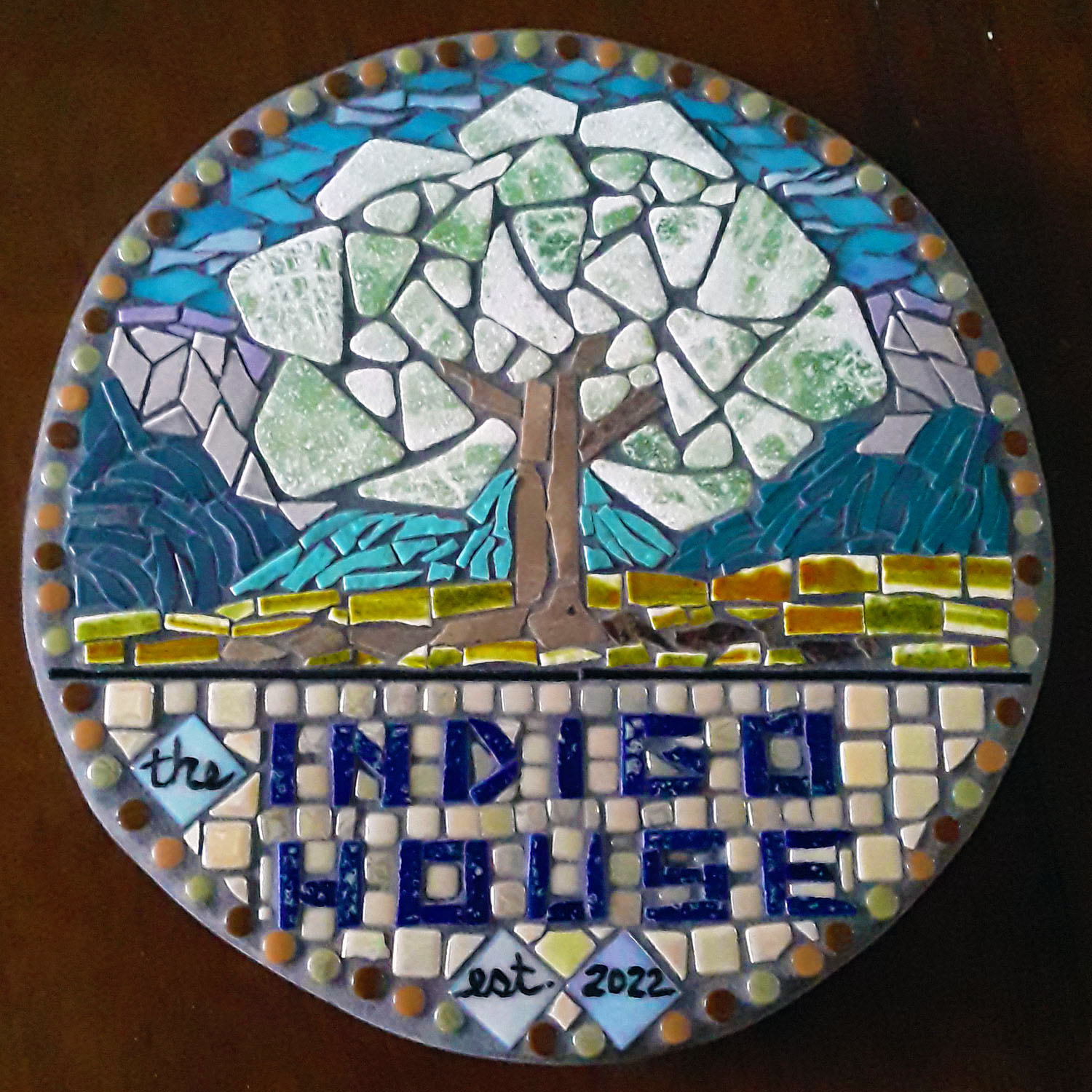
If white grout had been used for this mosaic, the white and green tiles used in the tree foliage would have lost all definition visually and looked like one mass instead of individual tiles.
TIP: To retain the “mosaic effect” of individual tiles being distinct, the grout color should avoid matching any tile color used in the mosaic.
The border of circular tiles is also problematic because the tiles aren’t able to nest and have the largest grout-gap area of any element in the mosaic.
Areas such as this border and the tree foliage should be kept in mind when evaluating grout swatches.
Value Contrast
Value contrast is more important than contrast in hue.
That is why a monochrome or black and white image can have so much verisimilitude (look so real).
Lorie’s composition works so well because the white foliage contrasts in value with the darker and more intensely colored elements in the background.
Notice how this wouldn’t be possible if white grout were distributed throughout the other elements.
White grout robs the artist of white as a fundamental component of basic rendering.
Other Contrasts
In mixed-media mosaic artwork, you can also play with contrasts in finish and iridescence. (And shape, type, material, origin, etc.)
Notice how the recycled antique hearth tiles of amber and green used for the grass portion of the landscape contrast in color intensity with the tiles used in the image and in the lower text background.
I thought that strip of intense grass was a nice divide for the sign composition as a whole.
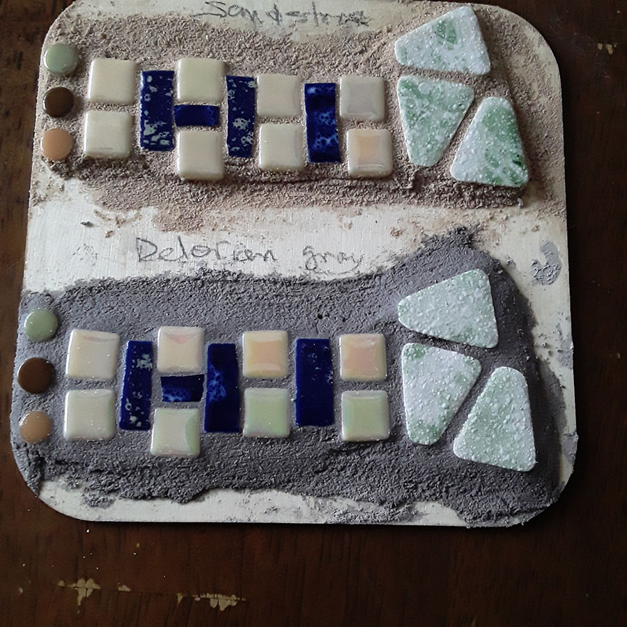
Grout Color Swatch
Make some quick-and-dirty grout color swatches if you are new to mosaic and don’t want to risk messing up your mosaic with the wrong color grout.
Making the swatches is also an opportunity to learn how you apply the grout and clean it off, and it makes you more familiar with the rate at which the grout hardens.
Gain peace of mind by dumping wet “concrete” on test swatches before doing it to your masterpiece.
Joe’s Crusade Against White Grout
For some stylized images, white grout is expected and looks fine. For images intended to be as lifelike as possible, white grout is a disaster.
The reason for this is simple:
In real life, cracks between objects are dark not shining with light.
If your gaps are tiny, the color impact of grouting is minimal -unless you use white grout, which will shine unnaturally from cracks that were previously dark and unobtrusive.
White grout has ruined a lot of art. That’s not my opinion. That’s the opinion of the people who made the art.

Leave a Reply