I once had an employee-artist who became angry with me for encouraging people who didn’t think they could draw to trace artwork or photos to make patterns.
I explained that we wanted to reach all skill levels and that included some people who would be attempting mosaic or even art for the first time.
I explained that it was a learning exercise that had value in itself and wouldn’t necessarily dull people’s imagination.
Chagall was the most imaginative of all the painters of the early 20th century, and his introduction to art as a school boy began by copying illustrations from books.
I can safely say that I’m not against people making exact copies of existing artwork on principle.
But why would you want to do that with a mosaic?
For me, there is too much labor in the execution of a mosaic to think of it in the same way as drawing a master copy.
When you copy a drawing, every moment is spent looking and learning, while that sort of intensive processing of the original is largely over with a mosaic once you work out the cartoon (pattern) with andamento (how the rows of tiles will run) and the color scheme.
At least, you are better off that way.

Something New
Trying to match the shape of each irregular tesserae to those of the original is extremely tedious. In all probability, the artist who made the original didn’t cut each piece to an exact shape.
Most professional mosaic artists cut 3 or 4 or 5 candidates and use the piece that works the best. We don’t trim pieces to size and shape if we can help it. We nest pieces as we go along and use rejected pieces in other locations.
For this reason, it is easier to make your own version of a mosaic instead of an exact copy, piece by piece.
I would hope you wouldn’t want to waste the opportunity to make something new and different.
Of course it is easier to copy a gridded mosaic made from square tiles, but again, why would you?

Something Old
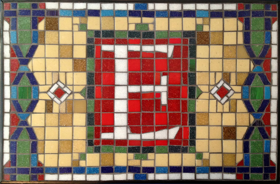
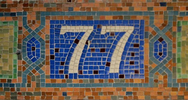
I knew I wanted to share Brad Srebnik’s mosaic when I saw it, especially when he showed me the mosaic that he looked at for inspiration.
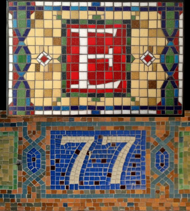
What an excellent example of using a piece of artwork as an inspiration and source of design elements without copying anything!
In my opinion, Brad’s mosaic is a better design for an eye-catching mosaic plaque for the home because it’s design is more detailed and warmer and more colorful.
BUT I have a lot to say about what’s good and interesting about the original inspiration.
I love how the greens and oranges are muted and the white is a cream and not a bright pure white. If the purpose of the mosaic is to look old, the hues have to look the part and not be as intense as modern factories can make them.
One of my general recommendations is to turn up the contrast between light and dark, but look how much more authentic and old the signs looks by NOT having the numerals rendered in brightest white. Another exception to the rules.
Before you follow a piece of artistic advice, make sure it is relevant to what you are trying to do.
TIP: The easiest way to make a mosaic reproduction look more old is to restrict the color pallet and use less-intense hues, less-bright whites.
I like how the NYC subway sign look old thanks to its muted hues, but I would prefer Brad’s plaque for brightening up an interior.
The heightened contrast, the brightness, and the color scheme of his mosaic make the mood lighter. It resembles a backlit stained glass window. That wouldn’t have been possible had Brad been copying a model, or even copying basic aspects of the model, such as the idea of a muted color scheme.
I just love that Brad didn’t copy anything but the general idea of a numeral or letter surrounded by a twisted double border!


Leave a Reply