Artist Dianne Stearns and her students have created an impressive mixed-media mosaic mural on the exterior of their school in Tuolumne County, California.
Too Much Inspiration
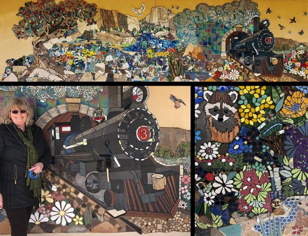
The mural is a “regional icons landscape collage,” and so naturally it shows local landmarks and regional archetypes, but when you have El Capitan in Yosemite National Park and the butterfly meadows of the Sierras, you have a lot to work with.
You could say you have too much to work with.
How do you show it all? How do you do the models justice when it’s “postcard country” you have to depict? How do you communicate the sense of mountains and space and light?
An Elegant Design
Dianne’s solution was a collage that left the big sky of the Sierras completely open, which evokes the feel of the cloudless skies so common in the Sierras.
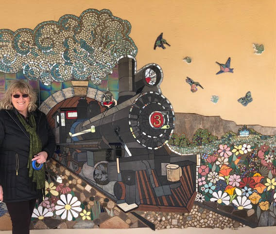
In the typical regional icons landscape collage, every square inch of the space is used to depict some other image. The old WPA murals from the 1930s in government buildings are good examples of what I mean by this sort of density. If one scene is someone plowing corn, just above it will be someone mining coal.
Instead of doing that, Dianne showed more by showing less. By leaving a large amount of area empty, she communicated a sense of space.
This sense of space is reinforced by the locomotive coming out toward the viewer using foreshortening.
The collage landscape is a stout triangular shape with the peak of El Capitan top and center. Creeks and flower-choked meadows flow down from there toward the viewer.
The density of the flowers and their variety and riot of color are perfect contrasts to the emptiness of the big Sierra sky.
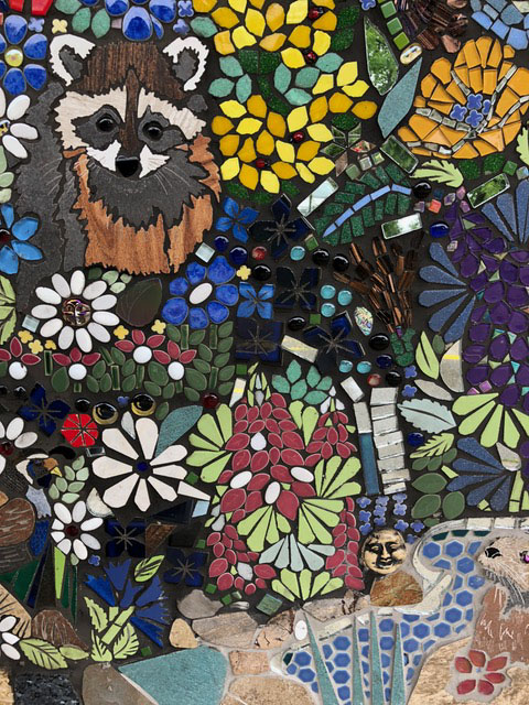
Mixed-Media Elements As Borders
The busy meadows also contrast with the mountains and boulders rendered in larger pieces of flagstone.
Notice how the boulders and mountains are arranged so that they surround the more detailed areas rendered with smaller pieces (flower meadows) and form an irregular frame for the composition. Clever.
This mural is truly mixed-media mosaic. There are tiles of glass, ceramic, porcelain, and stone of different types and sizes, but it all works well together. I think the only recommendation I could make would be to consider painting the sky a light blue (not dark blue because of the shade of the eave).

Exceptions to Rules
Dianne’s mural is also an exception to my general recommendation to work in a pure mosaic style (curved elements are built from small non-curved tiles) instead of a stained glass style (curved elements are one piece). Notice how the petals of her daisies are one piece cut to shape.
That sort of work requires a wet saw or glass grinder. I prefer making simple mosaic with a cutter instead of using these power tools because I have spent too many years working in loud factories and metal shops.
BUT look how well the results look in Dianne’s mosaic!
I like showing counter examples to my general recommendations because these exceptions help illustrate whether or not you should follow a particular recommendation. It all depends on what you are trying to do because there are many styles of mosaic art.
The Glare Of Midday
In my previous post, Wood Frames for Mosaics, I explained why diffuse light is best for photographing your artwork and why you should avoid the glaring sunlight of midday.
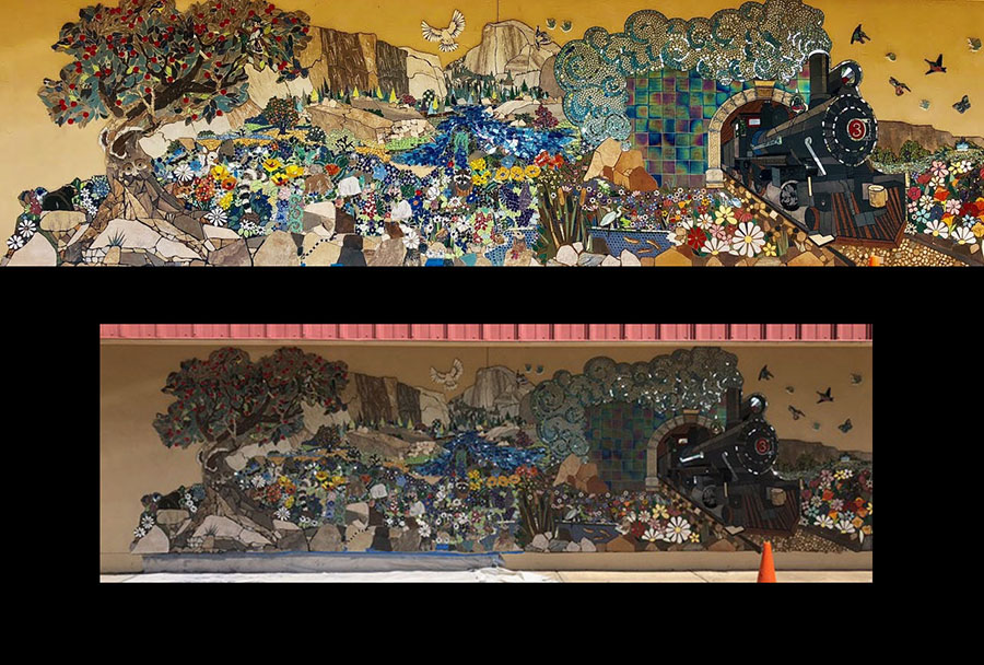
In the composite photograph below, we see the mural photographed in adequate light versus the results when the mosaic is photographed during a time of bright sunlight.
The mural is covered by a narrow awning or eave, and so the problem is shadow and not glare. The camera isn’t under the eave but is out in the sunlight, and so light sensor sets the shutter speed too fast for what is actually being photographed.
Had the eave not been in place, the photograph would have still been problematic, but the issue would have been glare from the glossy surface of the glass.
That is why the best light for photographing artwork is diffuse light, such as provided by overcast days and some late afternoons, depending on the cloud conditions.
Size Matters
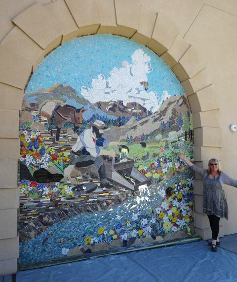
Notice the size of the mural relative to the artist below. Dianne works big!
Mosaic is more difficult to make on a larger scale because tile and grout are heavy.
Dianne’s students worked on all of the school murals, and public-art projects of this size are not practical without helping hands.
A large project also requires input from someone from a tiling or general construction background, preferably with that person leading the actual installation if many sheets of mosaic are involved.
TIP: If you are an artist from a studio background, and you get your first mosaic project commission that is public art or large and architectural, make sure someone on your installation team is a handyperson who has used mortar before to tile a wall, preferably with sheets of mosaic.
If that isn’t possible, you need to at least practice the installation method by mortaring a sheet of mosaic to a backer similar to where you will install the mosaic. Practice spreading mortar with a notched trowel on a scrap piece of plywood.
You need to be comfortable with these basics BEFORE the actual installation, because the focus during installation needs to be aligning and spacing the sheets.
Keeping sheets aligned and spaced the same distance as the grout gap is critical. You can’t do anything once the mortar hardens.
Leave a Reply