Mosaics cannot be a “food safe” surface as defined by the Food and Drug Administration because grout is porous and cannot be cleaned easily or completely, and it sheds material over time. That being said, you can still make mosaic bowls and platters as centerpieces for holding fruit and other decorative uses.
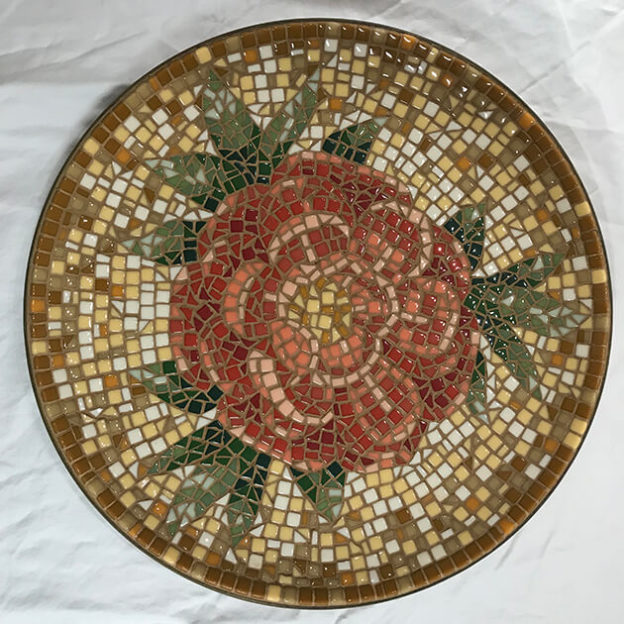
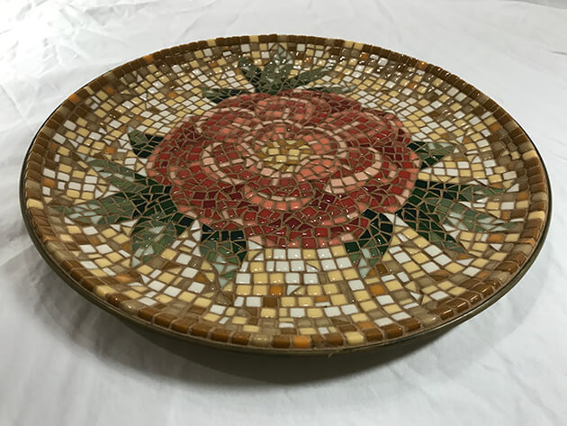
Artist Susan Klug Kahan emailed me some photos of her peony mosaic bowl and asked my advice on grout color. Susan used a narrow grout gap, and so the visual impact of grouting and grout color would be minimal, but there was still a lot of incentive to get it right: The design was all about harmonious colors, and so a poor choice of grout color would be particularly conspicuous.
Choice of Grout Color
We both agreed that white grout would be a mistake (as it is on most any mosaic), and Susan thought that gray would look out of place because the plate itself was brown. I recommended that the grout be dark, but I wasn’t certain which hue.
Normally I recommend contrast for grout colors, including the hue, but Susan’s mosaic was about harmonious colors. That meant that the dark grout should be a brown or a brown terracotta of some sort. The question became which exact one would sufficiently contrast the brown tiles. Susan had to evaluate the hue (color) and the shade (darkness) of the grout.
Susan mixed artists acrylic paint with white grout to make a range of dark brown colors. Then she made test swatches with a few pieces of tile as described in my article for making test swatches to evaluate grout color.
I think the grout Susan chose was ideal for contrasting with all the tile colors and still being harmonious. Note that the brown hue of the grout color is equally a greenish and reddish brown. Note that the shade (darkness) of the grout was ideal too: it is darker than the white tile and lighter than the dark brown tile.
Great Design and Implementation
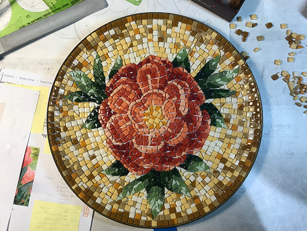
Susan worked from multiple photographs. She did not try to reproduce one particular photograph or flower. Instead, she drew one that captured the essence of several with optimal placement of petals for rendering in an iconic way.
That is how I draw patterns for something I am engraving or carving or mosaicing, because usually I am making an icon of some sort instead of a scene. I want that one idealized arrangement or view of the object that most strongly suggests its essence or symbol.
Lifelike Details Arranged
You can draw an icon from multiple photos or models without ignoring realistic details and individual variations.
For example, Susan doesn’t have all the petals cupped in the same way so that they all show the same amount of their lighter undersides.
I suspect one of the things Susan took from multiple flowers for her drawing was the best combination of folded petals.
Look to nature for the details, but arrange the model as needed. Make the model show its best self, its archetype.
Increase Visual Interest
With iconic images of one central figure , the figure can be made sufficiently large so that the background is only large enough to serve as a border and have to be kept relatively simple and monochromatic.
Susan didn’t do this. Instead, Susan used a smaller flower and arranged foliage in a way to leave just enough background to actually do something with it, and she didn’t waste the opportunity.
Susan’s background is a great study in color harmony and creating visual interest and framing.
I was having a drudge workday at the warehouse when I saw Susan’s email and photo. I gushed in my reply:
You have a natural artist’s eye for visual complexity and how to create it. The background alone is impressive in terms of visual complexity, and the color harmony is first class. All the colors are subtle and subdued. The result is the mosaic looks antique, almost ancient Roman. I very much like this mosaic. Have I mentioned that? 🙂 As for the grout color, I think you made an optimal choice.
Materials
Susan used the small 8mm Morjo™ Recycled Glass Mosaic Tile for this mosaic.
Leave a Reply