Most details in a mosaic are improvised and are not specified in the pattern. If so, then what is the purpose of a mosaic pattern?
Like a rough sketch on a canvas to be painted, the purpose of a mosaic pattern is primarily to specify key lines and proportions, to be a rough map of the outlines of figures and where they are placed.
What a mosaic pattern isn’t used for is to illustrate details that are finer than what can be rendered in tile.
What that means in practice, at least for me, is that any small detail I render on a pattern is done merely to help me visualize what I am making, to supplement whatever photos or objects I am using as models.
I don’t feel bound by what I draw in detail because I know there will be limitations in how small and precise I can cut the tile. Some of the details will need to be simplified or at least improvised in a way that is particular to tile and not the pencil. Each artistic medium has its own language.
My recent blog article Pattern to Mosaic: Design Evolution provides an illustrated example of how designs can vary from the pattern used to create them, especially when the mosaic is small.
In the photo below, notice how the pattern serves only to lay out rough proportions and outlines of the elements:
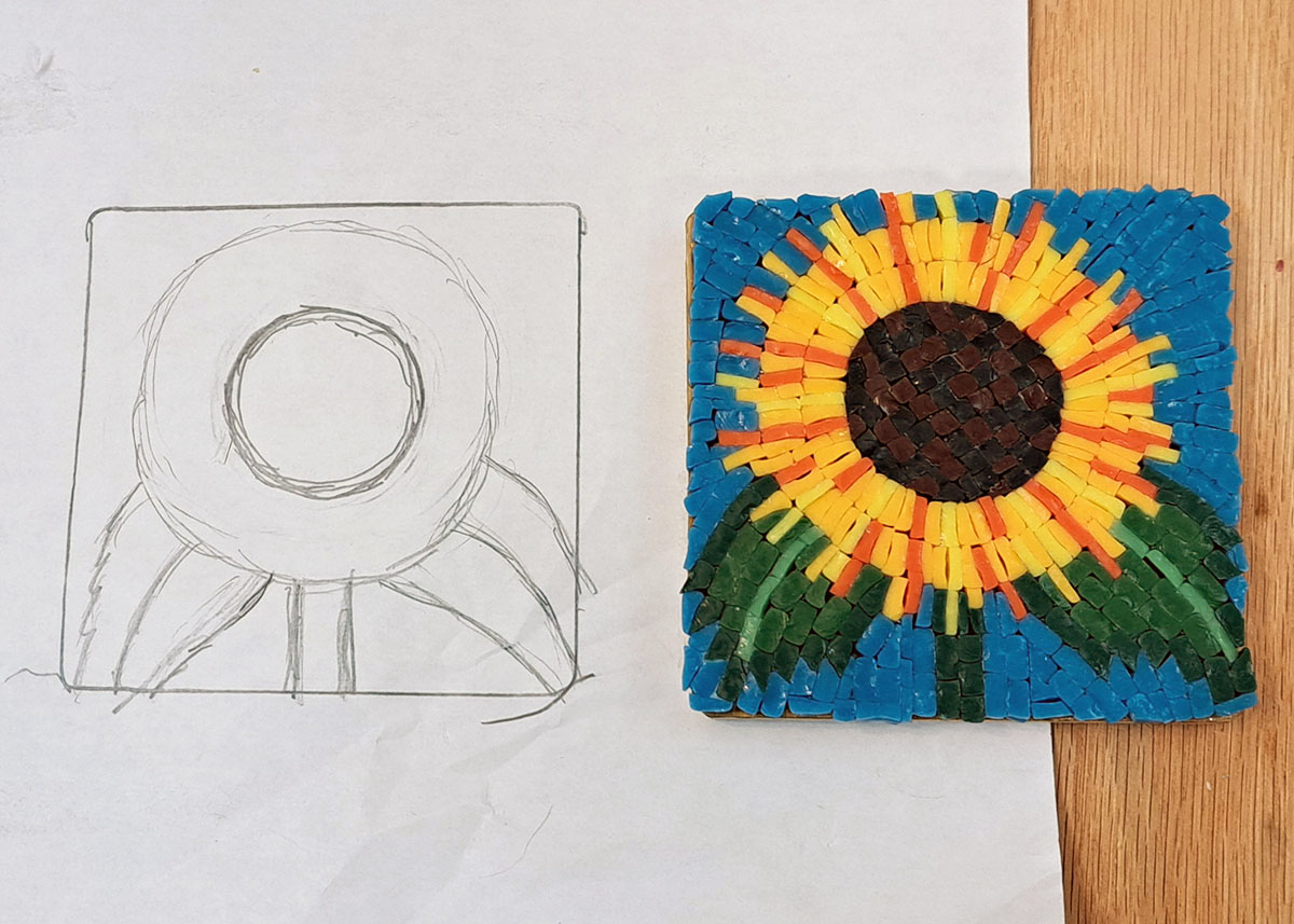
Notice how I didn’t try to draw the jagged edges of the leaves or petals because those were determined by the tile itself and no purpose would have been served by working all that out in pencil.
Actually, drawing all that detail could have been counterproductive distraction, especially if the pattern was used by a novice who might try to cut tiles to fit the details instead of building the details from how the tile cuts easily.
Pro Tip: Your mosaic needs to be built on the standard width of a tesserae or half tesserae instead of trying to cut odd shapes or widths just to conform to the details of an over-specific pattern.
Notice how the toothed edges of the leaves of the sunflower have points that are one tile wide.
Think about how much easier that is than trying to make points that are 3/4-width of tile merely to match a pattern drawn that way.
Color Is Reflected Light
The color we see from an object is merely the light that it reflects.
What that means is that if you look at a blue or purple tile under the warm yellow light bulbs most people use in their homes, then it isn’t going to look right.
Under those yellow light sources, purple tile will look like a dull gray. Blue tile will have little if any intensity and look more like a gray than a blue.
Most people buying tile are aware of this issue, either from life experience or junior-high science, but a few people each year send long ranting emails accusing us of being horrible frauds and the worst business in the world because they don’t understand this fact about how color works.
We print and hang these emails in my office as a keepsake of “the friends we made along the way.”
Color Is Relative
What most people don’t know about color is that it can look COMPLETELY different based on the colors around it. I have worked on art my entire life (even before I “became” an artist), and I never cease to be amazed by this.
Just last night I was working and thought I had accidentally mixed in a different blue from the one I had been using.
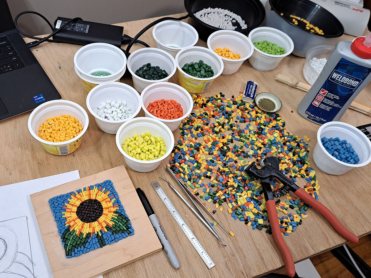
The photograph below does not fully capture the intensity of the difference, but notice how the blue tile in the white cup looks like a cyan blue while the blue tile in the assorted tile appears to be more of an ultramarine blue:
THOSE ARE THE SAME BLUE TILES!
I think what makes the blue tiles in the assortment look more ultramarine is the red-orange tiles in the mix and the red tones of the oak wood table.
I have heard more painters than I can count say something like the following:
You can mix paint all day long on the pallet, but you have no idea what it really looks like until you add it to the canvas with all the other damn colors.
-Claude Monet probably
Amen brother.
Leave a Reply