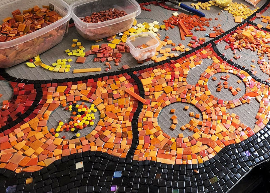
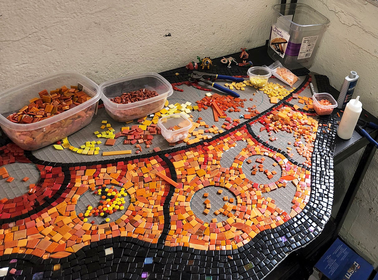
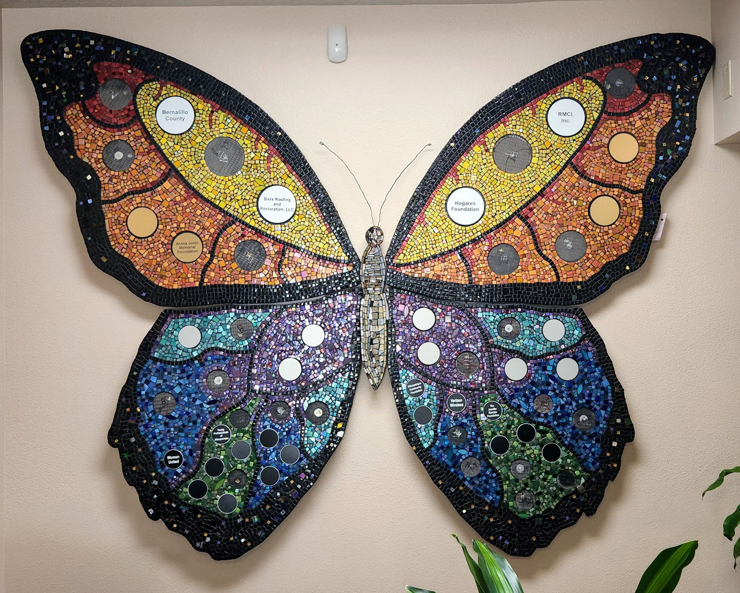
I wanted to share more photos of Jill Gatwood’s Mosaic Butterfly commission because it is a good example of subtle use of color variegation when fairly uniform color fields are desired.
I often recommend using color variegation (a mix of related hues or shades of a particular hue) as an alternative to monochromatic areas of color. Color variegation is a relatively simple way to create visual interest and increase verisimilitude, and so it seems like the logical way to mosaic by default.
The problem is that it is possible for figures to lose definition and be lost in backgrounds when variegation is overused or used without looking critically at the image as you create it.
TIP: Don’t stick with decisions if they don’t look right. Don’t just “go with it” hoping that grouting will fix the problem. Lay tile on the backer as a color study BEFORE you cut or glue down tile. Try different colors.
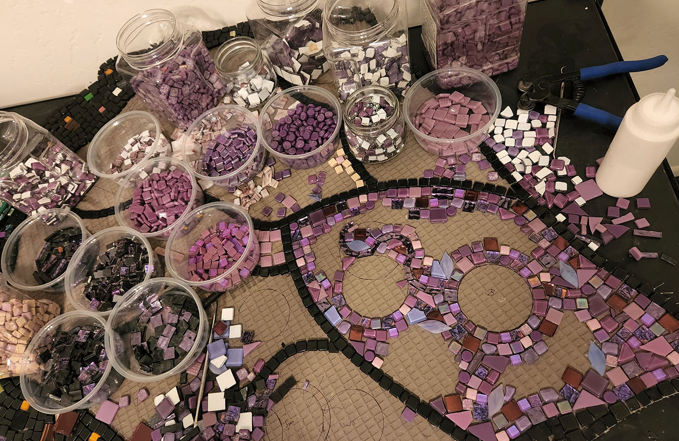
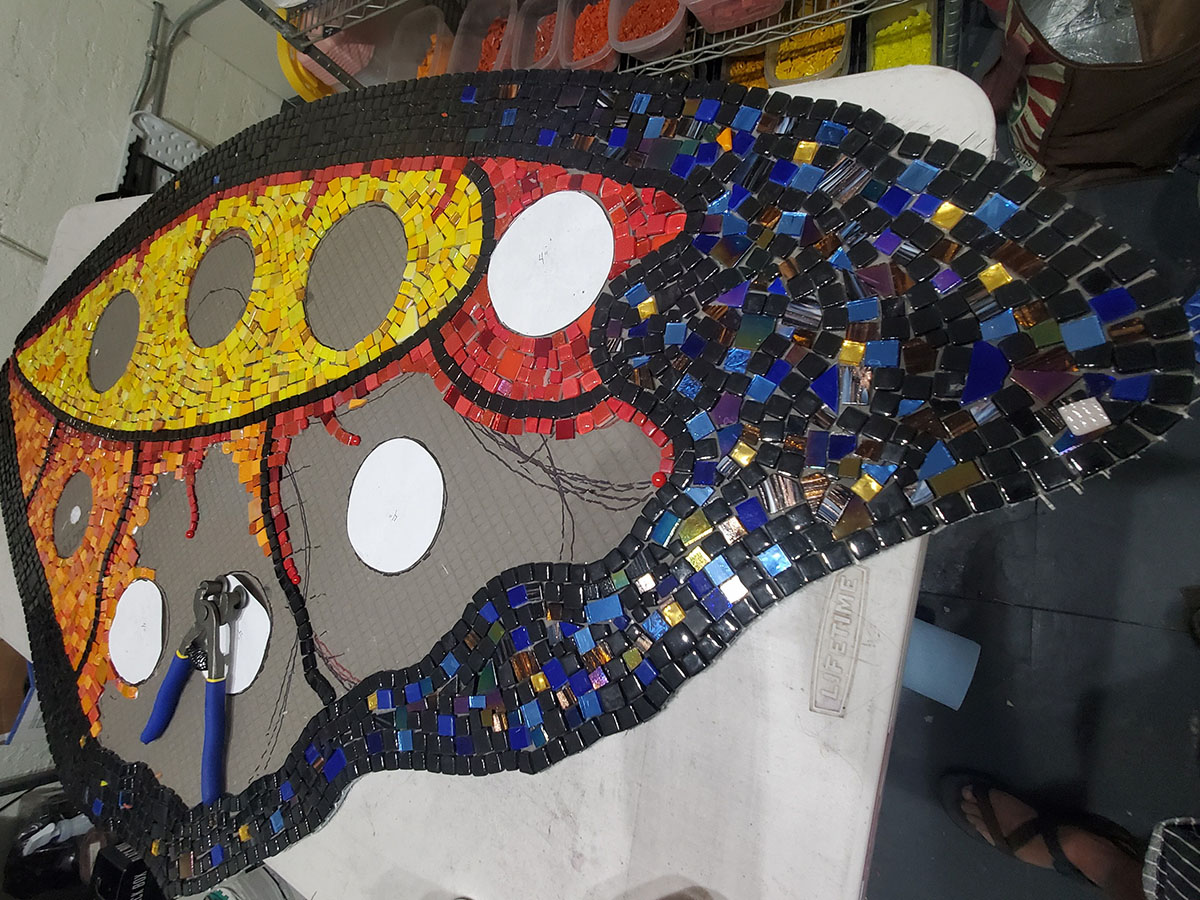
A practical rule of thumb is to not try to variegate the colors of small details. Keep those elements monochrome to reinforce their definition. Use color variegation only for larger element that can benefit with a break in monotony.
There is a second issue with using color variegation, but this second issue is more psychological than real.
This issue happens when an artist decides that an element needs to be monochromatic and as intense as possible but incorrectly assumes that this is only possible if the same color tile is used throughout the element.
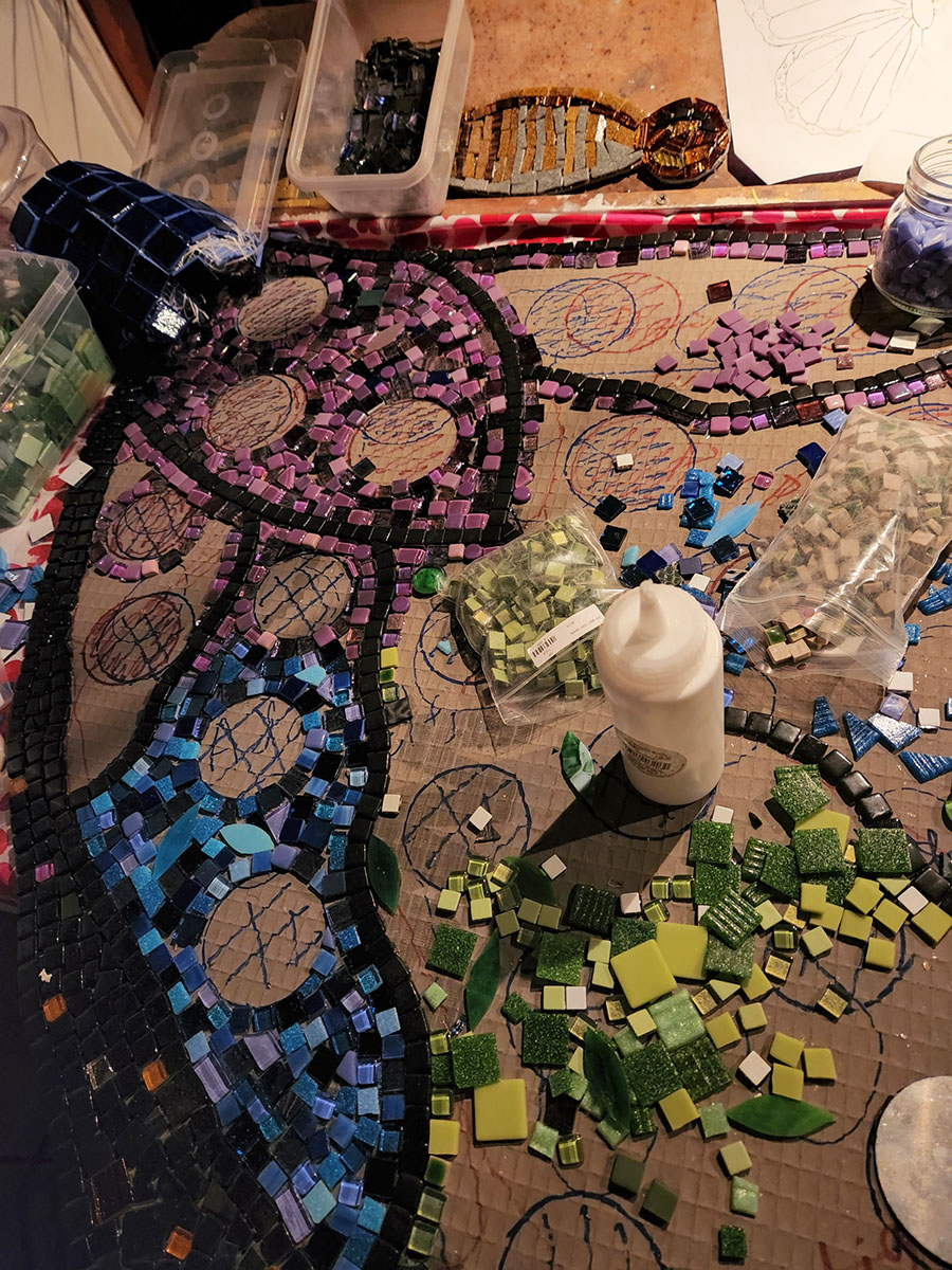
You can use variegation even when you desire a fairly uniform color field.
First, if the tiles are relatively small compared to the area being covered so that there are a lot of tiles, then the eye will help blend those colors in the mind of the viewer.
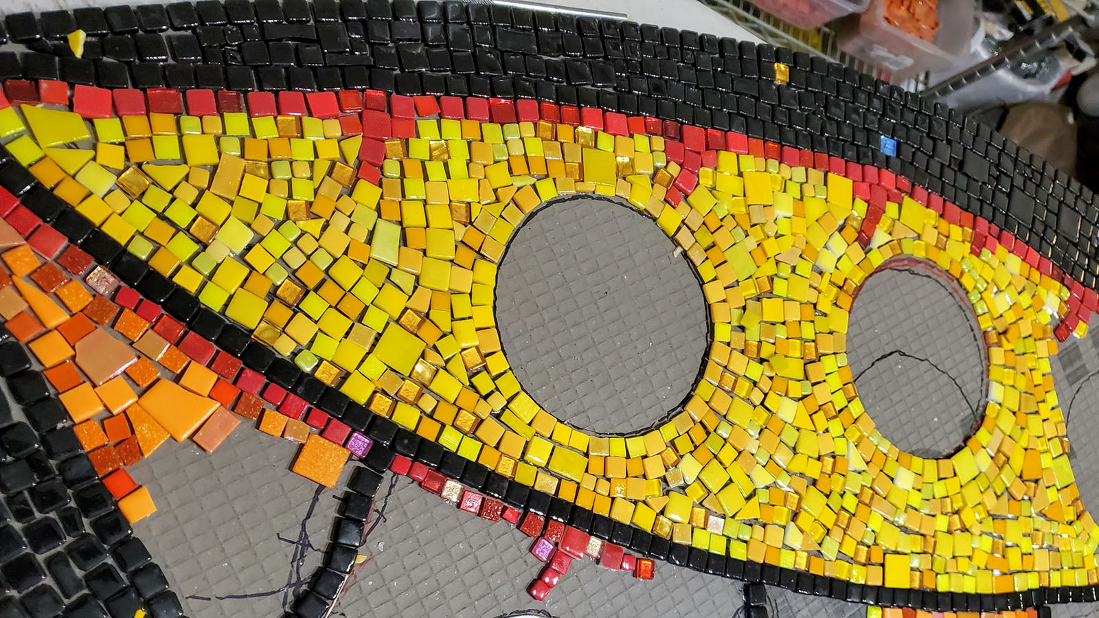
Also, you don’t need for the different hues or shades being used to be very different from each other. They only need to be slightly different to be effective in breaking monotony and creating visual interest.
Color Integration
Notice how the blue and purple areas both include some black mixed into them. This helps the black outlining used throughout the composition look less stark and less like the outlines in a coloring book.
TIP: By mixing certain select hues into a color field, you can help integrate different elements into a visual whole.
Installation
Notice how Jill’s design incorporates the removable sponsor plaques and uses the places where they will go as attachment points where fasteners can drill through the backer and into the studs of the wall. Very clever.
Leave a Reply