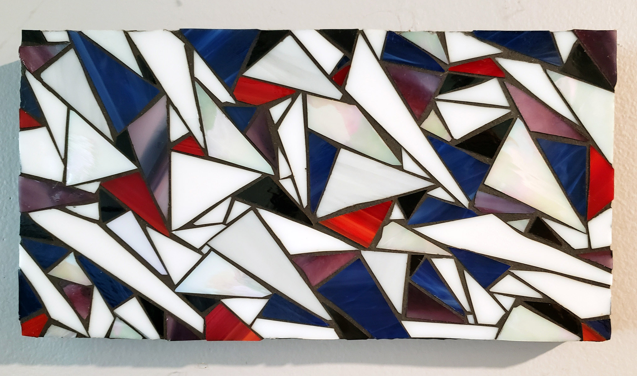
Natalija has made some abstract stained glass mosaics over the years, and I noticed something about one of them last week: It’s as a great example of value contrast and its power for creating a sense of depth and increasing visual interest.
I’ve written previously about the importance of value contrast in figurative mosaic artwork for depth and visual interest, but seeing it demonstrated in abstract mosaic art “proves” the point more objectively.
In abstract art, there aren’t figures to create a sense of depth with some figures in front of other figures. There isn’t perspective either.
In abstract painting and drawing, you can create a limited sense of depth with some strokes clearly being in front or behind other strokes.
Not so in mosaic artwork where all “strokes” are at one level.
In Natalija’s abstract mosaic, there aren’t any figurative clues or layers of strokes, but there is a clear sense of depth.
This is accomplished by a sharp value contrast of white and black with help from an extreme contrast of hue.
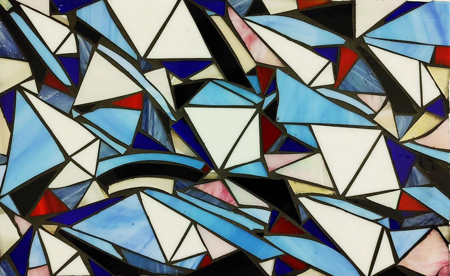
Here is a second abstract stained-glass mosaic Natalija made in the same series:
Color Transitions
One type of abstract mosaic art that is fun to make is a transition of colors.
The colors used for the transition be a lot of different combinations other than the standard rainbow,
Best results are had when the colors selected are harmonious as in the mosaic below:
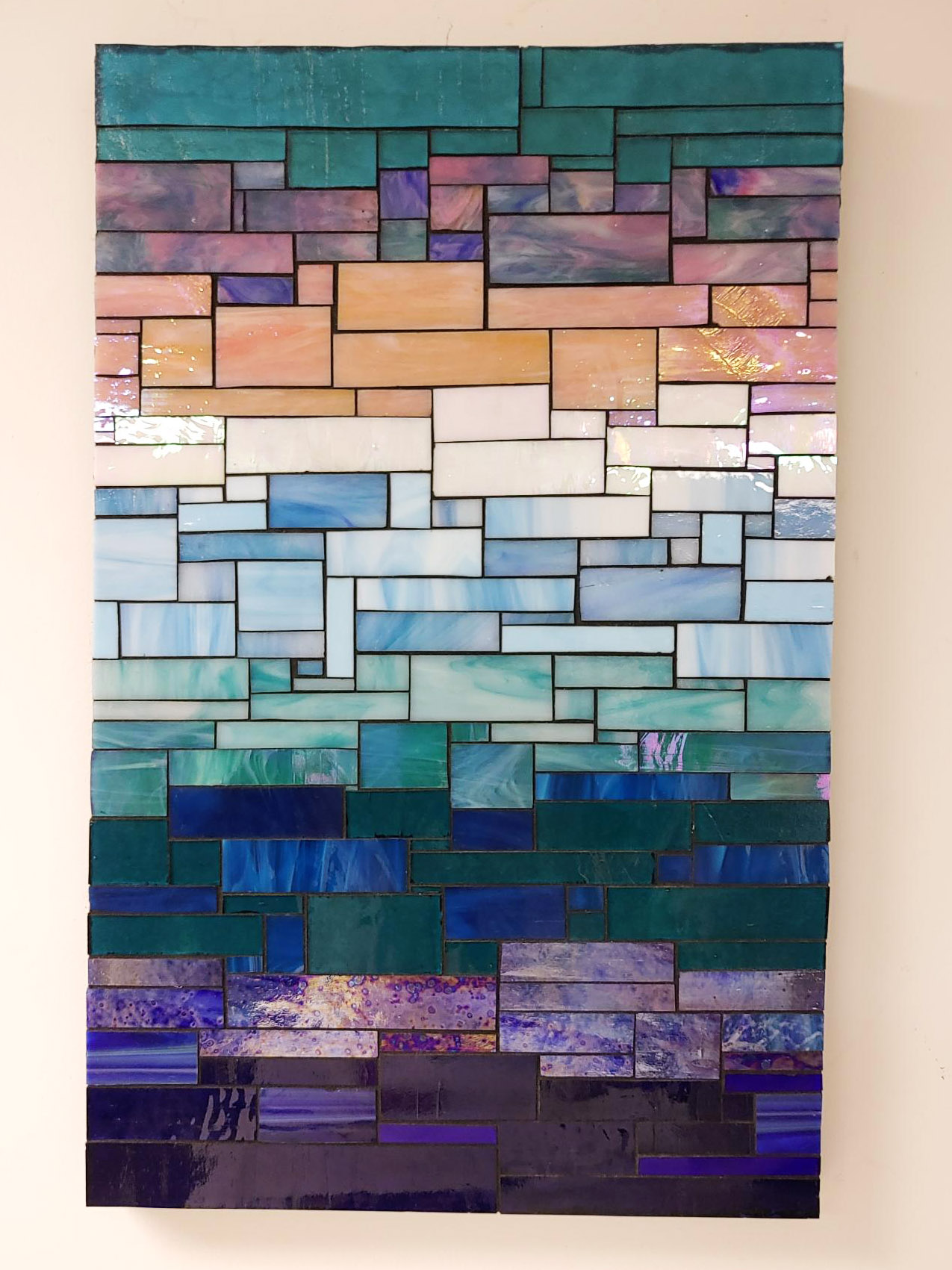
You can also make transitions of the same hue, say different shades and tints of the same hue of blue.
You can also make transitions of the same hue family, say greenish cyan blues progressing to reddish ultramarine blues.
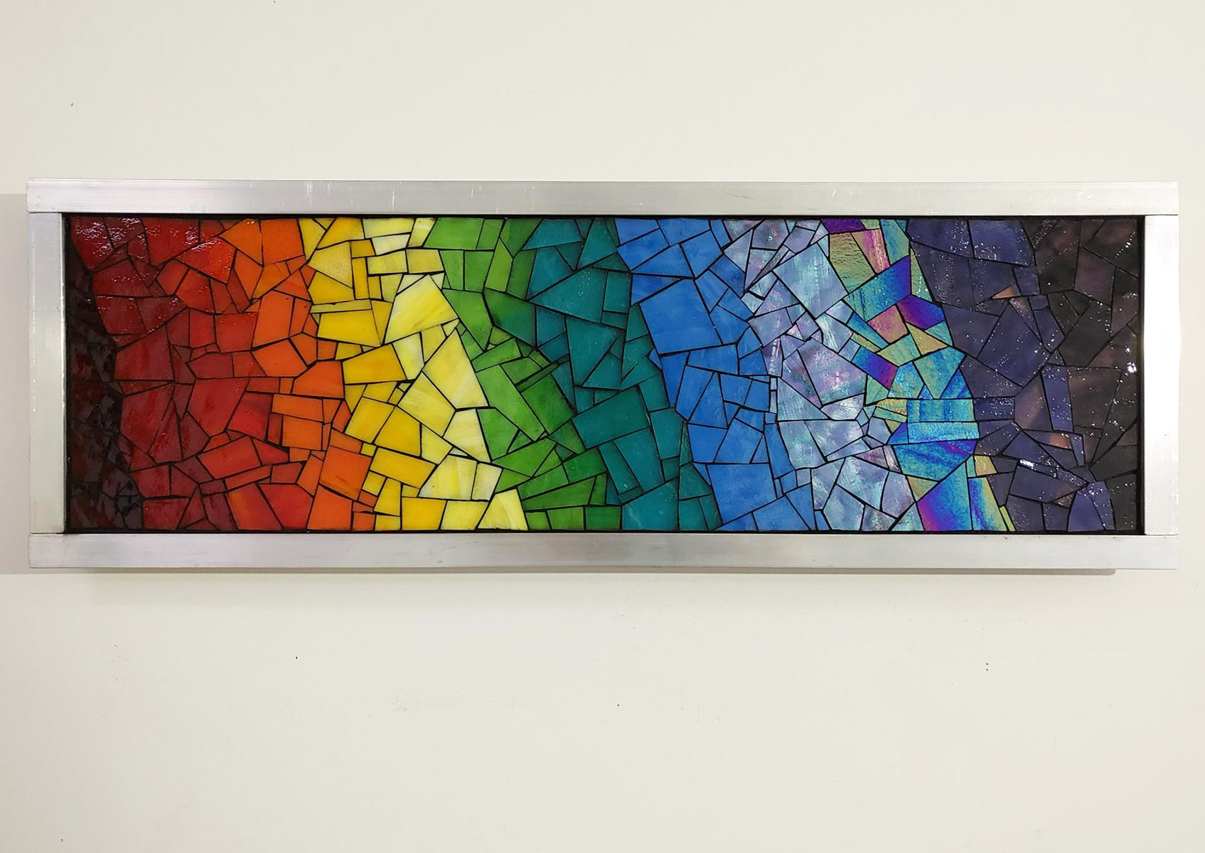
Here is a an abstract mosaic transition Natalija recently completed with a standard rainbow color scheme:
These photos were taken indoors with poor lighting, and so you can’t see much detail when you zoom in. Sorry about that.
For best photos of your mosaic, photograph them outdoors in diffuse sunlight, such as late in the day or on overcast days. Avoid glaring sunlight. Try to take the photo as “squarely” as possible with no foreshortening or angle.
Leave a Reply