Artist Jill Gatwood sent me some photos of mosaics made by her and her students as examples where white grout was used with good results.
Jill says she didn’t used to offer white grout as an option for grouting in her class, but has since done so with some surprising discoveries.
The featured mosaic for this article is a backsplash Jill made with different panels, some grouted in black and some in white.
Craft Aesthetic
At one point, we sold white grout, and I put a caveat in the product description about using white grout in mosaic artwork:
“White grout makes most mosaics look like a summer camp project, and that probably isn’t the look you are going for in your project.”
Over the years, I had more than one person off the Interwebs send me an email accusing me of being snarky by saying “that probably isn’t the look you are going for in your project.”
Well, I agonize over the artistic advice I give, and I meant that “going-for” qualifier quite literally.
Art is a broad banquet with something for everyone, and there are projects that are deliberately made in a craft style with different elements used to reinforce an ethos of fun and easy creation and rustic/coarse simplicity.
Some people want their project to look like it was made in a single happy session with a group of friends making similar projects: intense colors, bold strokes, hand precision not machine precision.
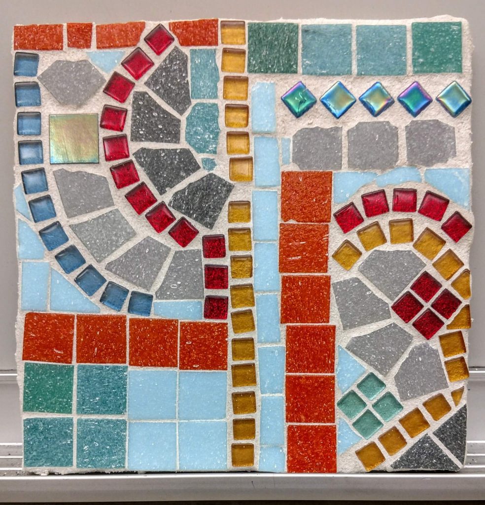
Abstract Designs
Abstract designs with bold colors might also benefit from white grout. This includes “modern” Mondrian-type abstracts and traditional designs with a lot of white, such as Dutch Hexes and quilting patterns.
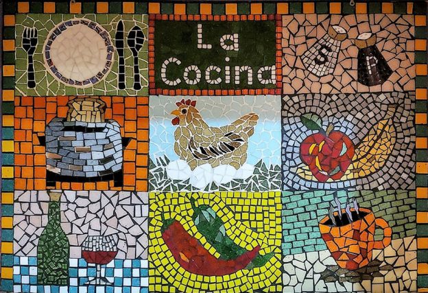
Found objects and broken tiles pressed in white concrete also looks nice. I fell in love with that type of mosaic while walking around small towns in Mexico back in the 1990s.
Why Not White?
If white grout works so well in certain projects, why have such strong blanket recommendations against using it?
The problem is that most artists we deal with are trying to render an image with as much verisimilitude as possible and want to avoid anything that might distract from the image being rendered.
We also have a lot of people using less intense tile colors and can’t afford for their design to be lightened any more than it already is.
Given the number of emails we receive from people in a panic because they “ruined their mosaic with white grout,” I feel fairly confident in keeping the caveat about using white grout as part of our general recommendations.
BUT, this discussion is still worth having because it illustrates a more fundamental point:
Before you apply artistic advice, make sure it applies to the type of art you are creating and what type of aesthetic you desire. You have to consider how the grout line and the directions of the rows of tiles will be used in terms of your specific project. Things like that can’t be an afterthought any more than the color scheme.
Remember, you can’t paint in a French Academic style and use Van Gogh’s thick impasto brush strokes at the same time. Mosaic is the same way.
I Love This Mosaic
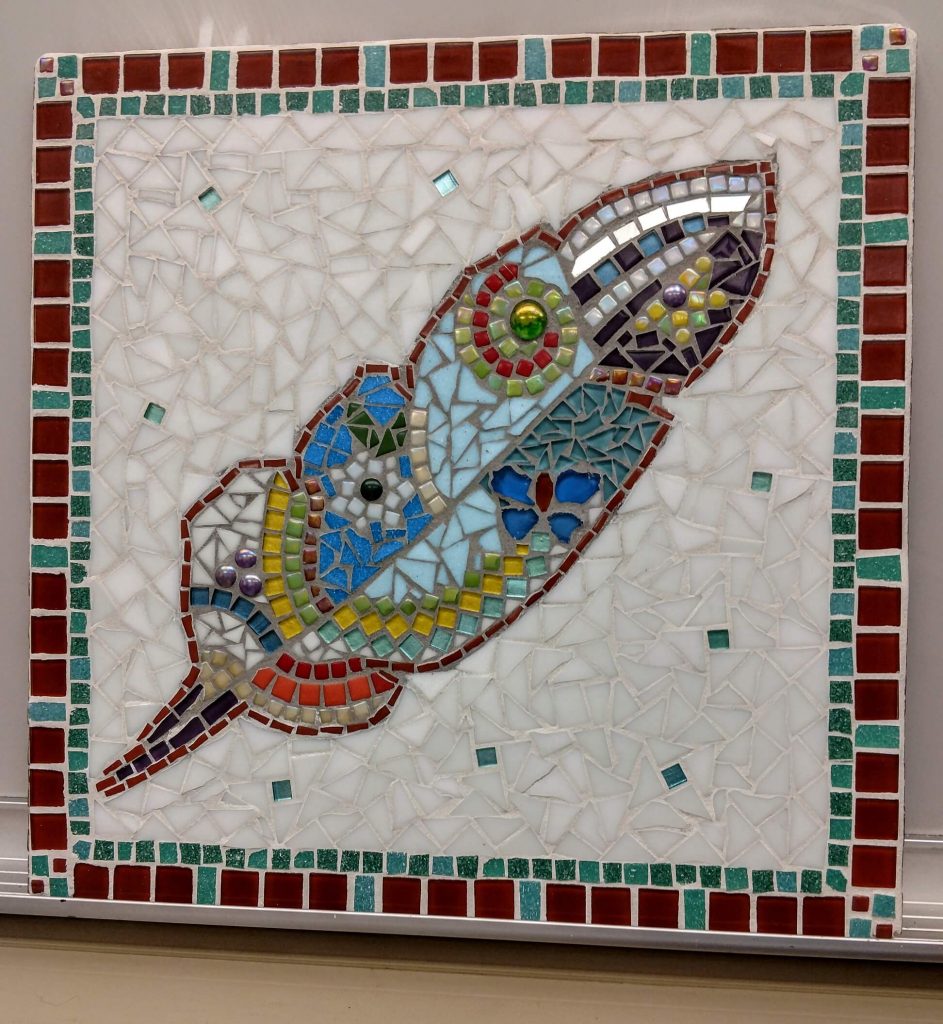
I love the mosaic above because it is an exception to several of my general recommendations:
- avoid white grout.
- keep grout gaps narrow.
- use one color grout for the entire mosaic.
The magic feather has the look and feel of beads and marbles pressed into concrete similar to the improvised mosaics I saw in Mexico. A grout gap that is large relative to the width of the tile is required for that look and feel.
This mosaic is also a good example of using different grout colors in different zones, which is something else I tell people to avoid if possible.
I love exceptions to rules and counter examples.
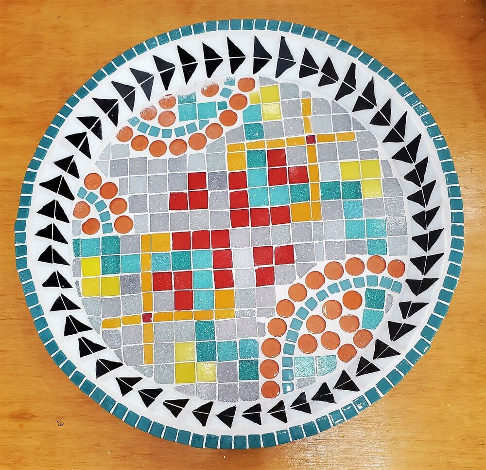
Birdbaths
Projects like birdbaths and trivets and planters are examples where a craft aesthetic or a geometric abstract look might be desired, and white grout can be an optimal choice for these. BUT, it’s important to note that these aren’t images. What affect does white grout have on an image?
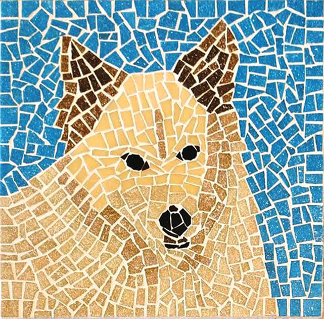
A Case Study
Jill sent me a photo of a mosaic dog made by her student and grouted with white. For purposes of comparison, I used Photoshop to quickly/roughly change the grout color to a soft brownish gray.
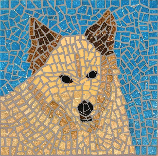
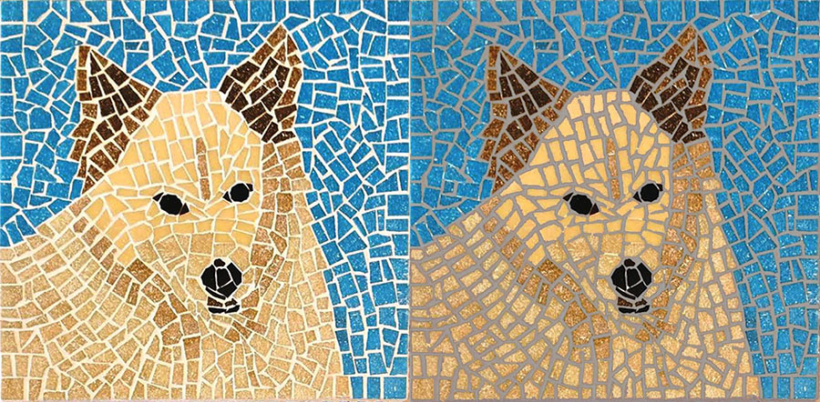
It’s a tough call. One definitive thing you can say is that if a smaller grout gap had been used, the color impact of grouting would be less.
That’s why I encourage the use of narrow grout gaps and remind people not to think in terms of the grout gaps they see in architectural tiling.

Leave a Reply