Contrast is critical for creating images that catch the eye and text that is readable.
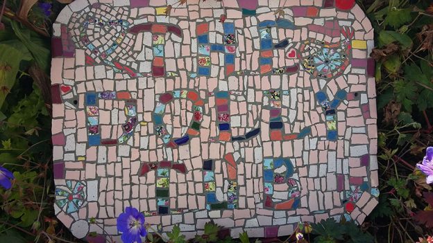
A mosaic sign recently completed by Ann Mitchell is a great example of the importance of contrast and the rewards of looking at your work in an objective way and reworking problem areas.
The Initial Problem

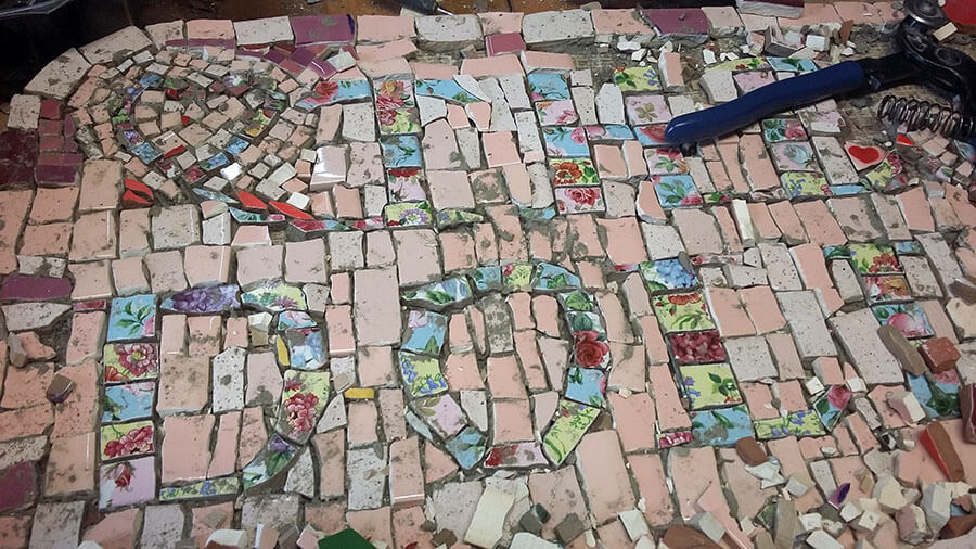
Ann emailed us the picture above asking for recommendations for a grout color that would help the letters stand out better from the background.
I replied that there doesn’t appear to be enough contrast between the floral letters and the pink background so that the letters stand out. I told Ann that I would use a gray grout, darker than medium gray, but I don’t think that will help with the underlying problem.
Ann then I asked me if I thought she should change the background that took her hours and hours to do.
I told her that I would change the background or put some sort of outlining around the letters or something because as they were, they didn’t stand out enough.
I actually enjoyed helping Ann because she was obviously learning by trial and error (which is how I do everything), and she was also willing to look at her own work objectively and to spare no effort to fix things that bothered her.
Ann decided that the most practical way to increase contrast was to pry out some of the lighter of the china pattern pieces in the letters and replace them with stronger colors. (Think about how much less work that is than prying off all the background tiles, and then a replacement in background color would still need to be chosen.)
Thematically-Appropriate Materials
I love found object-mosaic, but when you are trying to make a picture, what the material is in terms of theme or personal significance matters not nearly as much as how it looks.
TIP: If you are rendering an image or making a sign, you cannot neglect fundamentals such as contrast and iconic composition merely to a accommodate a clever choice of material such as broken china or thematically-appropriate found objects.
Do Your Treasures Justice
Ann used pieces from china dinnerware to make her letters, and I don’t think these plates had any personal significance for her, but sometimes artists will use materials that have emotional value, such as pieces of their grandmother’s teacups. Materials with emotional significance can be a problem because they cloud your ability to see the artwork objectively.
Here is what you have to keep in mind when using treasures like that:
The fact that the material is pieces of your grandma’s teacups can’t compensate for the fact that you didn’t use them in a more artful way. Eventually, you will get tired of looking at the finished artwork and wishing that you had done things differently. (Here I am speaking from personal experience.)
If the pieces of broken teacup are white, you shouldn’t use them in a place where white tile tile doesn’t look as good as some other color. Design a better project around the pieces of your grandma’s teacups or use them somewhere else maybe.

How To See
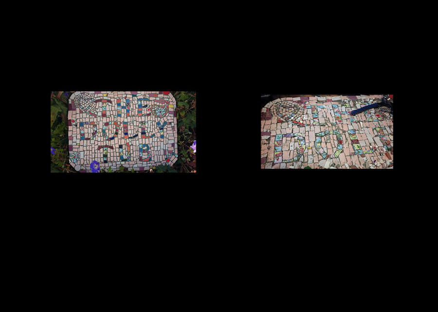
I could tell Ann’s original version didn’t have enough contrast when the text in the thumbnail was unreadable.
Here are some ways to see your artwork more objectively:
- Look at it in the morning and trust your initial impressions, not your later thoughts about what you were intending to accomplish.
- Look at it upside down.
- Look at it from multiple angles in succession.
- Step back from the artwork and squint at it. (The purpose is to simulate seeing it from a distance and to seeing it as a whole instead of all the details.)
- Snap a digital photo of it and look at the image as a thumbnail.
- Use photo editing software on the image to convert it to black and white.
- Use photo editing software on the image to experiment with different color schemes.
Remember to listen to your art and go where it needs to go instead of forcing your original ideas on it.


Leave a Reply