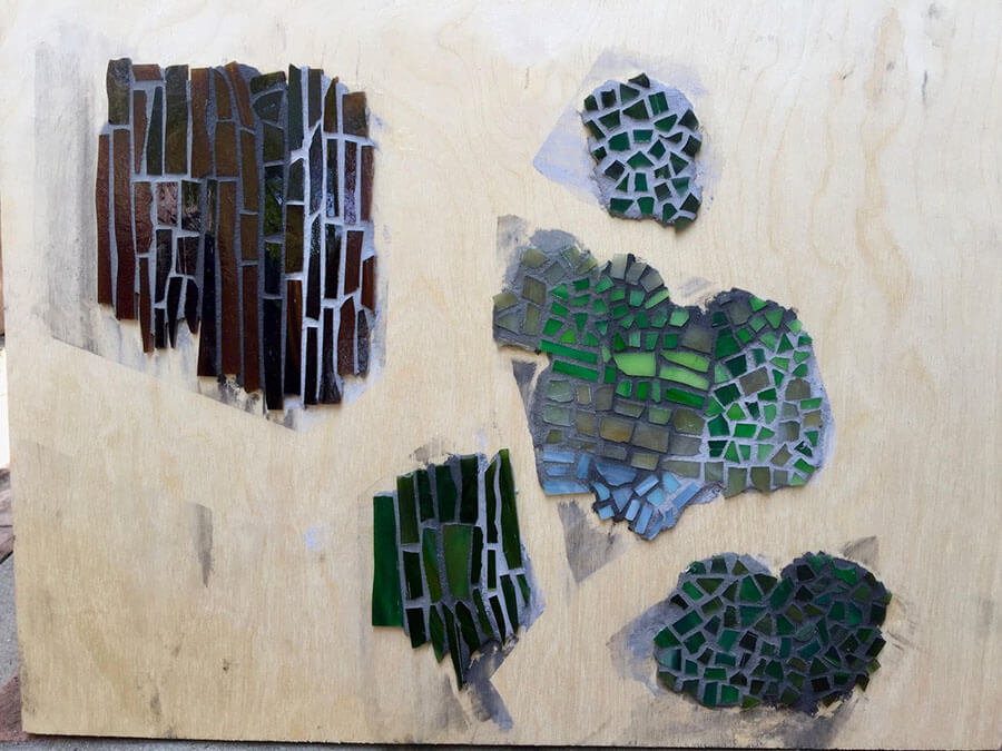
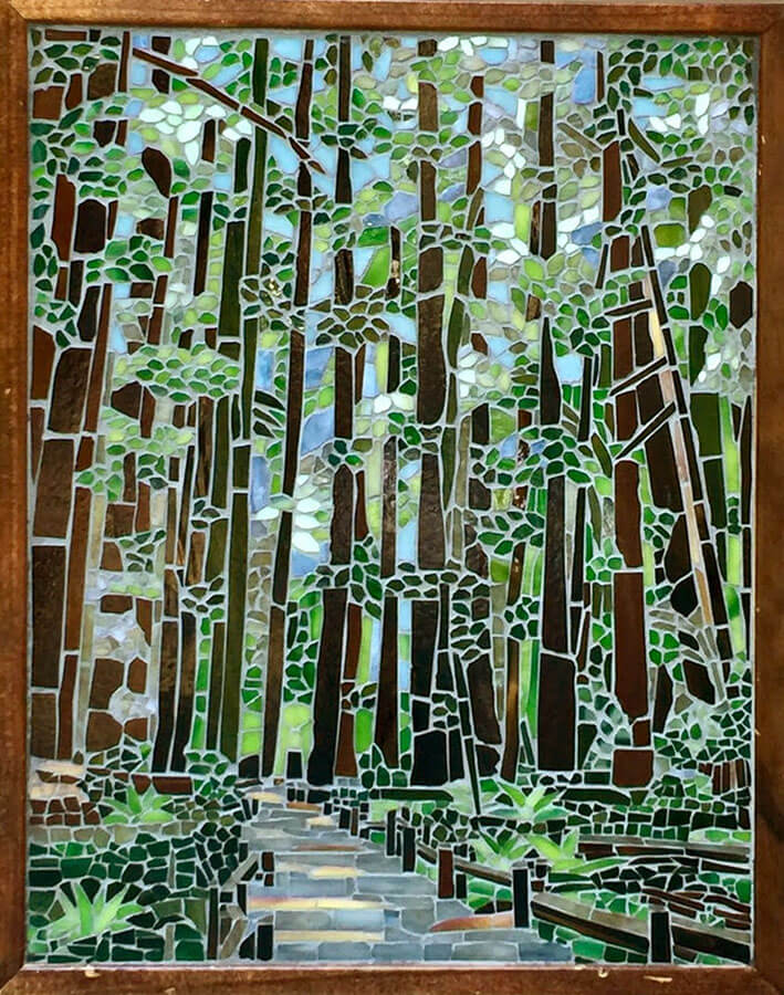
Tracy Kaplan recently emailed us a picture of her FIRST mosaic, and it is nice solid work, impressive even, especially considering that her instructor gave her some problematic advice concerning the grout color. Tracy’s teacher had recommended a chocolate or nutmeg colored grout, but Tracy wisely considered how a dark brown might cause adjacent tree trunks to no longer be distinct and separate.
Perhaps Tracy’s instructor had meant a lighter shade of those browns, but I still think that those could have caused problems with the adjacent tree trunks.
Most likely, the instructor only saw a portion of the mosaic without adjacent tree trunks. Tracy admits that she only finished about an eighth of the work during the course and spent many months afterward working to complete it.
If so, this is yet another example of how artistic advice isn’t one-size-fits-all and can be counterproductive or even disastrous if the advice isn’t specific to a particular artist or even a particular work of art in its entirety.
Fortunately, Tracy emailed us for advice.

Two Methods
Our response came from the general guidelines recommended in my article on how to select a grout color, which gives you two options:
- Take some of your tile (or the finished mosaic if small) into a building material store and compare the tile colors with the grout color swatches.
- Make some tile test swatches on a scrap piece of plywood and grout them with two or three different grout colors you are considering.
With either option, you should include some tile from all the colors used in the mosaic. Tracy chose the second method.
Overkill?
If either of these methods seem like overkill, then remember that our perception of color is determined by the colors adjacent to it, and that the same color can look radically different in two different situations. Even experienced fine-art painters don’t know how a color will look in a painting until they actually apply it to the canvas with the other colors.

Tile Test Swatches
Tracy actually used much more tile than I would have for some quick test swatches, but that is OK if you recycle the tile afterwards. (You can scrape the tile off with a paint scraper if you soak it, and you can nip the grout off the tile with a Mosaic Glass Cutter.)
When in doubt, use as much tile as you think necessary, but each of these swatches could have been 5 or 6 tiles.
In the photo above, note the dark grout in the center of the top left swatch. That dark grout is problematic as is, but if it had a brown hue, the brown tile would not be visually distinct at all.

Tracy’s Choice
Tracy chose a 50/50 mix of a cool light grey and a warm medium grey. I think the exact hue wasn’t nearly as critical as the shade, and I think the shade she chose is spot on for creating a forest sunlight effect.
The vegetation in a forest may have color, but on a sunny day, all that vegetation is a lacy silhouette for the sunlight coming around it and through every little gap. A light-colored grout such as Tracy chose was critical for making this happen.
A dark grout would have made a heavy outline around each leaf and robbed the clusters of leaves of “highlights” and light shinning through in many filigree places. The clusters would become opaque clumps with less depth. The trees would lose their sense of height and appear right overhead instead of soaring overhead.
If you wanted the forest to be deeper and darker by using a dark grout, you would have to build in all the filigree in the canopy using tile instead of suggesting it with the grout line. Else you lose detail and depth.
Hue? I don’t think a warmer hue would have worked because it needs to suggest blue sky in places, but in all probability, the mosaic will be displayed indoors in warm indoor light anyway.
The composition is strong with lines converging at the vanishing point: a broken wedge of blue sky over a wedge of trail and a wedge of forest framing either side. All wedges have a sense of depth, even the forest on either side because we can see sunlight on the forest floor suggested by the light grout.
I really like this mosaic, and I almost never like mosaics with light grout. I’m glad that Tracy used our recommended technique to choose a light grout that works well, especially since my general advice for grouts is that darker tends to look better.
Changing Grout Color With Paint
If you want to change the color of a grout line in a finished indoor art mosaic, you can do that with artist’s acrylic paint applied via wipe-on-wipe-off using a rag before the paint can dry on the glass. The paint should stick in the porous grout.
I recommend diluting the paint with acrylic media to make a water-based “grout stain.” You can also apply undiluted paint for a more opaque covering of the existing color, which might be simpler for most people.
I recommend experimenting on any piece of scrap material to figure out colors and dilutions.
I recommend testing on a grouted tile swatch before applying to the mosaic to see how it actually looks on the grout.
I recommend Yellow Ochre and Burnt Umber. Both are UV resistant mineral pigments and considered non-toxic. They also make great stains.
You can also use Ivory Black and Titanium White to make hue-neutral grays of every shade, but a wide range of colors are available, and you can make more interesting grays too.
I would avoid toxic Cadmium Yellows but Nickel Yellows are considered safe.
I would avoid making my grout paint more intense in color than the tile colors.
Grout Gap
TIP: If you want to minimize the color impact that grout has on your mosaic, use a smaller grout gap.
Outdoor and wet mosaics might need a standard grout gap to ensure that they are filled with grout to keep out the water, but indoor art mosaics that aren’t architectural coverings don’t need any grout gap at all, and you can press the tile as closely together as possible.
Small Projects for Beginners
TIP: First art projects in any new medium should be small, particularly with mosaic, because mosaic takes some work. You don’t want to find yourself working on something that has a long way to go when you already wish you could change decisions you have already made.
BUT with the photograph Tracy chose as a model, a larger size was needed to make rendering all the detail. Rendering all that detail in a smaller size would have been more work and more tedious work, not less.
If you choose to do a small mosaic as a first project, make sure you choose a model that can rendered at that size.
My rule of thumb is to look at the smallest detail in the model and render that detail in tile on my desk using the smallest tile I can cut and work with comfortably. From that starting point, I am able to gauge how large the overall mosaic should be.


Leave a Reply