Eastern Screech Owl Mosaic by artist Linda Lawton

Owl Mosaics and The Importance of Andamento

Linda Lawton emailed me some pics of her recent owl mosaics, and one of them had an issue that made it a good teaching example about the importance of andamento. That mosaic also became a case study for how to mosaic on top of part of an existing mosaic if you want to rework a detail.
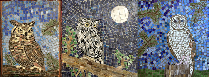
Three Owl Mosaics by artist Linda Lawton. Great Horned Owl, Eastern Screech Owl, Barn Owl

Since Linda is serious about her art and is always working to improve it, I felt like I could be honest with her in a way I couldn’t when critiquing the artwork of “someone I didn’t know.”

Over the past few years, Linda had emailed me about several different mosaics where she had ripped up tiles and re-executed details she wasn’t happy with. Some people have the true artist’s obsession with art and making it better, and it shows no matter the age or skill level.

I also watched Linda go from figuring out the basics of composition to making these owls, which I think are quite good. I know I would be pleased to have made any one of them, much less the series. Except for that moon. It plagued me.

Clarification of Terms

I often say andamento when I mean opus musivum, which is the style of mosaic where background tiles are arranged in concentric rows around the figures like ripples on a puddle.

If andamento is defined as creating visual flow and motion in a mosaic by arranging tiles in rows, then I say that only the opus musivum style really does that. Random angular shards (opus paladanium) and square grids (opus regulatum) do not lead the eye around the composition.

In my opinion, backgrounds made from square grids are wasted opportunities to create additional visual interest, and using a square grid arrangement for a figure in the foreground just plane looks out of place, especially if the other figures use curving arrangements of tile.

That brings me to the problem in one of Linda’s owl mosaics.

Eastern Screech Owl Mosaic
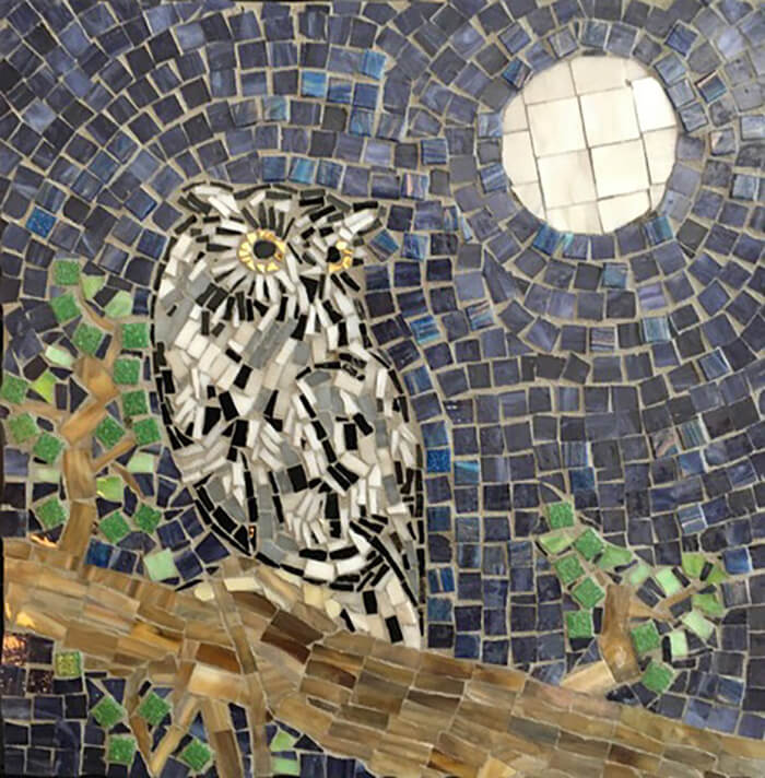
Eastern Screech Owl Mosaic by artist Linda Lawton

Notice how lovingly the owl itself is rendered with narrow pieces of tile that show the flow and texture of the plumage. Notice how the background seems to cradle and envelope the moon and the owl because the background tiles are arranged in concentric rows around them.

Now look at the rectilinear grid used for the moon. Notice how flat it looks compared to the sky just around it. A sphere should certainly have contours if every other shape in the mosaic has contours. My initial impression was that the moon looked like a hole in the mosaic that had been bricked up.

The details you always notice the most after you finish a mosaic are the ones you didn’t think about or rushed through just to complete the mosaic.
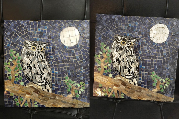
Eastern Screech Owl Mosaic with revised moon. (Note: not yet grouted.)
Eastern Screech Owl Mosaic, BEFORE and AFTER with revised moon. (Note: The revised moon is not yet grouted.)

Of course that wasn’t my initial response to Linda. I was too blown away by how much progress she had made and how jealous I was of the series.

But I kept thinking about that moon. Finally when Linda emailed me back, I proposed doing something about the moon in a novel way: tile a new version of the moon on top of the existing tile.

They really look great, but I do keep thinking about one detail I would change. (I do that with my own art too.) The moon is tiled in a grid, but everything else is concentric flowing andamento.

I’ve thought about retiling certain parts of my mosaics by tiling on top of the existing tile and just having it stick out slightly. I’ve even thought about doing this with external work because the thinset would stick to the faces of the tiles.

I thought Linda would email me her thoughts on the idea, but once she arranged some tiles on the moon as a study, she liked the improvement and just went with it.

A layer of glass tile is only about 1/8 inch high, and so it doesn’t really stick out enough to make a difference visually.

Safety Concerns

Mosaic elements that extend above the rest of the surface are not suitable in floor mosaics due to the trip hazard they represent and their potential to be damaged by foot traffic.

Raised mosaic elements could be a problem on other architectural surfaces if the edges of the raised elements become jagged due to incidental damage.

For a mosaic plaque or art object, those things aren’t a critical safety issue because the art is moveable and not cemented into the building.

Posted

in

, ,

by

Tags:

Comments

15 responses to “Owl Mosaics and The Importance of Andamento”

  1. Donna Conklin King Avatar

    Wow, excellent examples! Beautiful mosaics and I commend Linda on her tenacity. It’s important that an artist be willing to rip something up and redo it. That’s when the learning happens. Of course tiling on top is fine too. I would love to use these examples in my teaching practice.

  2. Sue Howard Avatar
    Sue Howard

    I do a lot of pet portraits and always do grids in the background. I am definitely going to rethink that in order to work on improving my own art. Thank you for this great lesson!

  3. lou mcwilliams Avatar
    lou mcwilliams

    even the small 1/8″ rise gives the moon a perfect stage. and yeah, taking it out of grid makes so much more sense. gridding it wasn’t right for the rest of the picture. and they’re are so beautiful. in our backyard we have a few barred owls. their voice is kinda distinctive and i looked it (the voice) up online. once i saw what the owls looked like i immediately thought how well suited to mosaic they were. she’s quite an artist.

  4. Cia Avatar
    Cia

    I am sooo happy that you’ve resumed your posts. I always learn something and/or find inspiration from them. I was inspired to re-read the coronavirus helmet post and ALL the comments. Wow, what a wild ride we have been on this spring into summer. And now it’s FALL. Egads. Lots of people have virus fatigue and are acting as if this was NOT still a big deal. As for me; I’m still staying in and creating like a crazy woman… never bored and losing the fear that my “art” is not “good enough”. So glad to hear from you.

  5. Jane Russell Avatar

    Excellent advice and photos to illustrate the issue.

  6. Ali Casado Avatar
    Ali Casado

    I didn’t know you can adhere tile over tile. Thanks for the heads up. I really learn a lot from your posts. I am also glad you started up again. Be looking forward to seeing more.
    Ali C.

    1. Joe Moorman Avatar
      Joe Moorman

      Hi Ali,

      It’s certainly not the best thing to do, and the edge of the raised portion is vulnerable to damage and exposing a sharp edge. I would do this only on a mosaic plaque or art object. I don’t know that I would do it on a mural installed on an architectural surface if it was likely to be subjected to occasional impact or abuse. I certainly wouldn’t do it for flooring.

      I would make sure the raised portion was glued or mortared very well and bonded securely.

      Always think in terms of durability and safety.

      1. Kimberly Grant Avatar
        Kimberly Grant

        Can and did she add grout to this, around the edges, in between, to cement and smoothe out the edges? Also, could she just have put a solid single piece of glass moon? Thanks for your help.

        1. Natalija Moss Avatar
          Natalija Moss

          Hi Kimberly, she did grout these mosaics.

          A single piece of stained glass could definitely be used for the moon, but the artist only used tiles which were smaller.

  7. Sally Stephenson Avatar
    Sally Stephenson

    I too ALWAYS learn from your posts, Joe. Thank you, and so good to see you back!
    As a newbie to this art form I struggle, the most, w/movement and constantly am ripping out to get it to look more “flowy”. I’m finding water truly difficult!!!
    For backgrounds, such as Linda’s, is it ok to mix the square tiles with other free form cuts…I’ve tried this in “my water” and not sure that I’m happy w/it?!?

    1. Joe Moorman Avatar
      Joe Moorman

      Hi Sally,

      Thanks for the encouragement!

      It’s a matter of not what you do but how you do it. If you are using a mix of cut pieces and whole square tiles, mosaic looks best if you do what Linda did in the Screech Owl: The figure (owl) is made from cut pieces and more tightly executed and spaced. The background is spaced slightly less tightly and a little more loosely with occasional cut pieces to make rows work.

      Or at least don’t do the opposite. It looks odd when some part of the background is more tightly executed or spaced than some figure it surrounds.

      You can see that problem sometimes in amateur mosaics and ancient mosaic floors, which were made by multiple people of different skill levels.

  8. B Chase Avatar
    B Chase

    Glad to see you back. I have missed your posts.

  9. Phyllis Akmal Avatar
    Phyllis Akmal

    Excellent comments, suggestions and kudos to Linda for her perseverance and improvement. She shows a lovely color sense, personality, and atmosphere in the piece. If I may add a couple of technical suggestions: keystoning (cutting angles on the tesserae as they work around the curve) would aid in the flow and curve of the rows both around the owl, around the moon and the moon itself. Keystoning is paramount in preventing V-shaped gaps around a curve and making a flowing pleasing curve. It is also advisable not to put in random small shards to fill in space. They tend the draw the eye. Often, if a tessera isn’t working in a particular space, the problem may not be that piece; you may have to go back 3 or 4 pieces and correct shape and size of those pieces. And read all the good mosaic books you can find in the public library and elsewhere! They are so helpful in their technical and design advice. Mosaic on!

    1. Joe Moorman Avatar
      Joe Moorman

      Hi Phyllis,

      In general, I could not agree more about keystoning. For readers trying to visualize what Phyllis is talking about, search Google for “Roman arch diagram” and look at how the stones are wider at the top making them more trapezoids than squares or rectangles. In Linda’s mosaic, the moon is a figure like the owl, and so it could have benefitted from being as closely fit together as the pieces in the owl are.

      All that being said, I would rather a mosaic use a flowing curving andamento without keystoning and other cutting to make pieces fit tightly than use a less interesting andamento because they were obsessed about tight fits. In that aspect, mosaic is a lot like learning to paint: you are much better off painting large color fields loosely and inexactly than drawing each detail. I frequently see mosaics by highly motivated novices that obsess so much about cutting and fitting the pieces exactly that they ignore more fundamental aspects of visual art. Or they default to a grid layout for the background to save time, and the work as a whole is much less interesting had they executed the fitting a little more loosely and spent time thinking about the other concerns.

      Thanks for your very important point!
      Joe

  10. Gale Thomas Avatar

    Your articles are wonderful. Much appreciated. Gale

Leave a Reply

Your email address will not be published. Required fields are marked *

This site uses Akismet to reduce spam. Learn how your comment data is processed.