Recently a friend of mine asked for a mosaic pattern for a kingfisher and the materials to make it. He made this request at the eleventh hour when he discovered that it would be raining the entire weekend of his family’s beach trip.
I literally had to get the pattern and the tile shipped the very next day, and so I couldn’t spend too much time creating a pattern.
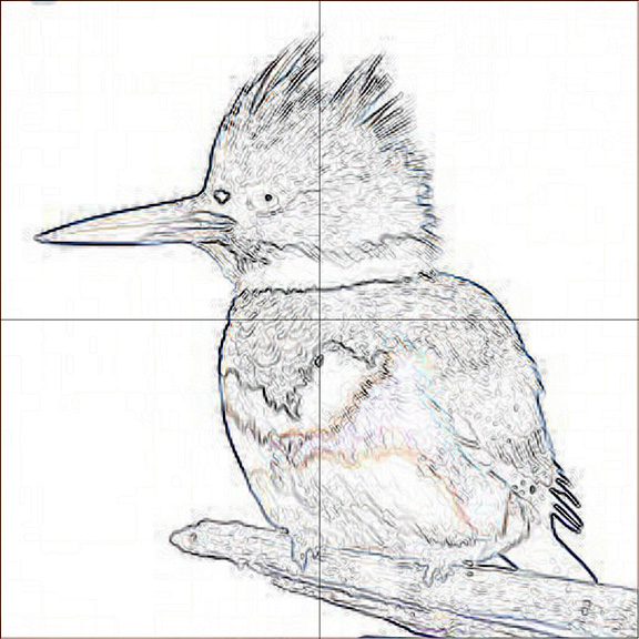
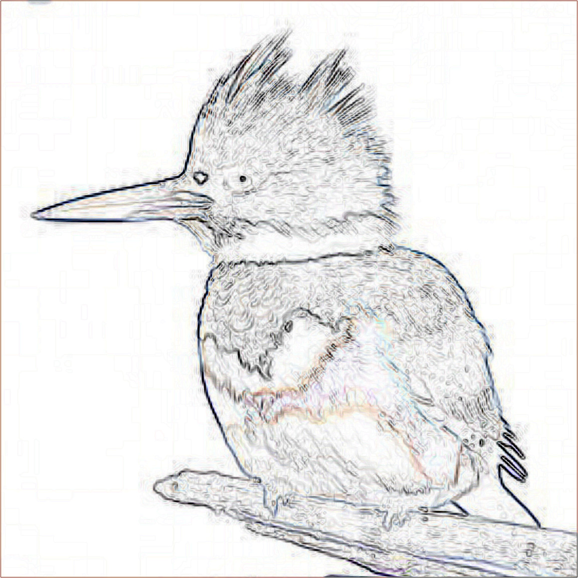
Fortunately, there is a quick way to generate a pattern using Photoshop’s “find edges” filter:
filter >> stylize >> find edges
Making Iconic Images
I looked through many online images of kingfishers to select a model.
I knew that I wanted a model in a pose that clearly showed the kingfisher’s most iconic features:
- crest
- long beak
- chest pattern
I suspected that these features would be most recognizable in a resting bird with his head in profile, but I scanned through images of kingfishers in all sorts of poses before I selected a model.
To capture the iconic nature of something, I’ve found that it’s beneficial to know an object as a class before focusing on a particular model.
Eventually selected this old photo illustration of a kingfisher, although there were many others which would have also worked well:

Adobe Photoshop
In one click, you can generate a pattern from any image using Photoshop’s “find edges” filter:
filter >> stylize >> find edges

I added a border of three pixels around the image by increasing the canvas size by 6 pixels in each dimension so that a black background layer could show at the edges.
How to Use A Mosaic Pattern
This pattern can be printed on a regular size piece of printer paper, taped to a worksurface, covered in contact paper (sticky side up), and put to use.
For those who prefer to work with the tile face up, you can use Mosaic Mounting Tape to pick the mosaic up off the sticky contact paper, using this method.
This pattern is meant to show the outlines of the figure.
Keeping your eye on the model as you use a pattern like this is essential if you want to get texture and color correct.
Don’t try to use the pattern like a paint-by-numbers pattern for each and every line.
Caveat
The pattern generated gives you more lines than needed for a mosaic.
That is because Photoshop is showing the edge of every subtle difference in color.
Unless you are doing a very large mosaic that attempts to capture the image photo-realistically by using small tiles as pixels, you do not need all these lines.
You do not need them because you will “posterize” the image and reduce it to a more simplified color scheme.
This is necessary when your color palette is limited to what colors you have available in tile.
Of course, if you use swirled stained glass instead of monochrome tiles, then you can render a lot of this subtly variegated color.
Note that I have tried using Photoshop’s posterize filter before the find-edges filter with mixed results.
Enlarging Mosaic Pattern
The pattern shown above can be printed on a single page to make small 8×8 inch mosaic, but what if a much larger mosaic is desired?
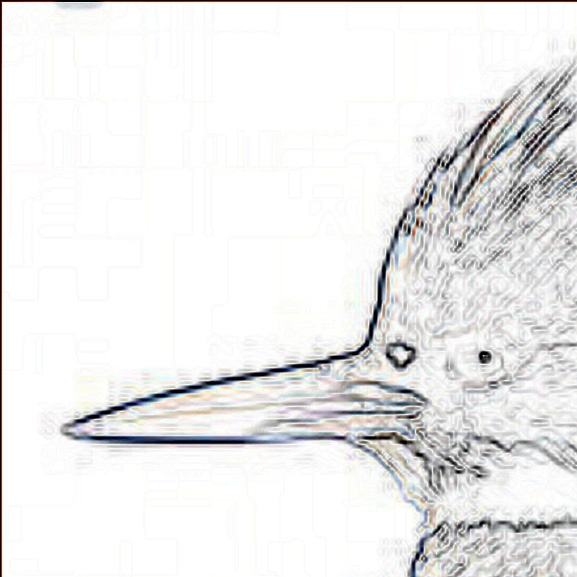
The digital pattern can be gridded, and then each cell is cropped and saved as a separate file with a filename that includes column and row number of the cell.
For example, kingfisher-pattern-cell-17-23.jpg would be the cell at column 17 and row 23.
After all these images were printed on regular printer paper, they would be trimmed and taped together to form the complete pattern.
I didn’t know what exact size of small mosaic my friend had in mind, and so I also sent him a second pattern the was four times the size of the first.
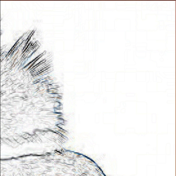
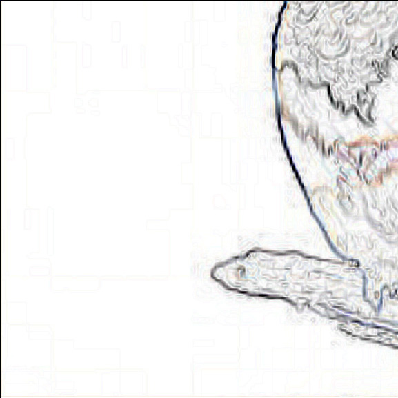
To make this pattern, I divided the mosaic up into four quadrants by drawing horizontal and vertical lines through the midpoint of the image. Then I cropped each quadrant and saved it as a separate image file for printing.
Character and Style
Working with a limited color palette makes translating an image into mosaic more challenging than it would otherwise be.
It also makes mosaic more interesting to look at.
Simplification of color scheme is similar to the stylization or simplification of detail in that both are opportunities for an artist to demonstrate their cleverness and style.
With limited color schemes and simplified details, we get to see how the individual artist deconstructed the image in order to build it in tile.
That’s why I don’t have much enthusiasm for large pixelated mosaics. They don’t have the quirky character of an artist interpreting an image; there is no style.
For me, the limited color palettes in mosaic function in a similar way.

Leave a Reply