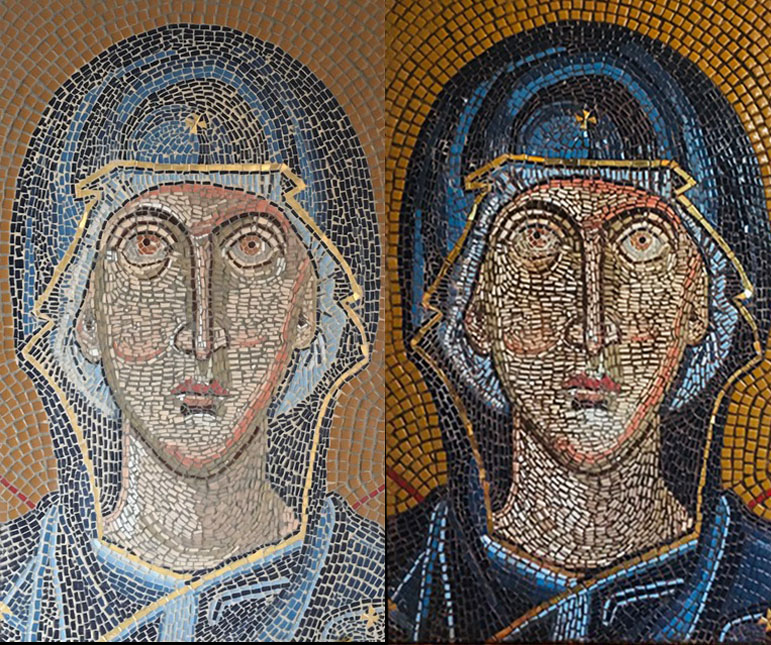
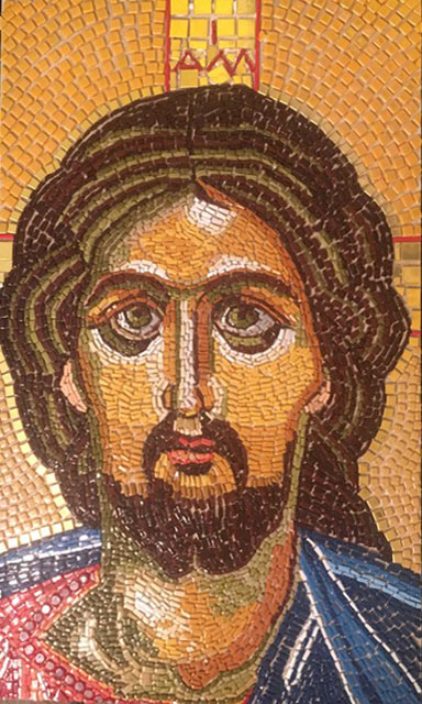
Artist Sue Hague’s mosaic icons are reproductions of medieval, byzantine, and early Christian icons, and some are mosaic interpretations of icons that were originally paintings. The mosaics Sue produced from these paintings were made with authentic andamento and look as if ancient mosaics were copied tile by tile.
Sue describes herself as a beginner still coming to terms with the learning curve, but I don’t think most artists would be able to do that type of cross-media interpretation while maintaining a particular style, at least not as well as Sue has done.

Sue wasn’t happy with how the light sandy beige reduced the color intensity of the mosaic, and so she stained the grout with acrylic paint in an umber color. This increased color intensity but left the mosaic darker than Sue desired.
To Grout Or Not To Grout?
I wanted to share Sue’s work now because they are central to an issue that I have been agonizing over for the past few months:
Has the emphasis on grouting in our instructional content caused people to use grout in a way that was detrimental to their art?
My main reason for always mentioning grout in our instructional content is so that people making outdoor and wet mosaics don’t neglect to use a grout line wide enough to be grouted.
(We get many emails from people trying to salvage mosaics that were poorly executed in this regard, and so this is a significant issue for me, one that causes emotional stress.)
Those mosaics should never have tiles close enough to touch, and the gap should be filled with grout.
But dry indoor mosaic murals and plaques and objects of art are different. You can avoid grout entirely (for small art objects), or you can merely grout the few tiny gaps that result from minor errors in tile size and shape, which is quick and easy.
The point is that you do not have to maintain a clear and obvious grout gap in these dry indoor mosaics, and it’s ok for tiles to touch occasionally. If you look closely at ancient mosaics, you can see that they were made with this sort of incidental gap.
To grout or not to grout is NOT the question. The question is: how well defined and consistent does the grout gap need to be?
The answer is not very much if your project is for a dry indoor location other than a floor.
TIP. When the mosaic is a detailed image made of small tesserae for indoors, the emphasis needs to be on rendering the image not sealing out water. Trying to maintain the type of consistent no-touching-anywhere gap will result in too much grout in the image.
Small Vs Not-Touching Anywhere
The consistent well-defined grout gaps that are essential for pools and showers and outdoor mosaics will put too much dull cement in the surface of any image made from small pieces.
At a minimum, you should avoid strict adherence to the not-touching-anywhere rule. Better yet, abandon it.
Make sure no grout gap is as wide as a tesserae or even half as wide.
If you are afraid of making the grout gap too small, remember this:
- The gap will always look larger when filled with grout.
- A lot of the color that you see in a standard-gap mosaic before it is grouted comes from seeing the sides of the tiles.
- That color from the sides won’t be visible after grouting.
You should always try to make your mosaic as durable as possible, but avoid the not-touching-anywhere rule if you want to minimize the color impact of grouting. Let the tiles touch occasionally, at least at points/vertices.
Tile Estimators & Recommended Grout Gaps
Keep the above points in mind when reading coverage information in product descriptions and tile estimators. Those estimates and the grout gaps they reference are for area calculations for tile arranged in a grid as an architectural covering. They are not the best suggestions for how tile should be used in a figurative mosaic, although some large outdoor mosaic murals are made that way.
Note that you can still make use of grid-based estimates for planning purposes by increasing the numbers by 10 to 15% to account for the diminished grout gap and cutting scrap.

Which Looks Best?
Before Sue emailed me photos of her work, I would have said that having a standard grout gap in an icon such as this was definitely a mistake because of how all the extra cement makes the colors of the image look a lot less intense.
Of course, that is objectively true. Using the grout gaps recommended for architectural coverings will result in a mosaic where the colors are less intense, but what if there are other criteria than keeping the colors as intense as possible?
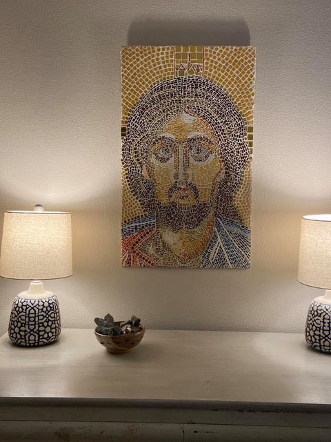
The general trend in interior design is muted color tones.
Look at how “at home” the mosaic icon looks below with its surroundings. Would the mosaic look as integrated with the room’s decor if its colors were as intense as the ungrouted mosaic?
Does the reduction in intensity provided by the grout make the artwork look more aged and weathered and thus more like an ancient relic?
My default instinct of making colors look as intense as possible might not be the best recommendation in this case. There are always exceptions that prove (test) the rule.

Advice Is Not One-Size-Fits-All
Whenever you make generalized recommendations, you should try to take into account all the different ways that advice might be misapplied. Of course that is impossible. You can never anticipate all the different ways some piece of information might be used.
Also, different people need to hear different advice. The student chained by rigid precision needs to hear that it is OK to loosen up and put more emphasis on seeing the overall image than on exact execution of individual elements.
BUT, the student who is losing focus and definition in their images would not benefit at all from that same advice.
Whenever you read any artistic advice or instruction, it’s important to evaluate whether or not the information is most relevant to your project and how you are working.
Art is a broad banquet with something for everyone, which is a positive thing, but it is important to remember that all these different dishes have different recipes.

Robust Advice
There are some points that are robust and apply to all or most situations:
- Keep your grout gaps small to minimize the color impact of grouting.
- If you use a small grout gap, you can use dark or black grout without making your mosaic too dark.
- The best grout lines for visual purposes are small thin lines that are just enough to keep two tiles of the same color from looking like one piece of tile. Think of your groutline as a line drawn with a pencil in a watercolor painting.
- Mosaics that attempt to use grout as a source of color often do not turn out as desired.


Leave a Reply