Many people are drawn to the idea of making mosaics from marble and stone, mostly because that was the material used by the ancient Romans but also because they would like to make a mosaic from natural materials in subdued colors.
Nevertheless, as soon as these people start trying to source materials, they quickly become frustrated with how limited the color palette is in marble mosaic, and they usually end up mixing the stone with smalti or ceramic or porcelain tiles, or they use dyed stone or synthetic stone for certain colors.
In either case, the mosaic usually doesn’t have the look and feel that was desired, which is really a tragedy because superior results could have been more easily and cheaply accomplished had the artist used all glass and merely restricted the color palette to more subtle hues.
Before you convince yourself you need to work in stone, spend some time looking at glass mosaics made from subdued color pallets.
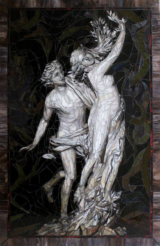
Apollo and Daphne

Apollo and Daphne was executed in a painterly style of irregular pieces and does not have the “tile-in-rows” classic andamento of an ancient Roman mosaic, but it definitely illustrates the point that you can use glass without using intense colors.
Notice the stained glass in the border. Could you find marble tile that beautifully marbled? If you did, could you cut it without it breaking along the seams of color?
This example is a picture of a white marble sculpture. Don’t let it give you the impression that you are limited to neutral-hue grays as the only alternative to intense colors.
If you can’t find a light version of a hue in molded glass tile, you can cut pieces from the swirls of stained glass and find all sorts of umbers and mosses and browns and ochers and mustards and other muted hues, and in a variety of shades too.
In Praise of Glass
Instead of struggling just to cut and shape the materials, which is what I mostly remember from my time using stone, you spend more time on the design itself if you go with glass.
Glass is much easier to cut, more affordable, and comes in more colors, including a larger selection of colors in the muted hues.
In addition to a fairly broad range of molded glass tile, there is also stained glass, which has swirled and variegated colors, and I am fairly sure that recycled glass tile is more ecologically sustainable than the amount of energy that is used to produce stone tile, which requires a large amount of machining.
Then there is the cutting waste. In some colors (types) of stone, there is a lot of waste generated when cutting with compression tools such as a compound tile nipper because some types of stone are simply more crumbly than we would like and do not have high tensile strength.
With stone, you have to sacrifice some properties to get the color you would like. Not so much with glass.
Lastly, glass tile is frost proof and can be used outside without issues, while stone tile is vulnerable to penetration by moisture and freeze cracking.
Color When You Need It
At the end of this article, I include a picture of one of my mosaics that was made explicitly to have the look and feel of a classical Greek mosaic, and so you should look at that one if that is what you are after, but first I wanted to talk about what is possible by using a restricted color palette enhanced by one or two more intense colors.
After all, people might say they want the muted colors of natural marble for their mosaic, but they sure do send us a lot of emails looking for natural stone tile in a “true blue” or “more intense green” or some other color that only occurs in semiprecious stone.

Showcase Mosaics
Artists Sandra and Carl Bryant have and impressive body of work at their website Showcase Mosaics, and I recommend that anyone needing inspiration take a look there.
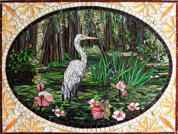
There is much to admire in Sandra and Carl’s work, but what really caught my eye were their mosaics that use a limited color palette to showcase a more intense color.
In their mosaic For Life (shown above), notice how the small flourishes of purple and blue in the wings enhance the white-gray bodies of the geese. Notice how the dark clouds around the periphery and the grayish bodies of the geese make the yellow-orange clouds explode with intensity.
The power comes from the contrast. There is the contrast of the cool blues versus the yellow oranges and the contrast of light and dark.

The above mosaic is a good example of how less is more in terms of color and creating visual interest. I love looking at snowy landscape impressionism (oil or stained glass or torn paper) and looking for the small flourishes of color and how the overall painting captures the light of the day. This is a favorite.
And yes, it is another good example of a mosaic with a mosaic with a muted color palette.

The mosaic above is another example that illustrates how glass can be used to mimic stone, even to make a naturalistic picture of a polished white marble statue.
More Inspiration
Here is some more inspiration from Sandra and Carl. See even more at ShowcaseMosaics.com.


Ancient Greek Vitreous
Vitreous Glass Mosaic Tile is generally regarded as the most generic and lackluster modern material you can use, but it is routinely used in fine art mosaic. I figured, why not use it for a classical reproduction or a mosaic in a classical style? I used thinset to mount it to an irregularly-shaped piece of flagstone for further “authenticity” as a fragmentary relic. Art goes out of the frame sometime.

Acknowledgements
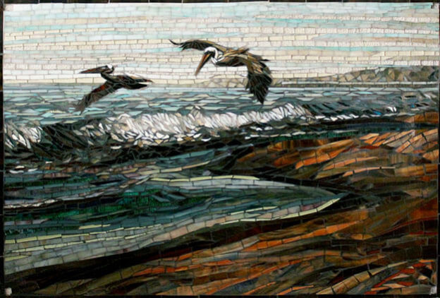
The featured image for this article is Pelicans by artists Sandra and Carl Bryant.


Leave a Reply