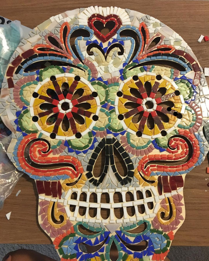
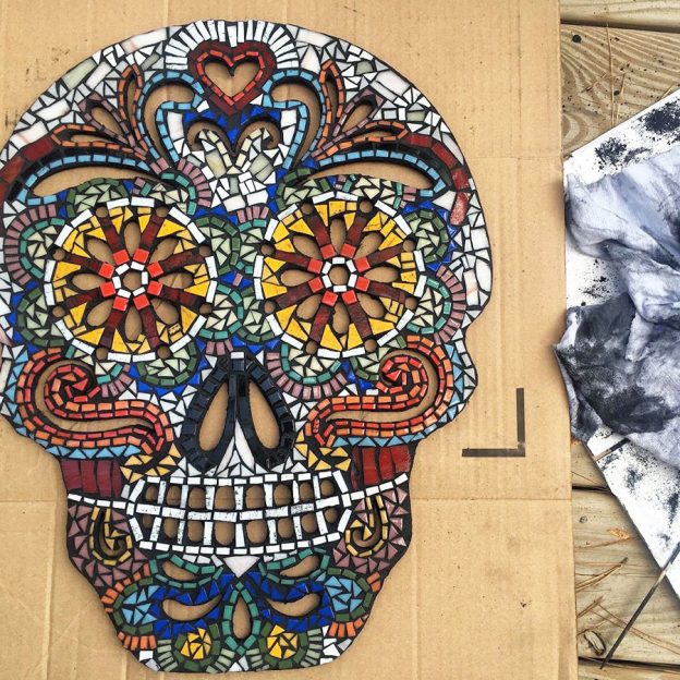
Black grouts bring out the intensity of tile colors while white grouts overwhelm them. Natalie Knox’s Day of the Dead Skull mosaic is a good example of how well black grouts work and how a light colored backer isn’t a good indicator of the mosaic would look with white grout.
Don’t Be Fooled
If you lay the mosaic out on a white backer and try to use that as an indication of what the mosaic will look like with white grout, remember this:
When the gaps are filled with grout, they won’t have all the contrast provided by empty gaps, which have depth and shadow. A lot of white concrete at the same level as the surface of the glass tends to make the colors look washed out.

Looks Can Deceive
The photo above does NOT give an accurate impression of what the skull would look like grouted with white grout compared to black grout for several reasons.
- The empty gaps have a lot of depth and shadow because the light source is bright and to the side.
- There is additional contrast (compared to the photo of the black-grouted mosaic) because the dark background shows through the many slits in the mouth and eyes.
- The ungrouted mosaic was photographed in warmer light. Imagine it in cooler saturated light like the light in the photo of the grouted mosaic.
- The backer isn’t white. It is the warm hay color of unfinished plywood. If you are set on using white, use an off white, never pure white.
Tip: Antique Whites and Light Beiges and Eggshells and Cremes and other similar light hues make better “whites” than pure white grout when used in mosaic images.
Making White Grout Work
Skulls are white, and so in this case a white grout makes sense in terms of what was being rendered. That still doesn’t change the fact that there will be a loss of contrast and the other issues explained above.
This particular mosaic could get away with white grout because the grout gaps are relatively small. The smaller the grout gap, the less flash of bright white the overall image will have scattered throughout.
If larger grout gaps are used, the mosaic image is dominated by lines of white concrete not the tile, and you find yourself wishing you had made the tiles larger. I think that would still be the case even if there is supposed to be skull or painted white face under the tile.
Tip for minimizing the visual impact of grouting:
Grouting changes the look of a mosaic, and many novices are disappointed because they used large grout gaps. To minimize the visual impact of grouting (and the choice of grout color), keep your grout gap minimal.
Tip for minimizing grout gaps:
If tiles only touch at points but not along the length of their sides, then tiles can be positioned very closely and yet still be grouted. Consider working in this way instead of carefully cutting each tile to maintain a uniform grout gap.


Leave a Reply