
Artist Mary Spadaro’s mosaic portrait Mildred is a reproduction of a mosaic she saw on Pinterest. I am reluctant to show the model image because I think the photo may be somewhat muted and blurred to enhance its verisimilitude:
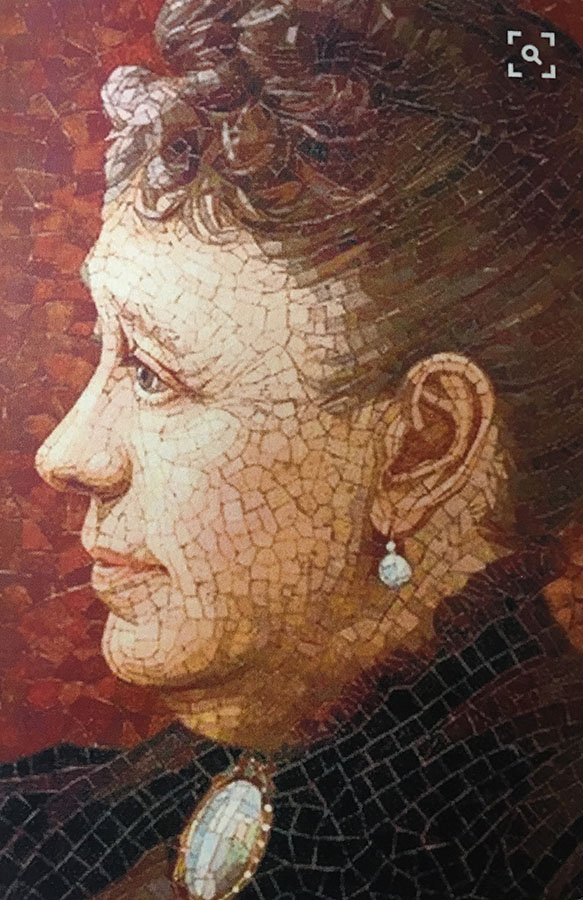
I also think the original mosaic was rendered in vintage material with beautiful imperfections and a broader selection of muted tones.
I recommend stained glass instead of molded tiles when I need a more variations of hue and shade to make something realistic or Impressionistic.
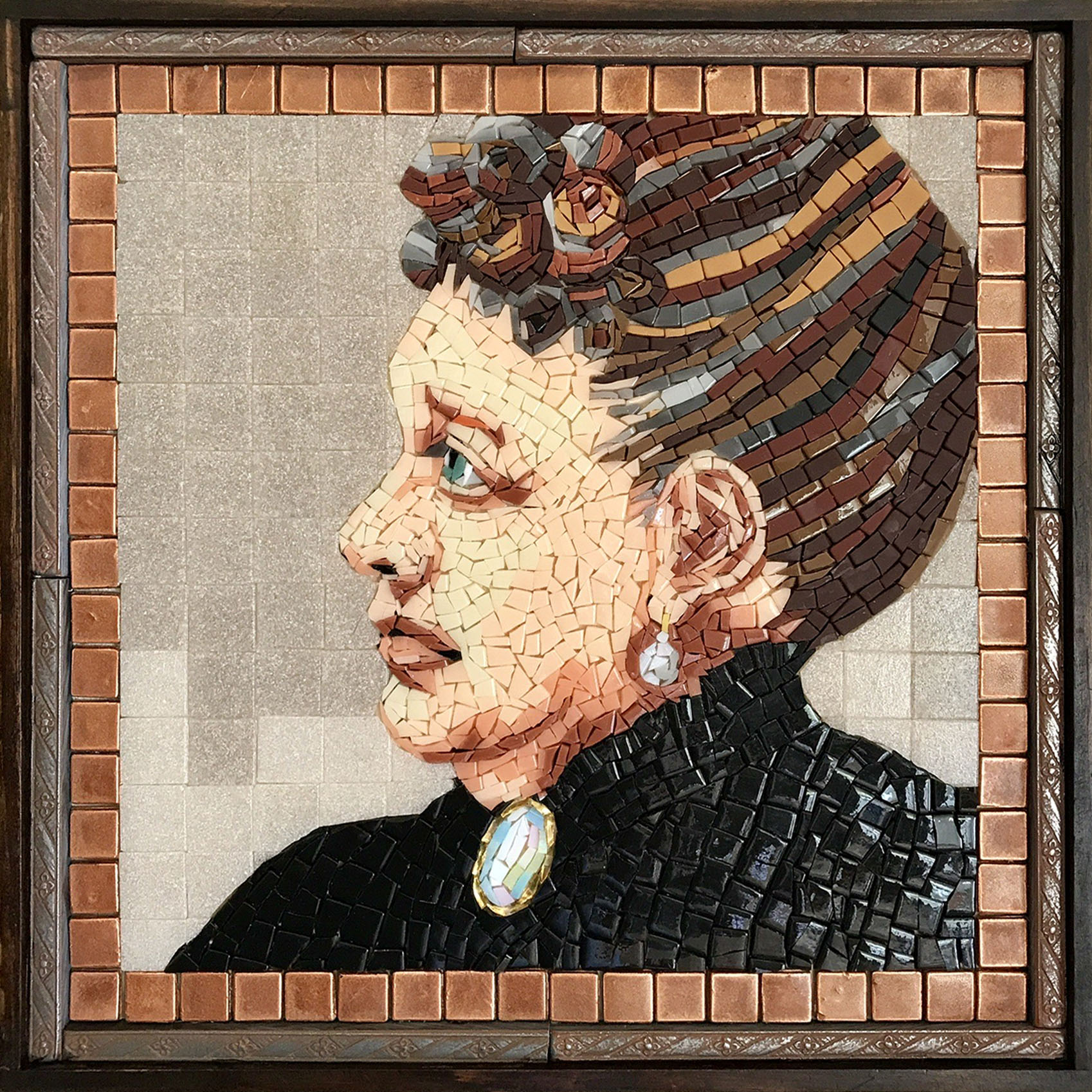
Mary says her mosaic didn’t turn out as she had intended, but she is pleased with the results.
Intrinsic Limitations
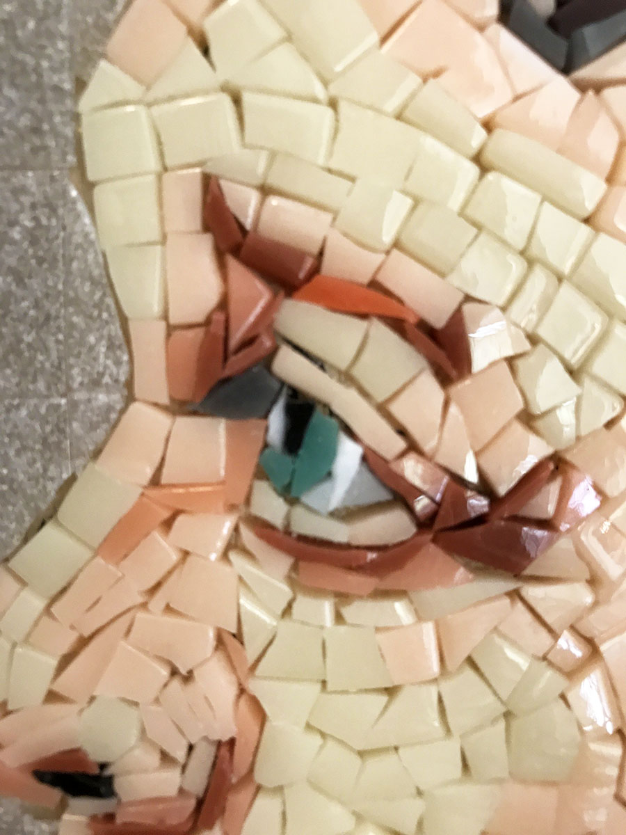
I’m very impressed that Mary was able to convert a scheme of about 12 flesh tones down to a scheme of about 4 to interpret this image in molded tile.
The porcelain tiles that Mary used can’t be cut as small and as narrowly as stained glass.
To achieve the same level of detail in porcelain tile, the size would need to be increased.
TIP: The lesson here is that materials determine the level of sophistication that is practical and that you can defeat those limitations by working at a larger scale and mixing materials to supplement the color palette.
Details Matter
Given the scale Mary was using, I’m not surprised that individual likeness wasn’t captured, but I am still impressed with the level of sophistication in the rendering.
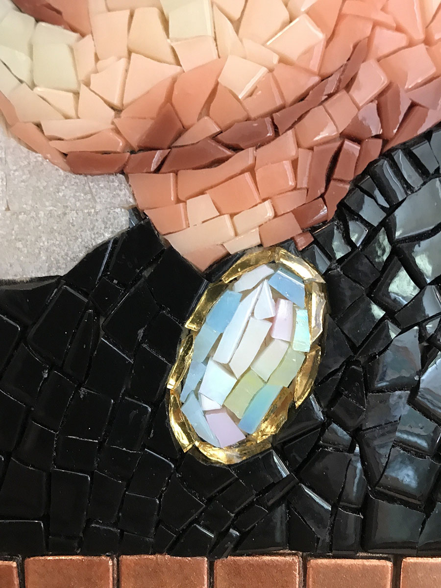
I love the brooch below. It’s such a good example of the power of suggested detail compared to an overworked rendering:
Backgrounds
Mary did something I recommend. She laid out tiles to see what background color she liked:
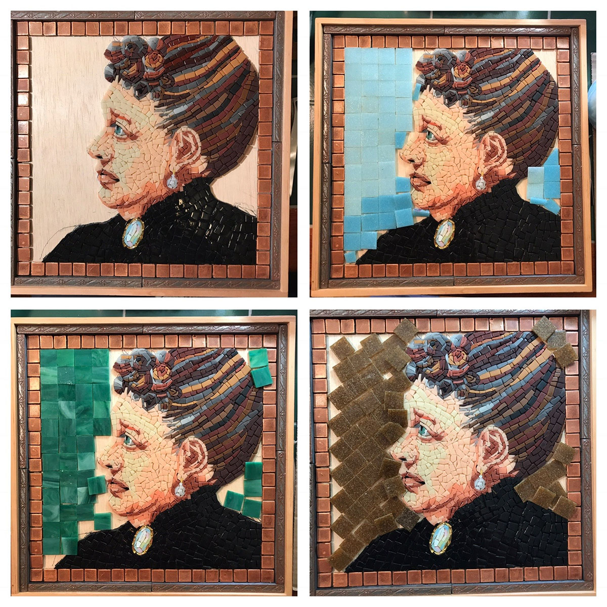
I have to say I really like rich green stained glass tile background in the lower left.
There is light-dark (value) contrast between the face and the background, and the green is the perfect contrast of hues with the copper colors of the border and hair.
I suspect Mary may have chosen the off-white background because she had been struggling to make her porcelain tile as subdued and muted as the vintage materials in the model.
If so, I think the background color might be an instructive example of how the characteristics of the model can be both a guide and a trap, especially when executing in a different type of material or dealing with some other challenge.
In this situation, you have to let a work of art take on its own life independent of the model.
But it’s also possible that Mary simply preferred the white or disliked the green.
Artists might not have to stay true to the model, but that model in the head or the original idea seems to exert even more control.
I know it does with me. I make a conscious effort to remember to let things go their own way when they need to.
Leave a Reply