Category: Improving Your Art
-
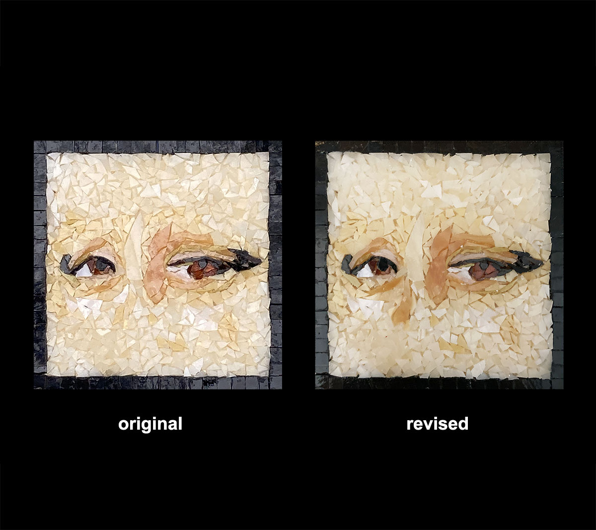
Finishing Touches and Revising Mosaics
I had previously written about Lisa Sunshine’s Eyes Mosaic in my blog article The Importance of Context in Figurative Mosaic Art. In the article, I addressed the problem of the mosaic not being instantly recognizable as eyes, and I recommended extending the bridge of the nose slightly to provide context. Lisa took me up on…
-
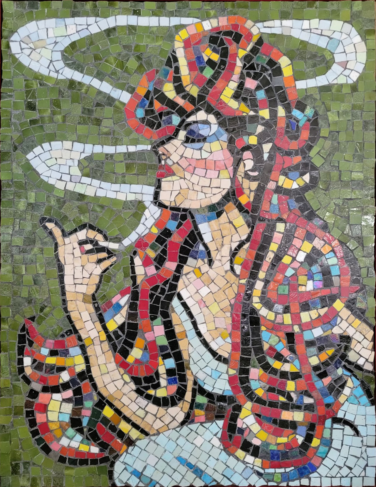
Building a Mosaic Portfolio
Artist Jacqueline Spohnholtz is building a mosaic portfolio to solicit commissioned work, and she is doing it in an intelligent way in my opinion. Of course the portfolio needs to be uploaded to an online platform such as the artist’s website or Instagram, and it needs to be built from catalogue-quality photographs (full spectrum white…
-
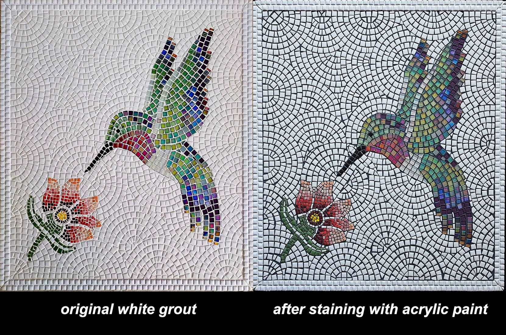
White Grout Case Study
Artist Mark Eibes‘ hummingbird mosaic is figurative art made from (mostly) whole tile, and it makes a great case study for deciding if you should use white grout for your mosaic artwork. Mark wasn’t satisfied with the white grout, and so I explained how the grout of dry indoor mosaics can be stained by with…
-
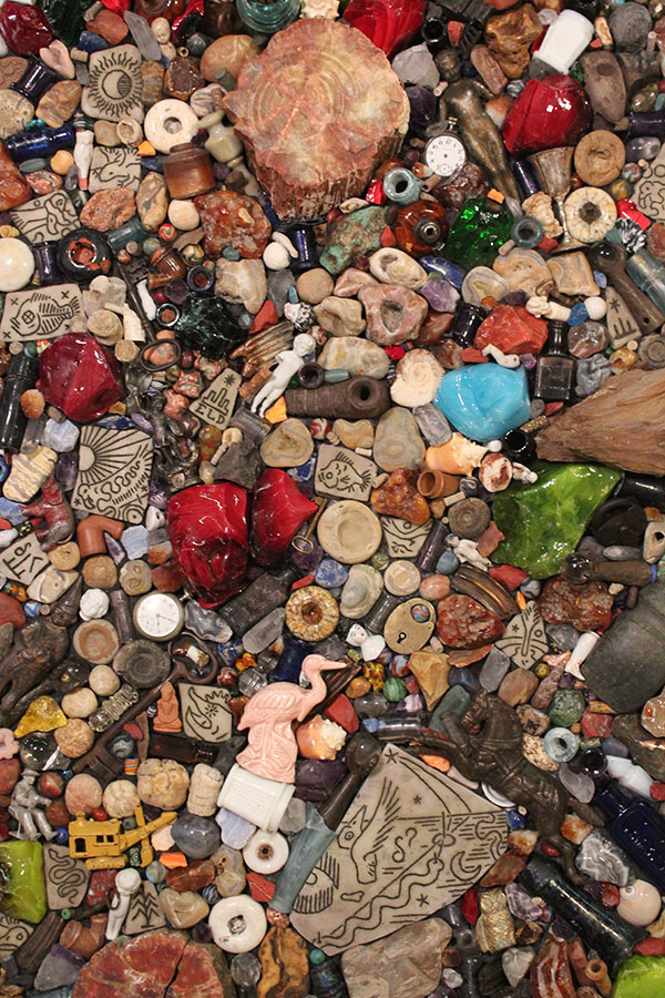
Nested Found-Object Mosaic Art
I sometimes make found-object sculptures and surfaces with many different types of objects but without conventional tile or with conventional tile used only for a particular element. All of these found objects are made from durable materials such as glass, porcelain, and hard varieties of stones If the mosaic is indoors, I will also make…
-
Getting Mosaic Artwork Right
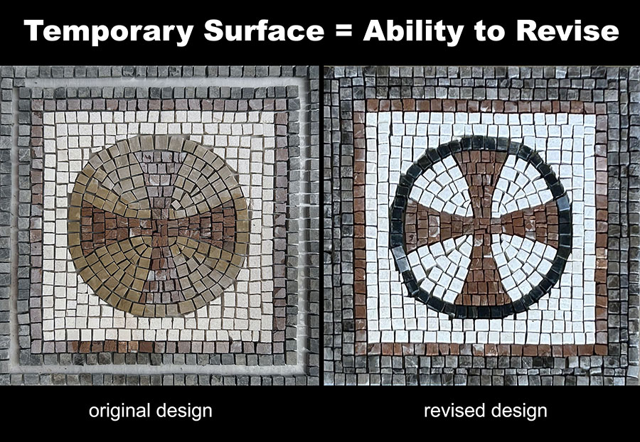
Many artists are plagued with self-doubt, including some of the great ones, but there are several ways to overcome these fears and make better art: The first of these are quick, small studies and sketches which can be made before a particular detail in the main work is executed. In mosaic, a “sketch” can be…
-
Thoughtful Backgrounds Improve Mosaic Artwork
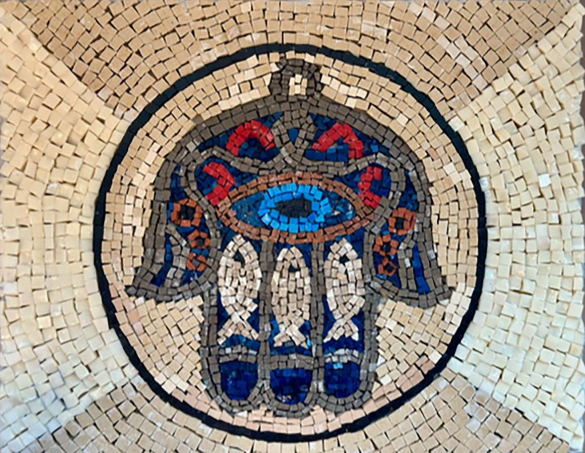
Artist Bonnie Eisner emailed me a photo of her Hansa (Hand of Fatima) mosaic in progress because we were out of the color she wanted to use for the whole background. My solution to the shortage was to take the problem as an opportunity to enhance the design by using andamento, color variation, and pattern…
-
Weldbond Mosaic Tile Adhesive Outdoors?
Weldbond is a PVA (poly vinyl acetate) adhesive that is the best all-around adhesive for dry indoor mosaic projects and craft projects. It is water based, nontoxic, fume free, archival, easy to clean up, and water resistant when fully cured. Note that Weldbond is water resistant and not waterproof. There is a significant amount of…
-
The Importance of Context in Figurative Mosaic Art
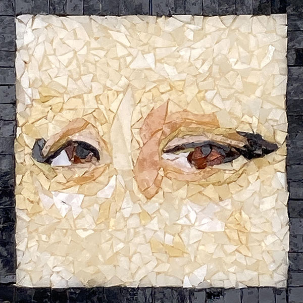
Artist Lisa Sunshine emailed us asking about improving one of her recent mosaics, and Natalija and I both agreed that the problems Lisa perceived in her work largely disappeared when the mosaic was viewed at the appropriate distance. The situation reminded me of a line from the award-winning 1995 movie Clueless, which is the story…
-
Framing and Hanging Exterior Mosaic Plaques
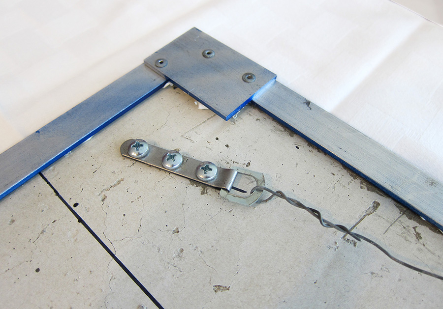
Artist Brad Srebnik’s mosaic street number plaque is worth taking a look at for several reasons. It has a harmonious color scheme with good warm-cool contrast, it’s tightly executed, and the numerals have crisp outlines and subtle curves in a distinct font style. If you are thinking about a project with mosaic numerals or letters…
-
White Tile in Mosaic Artwork
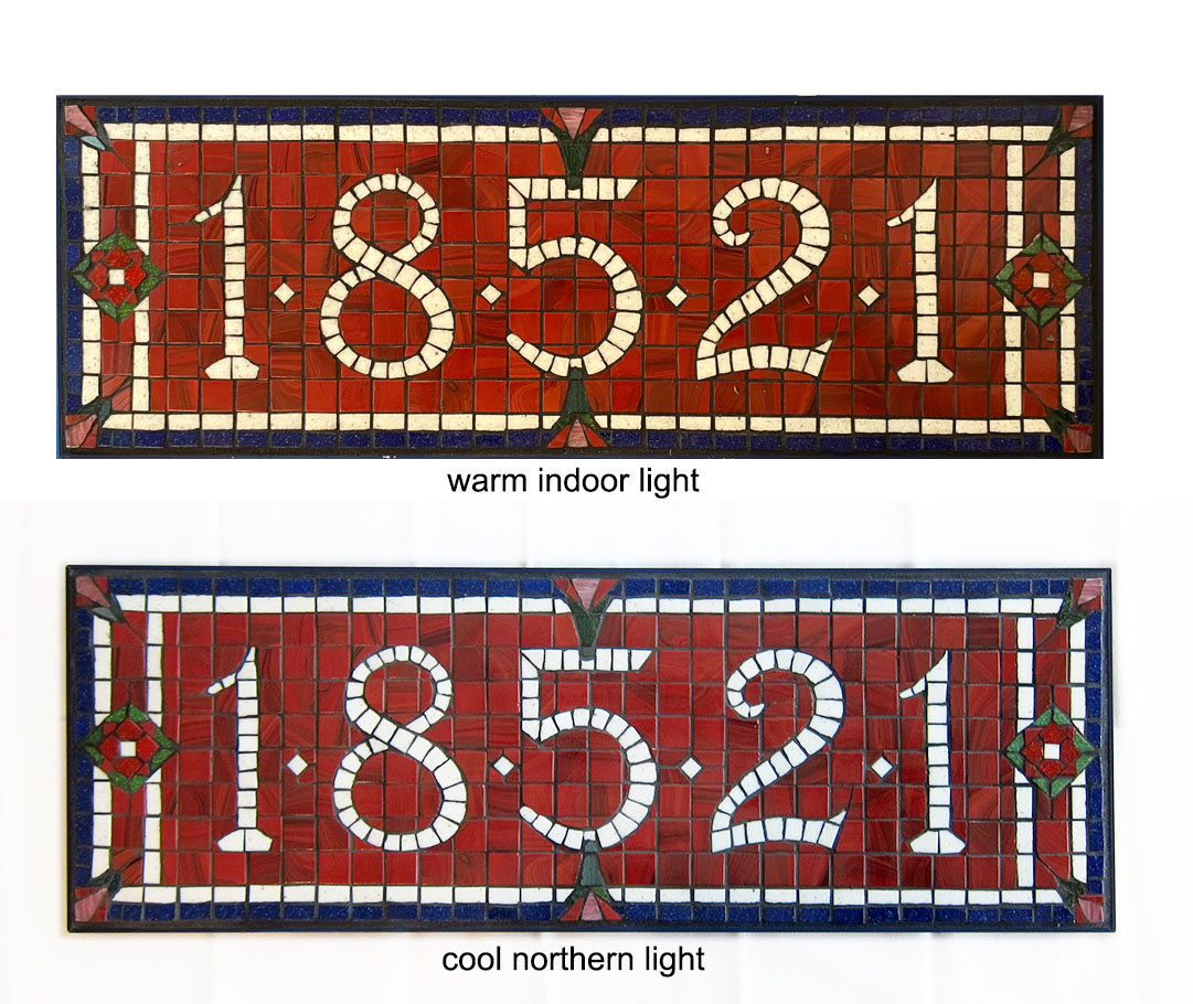
Artist Brad Srebnik‘s latest mosaic street number sign is a good example for a discussion about white tile in mosaic artwork. I also think the color scheme is excellent, and I wanted to say a few things about that. The green and blue and red are all intense but not bright. The color scheme is…
-
Mosaic Surfboards
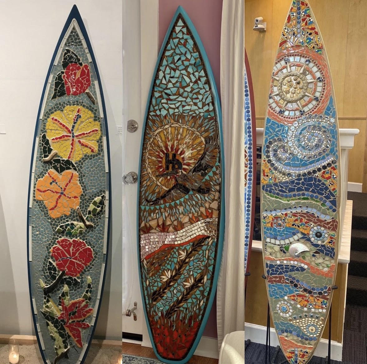
Hermosa Beach artist Katy Jenssen makes mosaic surfboards, and for her, it is a logical choice of sculpture base. Katy’s family history and ethos are grounded in the local community, a premier beach town and surf destination, part of an area where a lot of Americana was born. Katy’s compositions fit the shape of the…
-
Value Contrast in Abstract Mosaic Artwork
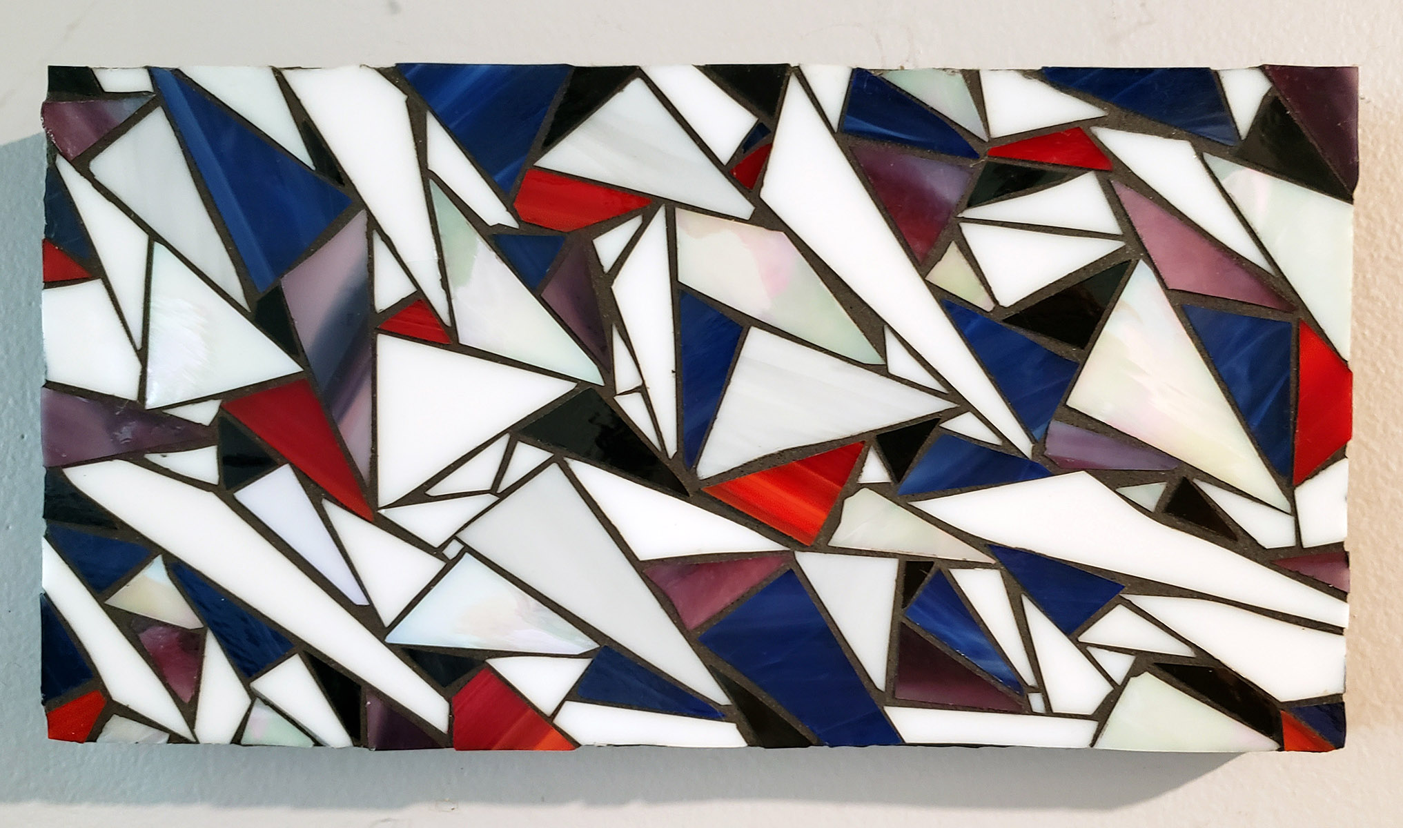
Natalija has made some abstract stained glass mosaics over the years, and I noticed something about one of them last week: It’s as a great example of value contrast and its power for creating a sense of depth and increasing visual interest. I’ve written previously about the importance of value contrast in figurative mosaic artwork…
