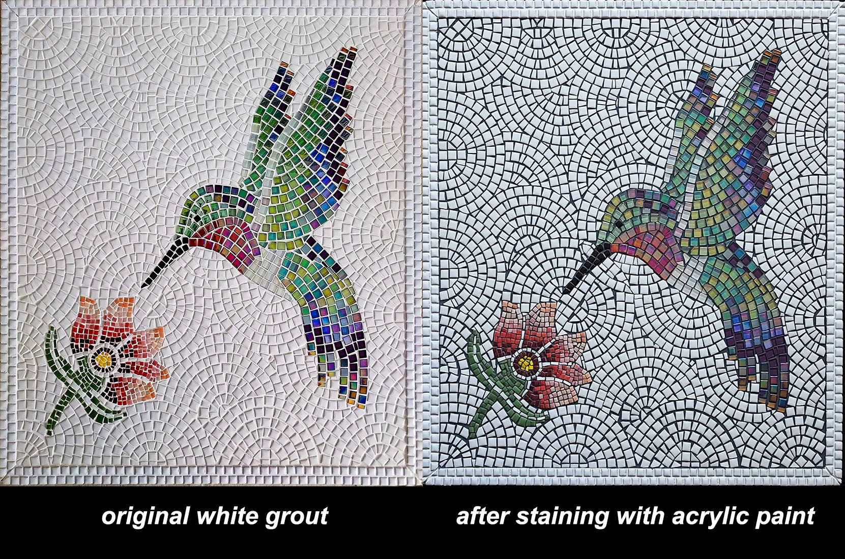
Artist Mark Eibes‘ hummingbird mosaic is figurative art made from (mostly) whole tile, and it makes a great case study for deciding if you should use white grout for your mosaic artwork.
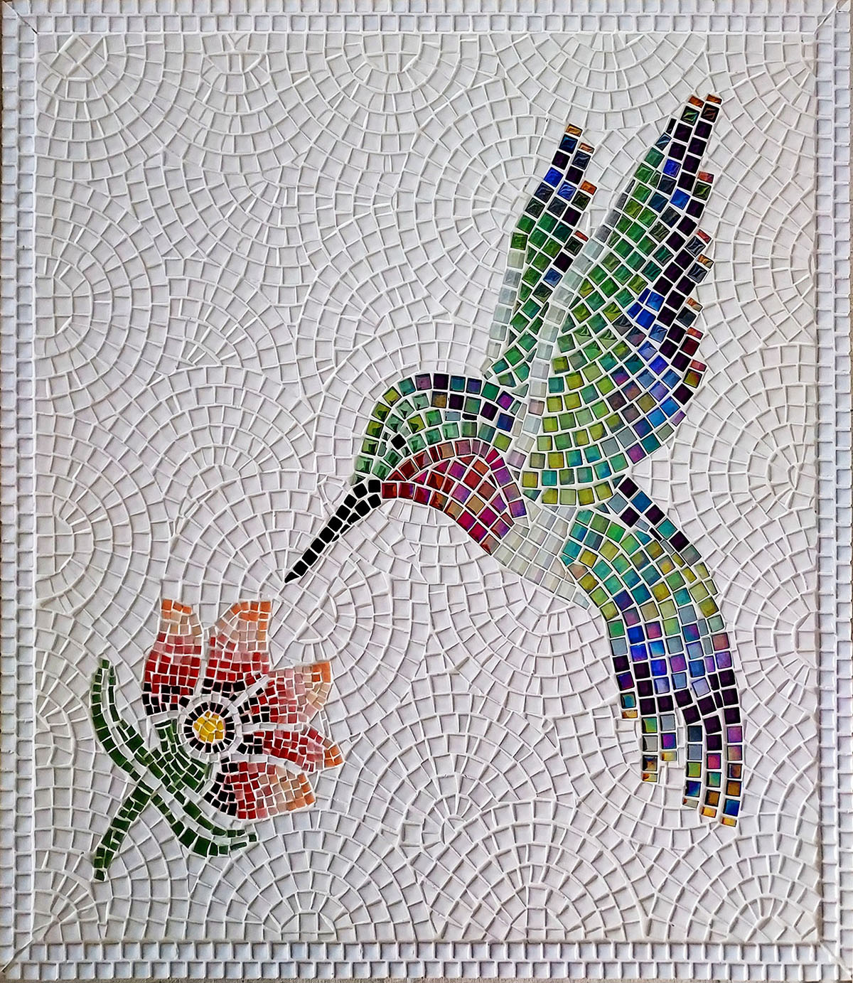
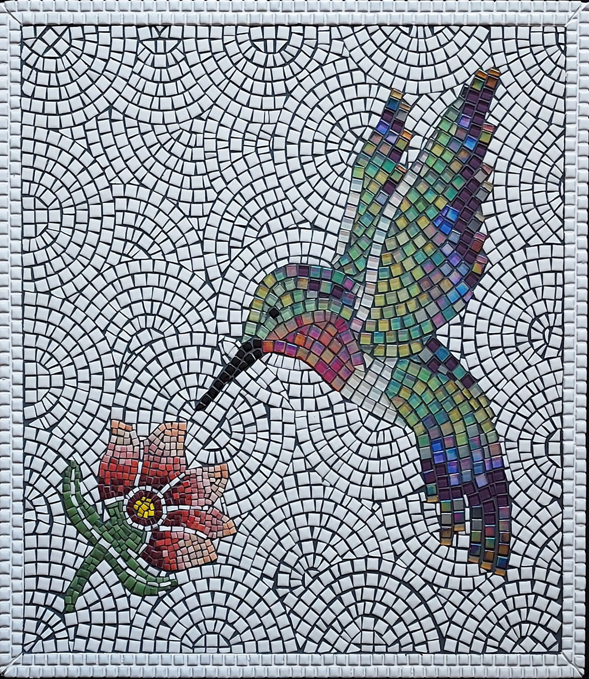
Mark wasn’t satisfied with the white grout, and so I explained how the grout of dry indoor mosaics can be stained by with artists acrylic paint in a “wipe on/wipe off” process similar to applying wood stain.
Another teaching point about the mosaic is that the choice of a dark color for the grout stain had an “unexpected” consequence, which demonstrated how basic visual elements (color, contrast) trump any concerns about precision.
White Grout
The rule is: for a mosaic with a craft aesthetic or print aesthetic, use white (or off-white) grout, but for maximum trompe l’oeil, use dark grouts. The cracks between adjacent objects are naturally dark not filled with white light.
One problem viewers might have with white grout in the white background of Mark’s mosaic is that it makes the mosaic look like it might be molded from some material like plaster and not true mosaic.
The extreme precision of the challenging andamento only adds to connotations of being factory made.
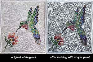
A quick “squint-test” comparison of the two versions using thumbnails side by side reveals that the dark grout stain provided some much-needed contrast and visual interest in the background and made the figures more solid and lifelike.
Naturally, some viewers will prefer the original white grout in the background, but my thought was this:
If you had that much work invested in the andamento of the background, why wouldn’t you want it to be more clearly visible at a distance?
Also, I have to look at a lot of factory-made mosaics and craft-kit mosaics in the barrage of emails I receive from Chinese manufacturers.
White is big with them. So are precision and templates. They’ve got white, bright perfection covered.
Dark Grout Stain
A word about “unexpected” problems.
When I recommended a dark-colored grout stain to Mark, I had no idea that the contrast would reveal imperfections in the andamento of the background. All I could see with the white grout was an extraordinary level of precision.
Having cut and set every single tile, Mark was thoroughly aware of these imperfections.
I can’t put into words how important Mark’s decision to proceed was in terms of artistic development.
Artists tend to obsess over “flaws” in their work that are details everyone else doesn’t even notice or think are important. I am particularly prone to this. I am an engineer and maker as much as an artist.
I’ve noticed that I sometimes waste large blocks of time on “correcting” or “perfecting” some small problem with a mosaic or painting that turns out to be irrelevant when I look at the work with fresh eyes.
Worse than that, my fresh eyes then notice some larger issue that I completely ignored because I was focusing on the wrong thing.
That is why Mark’s reworked mosaic seems like a triumph to me.
The dark grout makes the inconsistencies in the grout line instantly visible, but the trade off in terms of increased contrast and visual interest make the exchange a bargain.
Also, these flaws in the andamento give it the signature of authenticity and evokes similar flaws in ancient Roman mosaics.
It is so vitally important to get the basic visual elements correct (tone, contrast, color) compared to precision.
TIP: If you are incorporating some amount of error or irregularity in your mosaic background, spread the love around and not have all the errors in one zone.
Fun Fact: In ancient Roman mosaics, you can sometimes see places where less-skilled hands worked side-by-side with more skilled artisans. The discontinuity in skill wasn’t always due to later repairs or divided between detailed figures versus background.
Leave a Reply