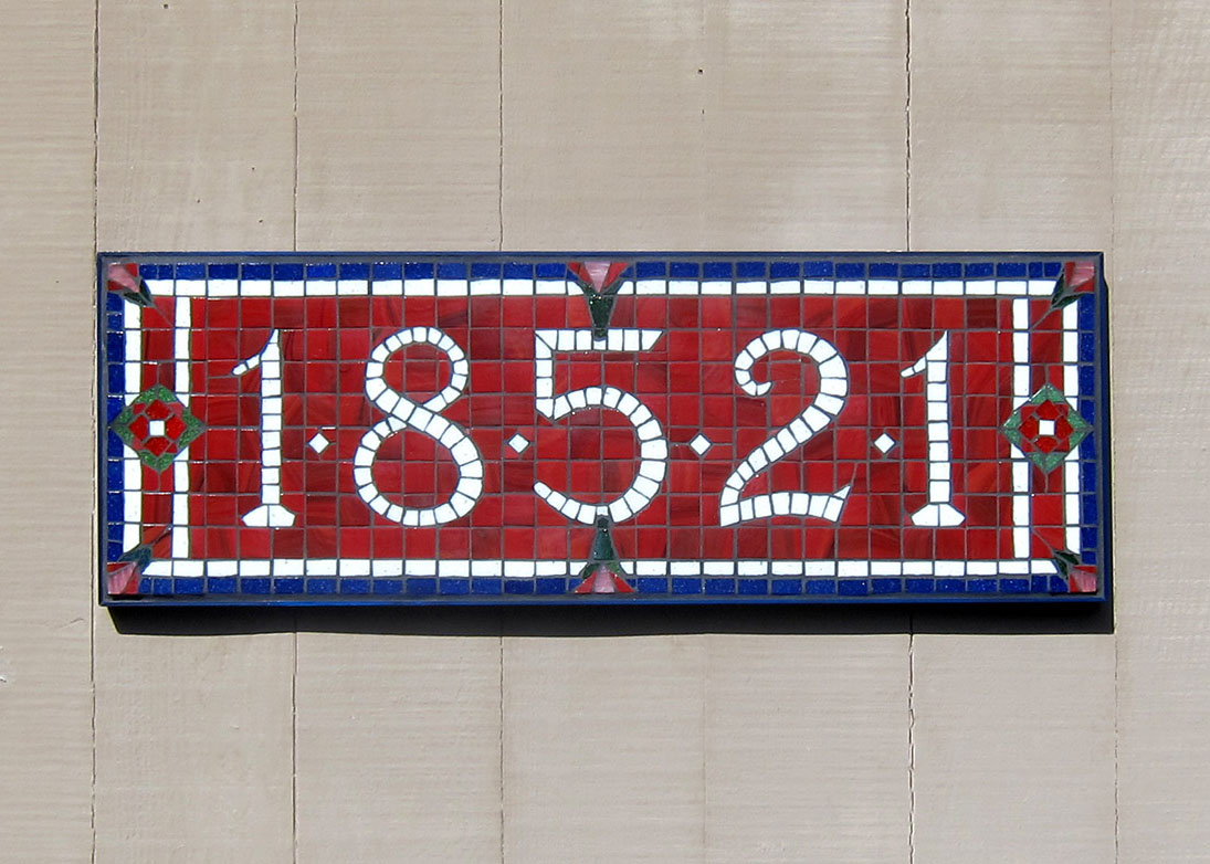
Artist Brad Srebnik‘s latest mosaic street number sign is a good example for a discussion about white tile in mosaic artwork.
I also think the color scheme is excellent, and I wanted to say a few things about that.
The green and blue and red are all intense but not bright. The color scheme is all “in the same key” (instead of being a mix of intensities) and so the mosaic looks more sophisticated.
I think the accent of green was a critical addition. The choice of a dark marbled red instead of a bright primary red also goes a long way toward creating an antique look.
With an antique look in mind, an antique white or ivory might have been chosen instead of pure white.
In the case of Brad’s mosaic, the choice of pure white was in part determined by the color of the site of installation: an exterior wall that was painted a tan-hue cream color.
The pure white makes a bright contrast while an off-white risks not looking distinct enough or not being the best choice of hue.
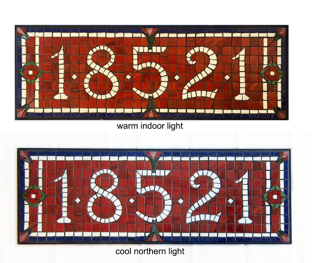
Lighting is another reason why you might want to use pure white tile in your mosaic even though your artistic instincts might be to use a faint tint or off white instead.
White vs. Off White
Painters rarely use white paint without tinting it with some hue, usually a warm tone color, or shading it with a tiny amount of umber or black.
Choices of white available in molded glass tile are limited to a handful of options, and most of the tints are more colorful than desired.
The usual approach for making use of these tints is to mix pieces of them with pieces of pure white, but that requires working on larger scale or cutting the pieces smaller.
For many designs, only one row of tiles can be used for a white element, and so pure white or off white makes a better choice than a warm tint, which risks being too dark in lower light levels.
Most indoor light is warmer and fainter than task lighting, and so a pure white can take on a warm hue in appearance:

Keep that in mind if you are considering a light tint of some warm hue instead of pure white.
Colors like eggshell white, ivory, and antique white make good “whites,” but anything tinted more intensely can look too dark in low light environments to make a good stand in for white.
Here I am thinking of colors like Butter, which does better as an a augmentation to white than it does as a white replacement.
Leave a Reply