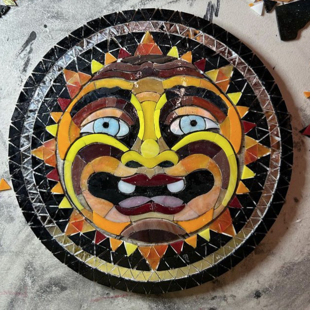
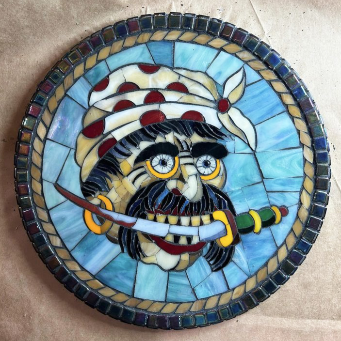
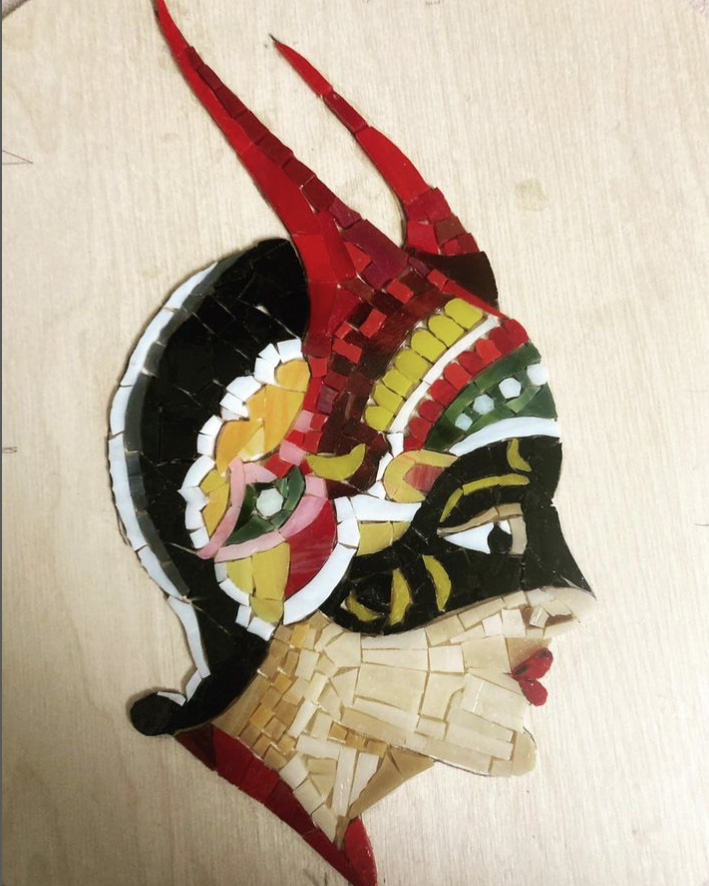
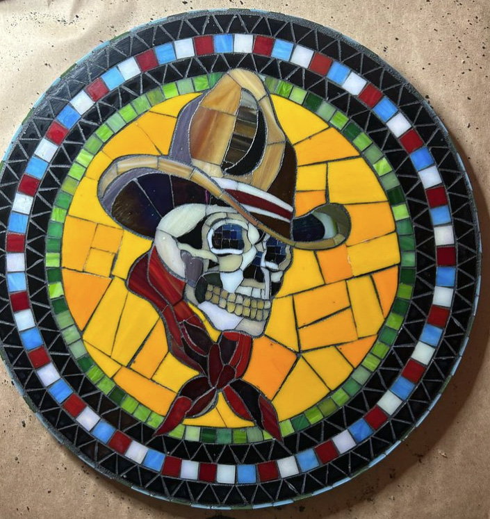
Artist Sheldon Stehman‘s tattoo-inspired work demonstrates the vitality of the mosaic medium and how surprisingly well it accommodates contemporary pop-culture designs and themes.
Sheldon uses classic tattoo designs as models for his mosaic interpretations. I think that was an inspired decision.
Body of Inspiration
Tattoo design is informed by animation and cartoons and other modern forms of illustration, and so that medium has a lot to offer in terms of bringing freshness to mosaic.
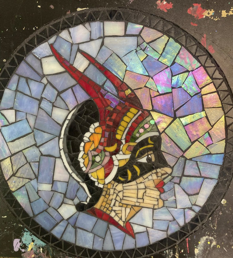
This freshness of theme is very important for the success of contemporary mosaic as a fine art because most people think of the medium primarily in terms of classical Greco-Roman designs or their reproductions.
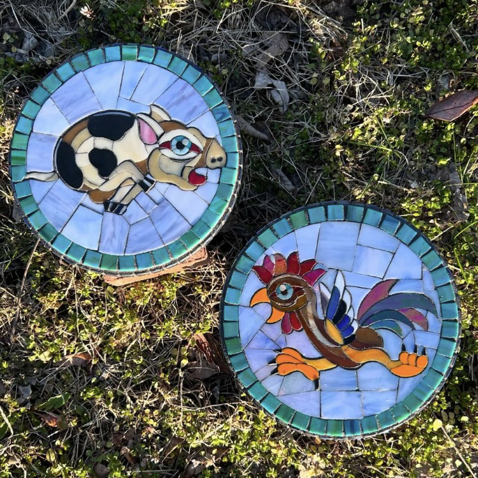
Artistic Skill
In addition to having fresh themes and designs, Sheldon’s mosaics are tightly executed and well done.
And just so we can all feel a little more inadequate when we look at Sheldon’s work, keep in mind that he hasn’t been doing mosaics for very long…

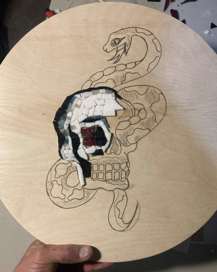
Also, Sheldon doesn’t lay up his designs on a temporary surface to make the work easier. Instead, he glues each tile directly onto the backer one tile at a time, which is a lot more unforgiving and takes more time.
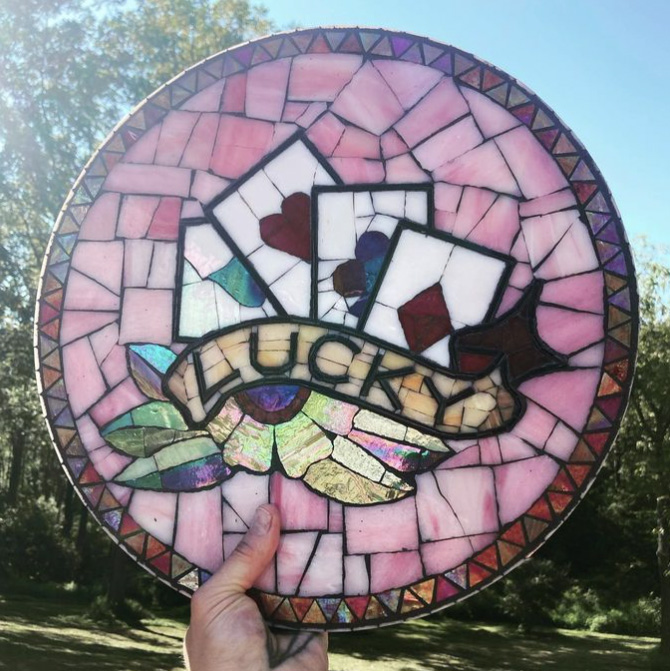
Sheldon’s direct method doesn’t allow him to edit things, which makes his impressive results even more impressive.
Fundamentals of Visual Art
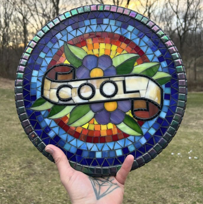
The best art is always like a lesson, as if the art was a teaching example of a fundamental concept or two.
In the above mosaic, notice how the warm red, orange, and yellow tiles provide contrast to the cool colors. Would the blues and greens and purples look as cool without this warm contrast? Nope.
Also, the warm sunburst behind the flowers and banners creates a sense of depth.
The Cool Mosaic has contrast of hue (warm versus cool), and it also has contrast of value (light versus dark).
Materials and Methods
Sheldon is using a high-quality PVA adhesive such as Weldbond to glue glass tiles and stained glass to plywood backers.
Illustrations Versus Photos
Sheldon creates his mosaics by gluing tiles directly to the backer.
That method requires Sheldon to commit to all the colors that go into the figure before he can see how the figure looks in mosaic.
I prefer to lay up mosaic designs on a temporary surface so that I can quickly compare different colors for a particular detail.
I have found a temporary surface to be necessary when working from a photograph as a model.
Why is that?
When you translate a photograph into a mosaic, you sometimes find that you need to simplify a repeating detail that occurs in multiple places.
It’s hard to go back and revise what you have already done if it is glued down.
Hence the need for a temporary surface when using a photo as a model for a mosaic.
One HUGE advantage of using an illustration instead of a photo is that the work of stylizing the image has already been done.
This allows the artist to focus on rendering the image in tile, which is demanding in itself.

Leave a Reply