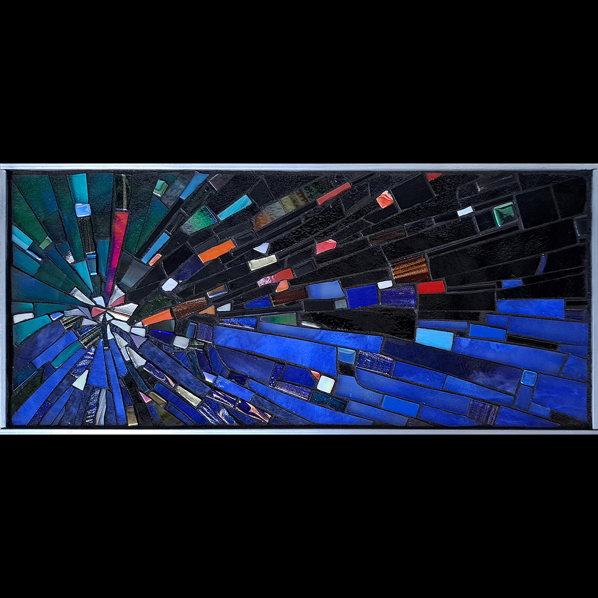
Natalija Moss’s latest mosaic is a small work of 12 inches in width, but it demonstrates the power of contrast in value and of contrast in hue.
Hue Contrast
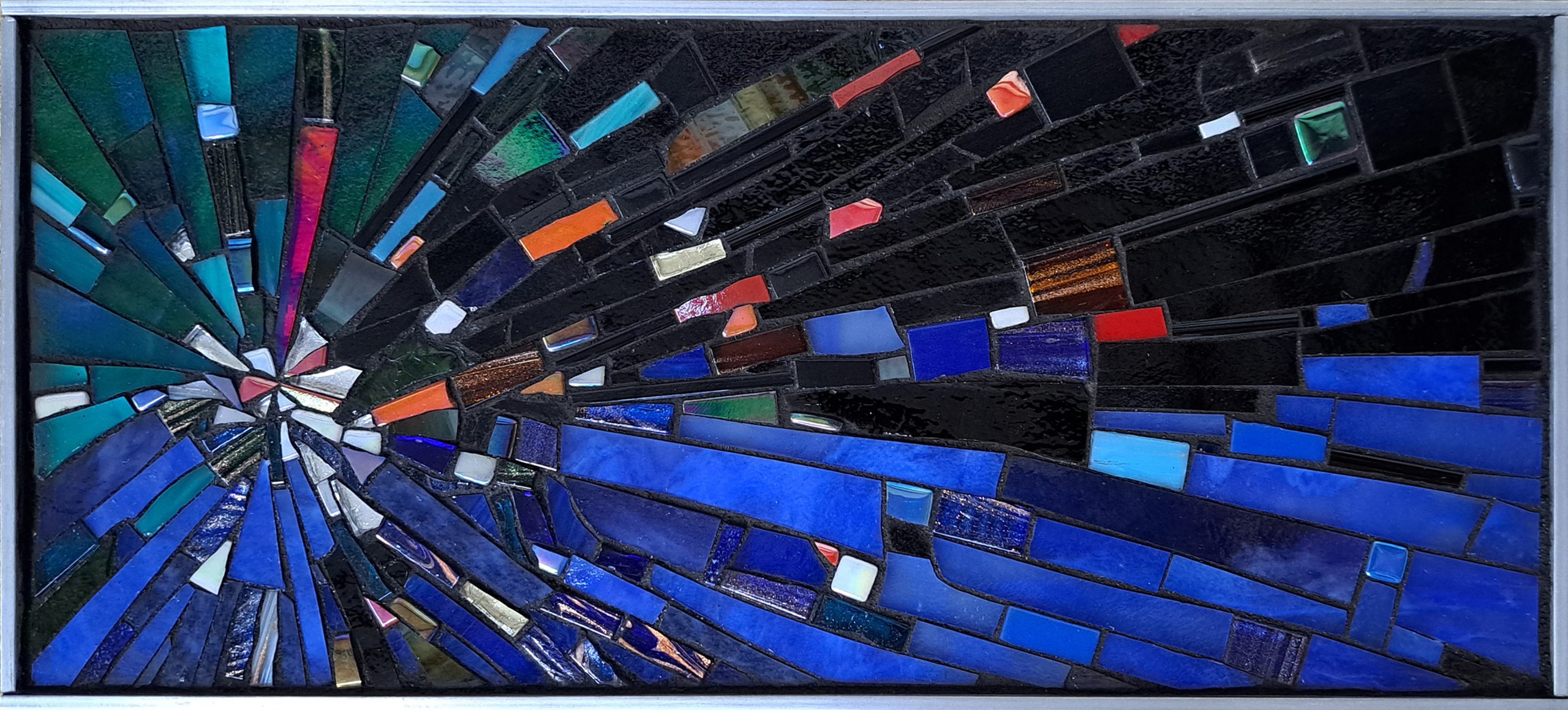
Notice how the few pieces of red and orange leap out from the cool green and blue hues of “the background.”
The mind naturally thinks of warm colors as being closer and cool colors as being further away.
That rule of perception isn’t culturally constructed. It’s how our brains work, a basic piece of biopsychology.
Notice also how well the few warm-colored tiles stand out because of the cool hues of the background.
What’s less obvious is how these warm colors make the greens look more intensely green and the blues look more intensely blue.
Value Contrast
Just as there are only a few warm red and orange tiles, there are only a few white and light-colored tiles, and yet these tiles have a huge visual impact for a similar reason:
The white and light tiles contrast with the darker colors and black that make up most of the surface.
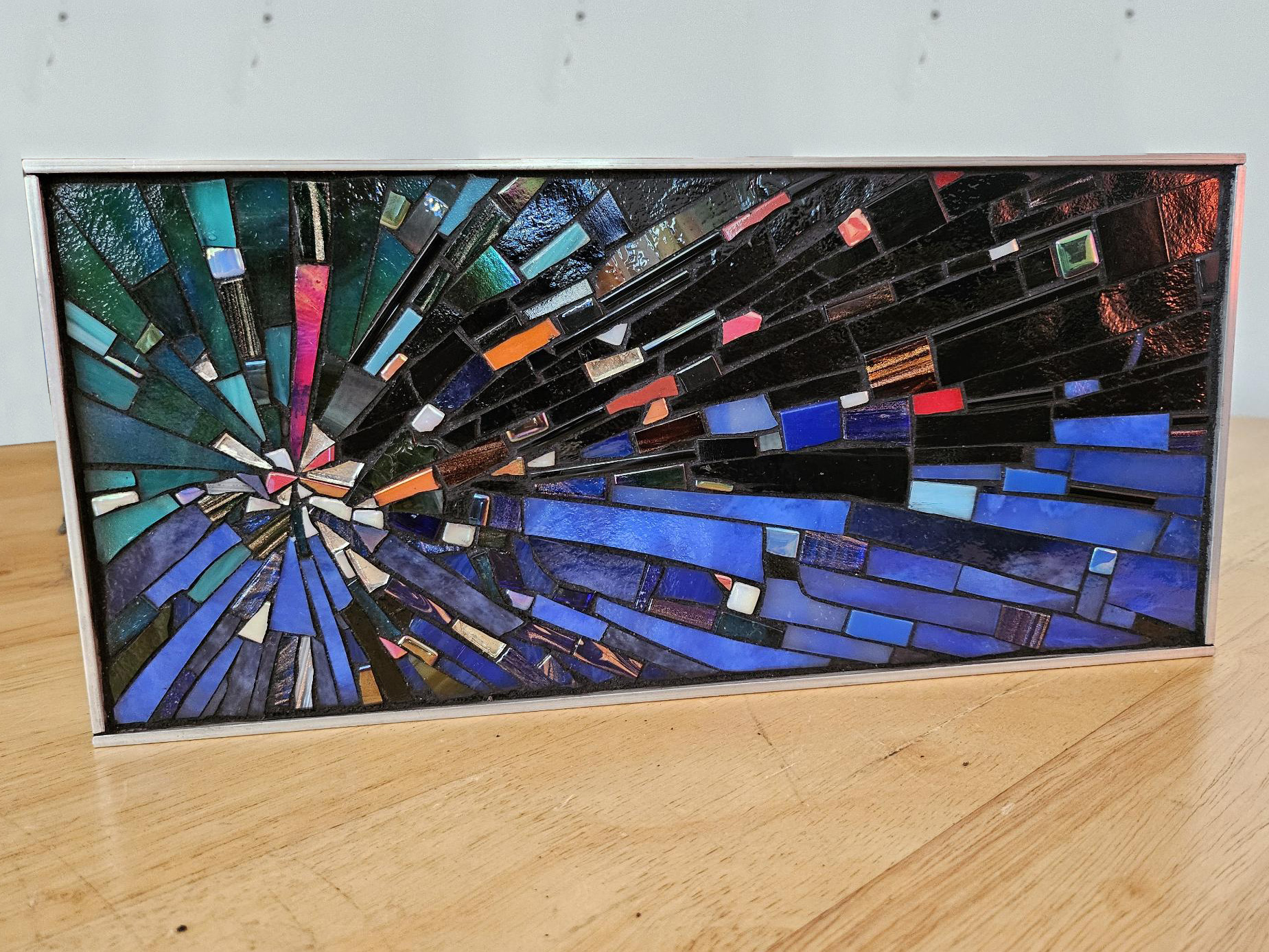
Display and Lighting
I’ve never made anything without looking at it and thinking of ways I might have done it differently.
Second-guessing yourself after the fact can be demoralizing, but it is an important part of the process if you are serious about improving your art.
Any regrets we have teach us to slow down and be more reflective on our next project.
All too often we our hypercritical of our own work and see only the “flaws” (both real and imagined) that no one else would even notice.
Other times we make serendipitous discoveries.
Notice how the red light in the photograph above shows us what the mosaic would look like with a small amount of red glass instead of black glass at the top right corner.
I think that little bit of red adds quite a bit to the mosaic.
Not that the mosaic isn’t successful at it is, but this sort of reflection is worth doing because there is always the next mosaic.
Mosaic Workstation
Here is a photograph of the workstation Natalija used to make her mosaic.
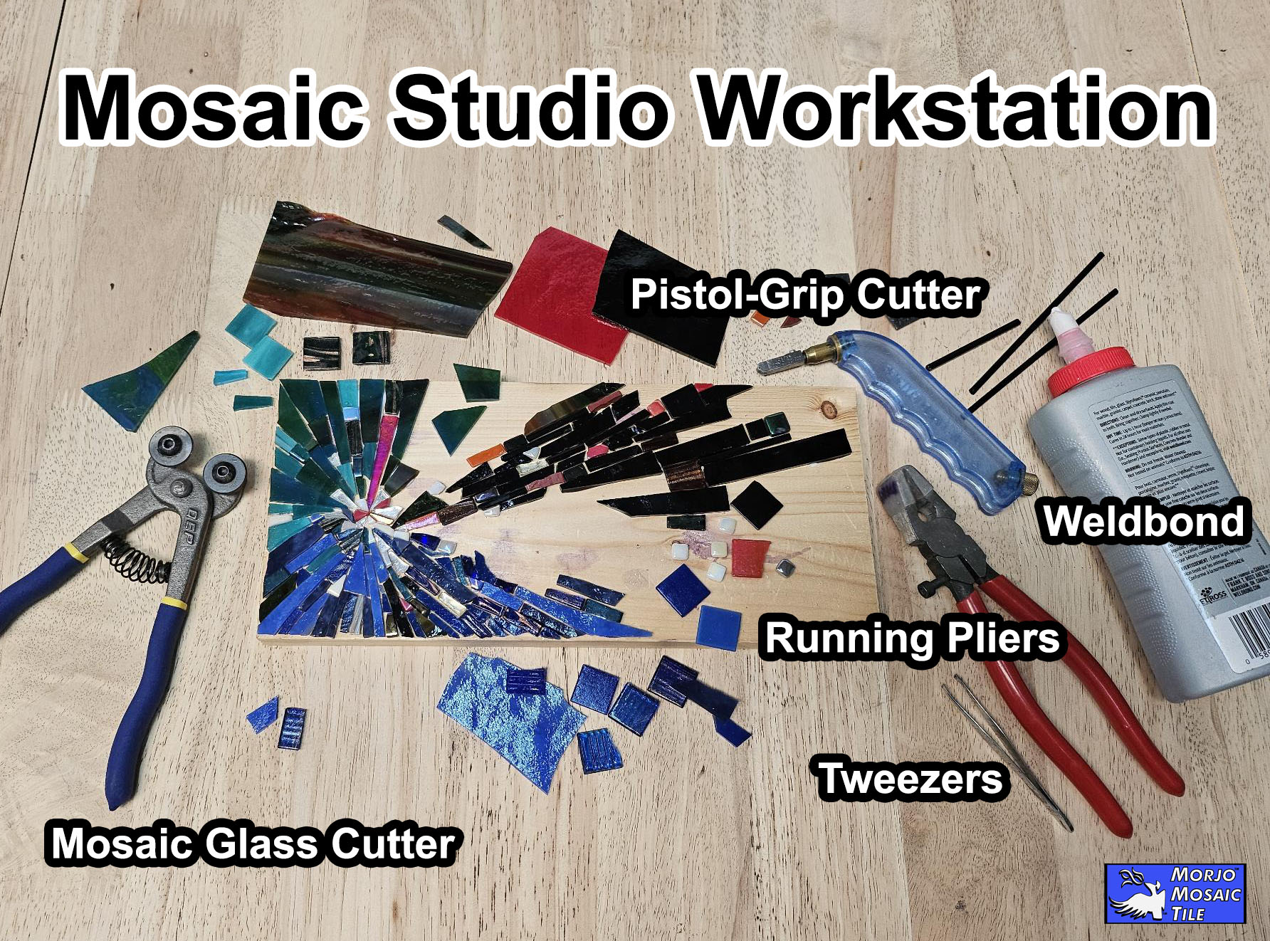
Notice how compact the work area is and how little area is needed to make a mosaic.
Two things not shown in the photo are a Steel Ruler (or some other straight edge) for wiping away glass slivers and a shop vac for cleaning up after a work session.
High-Resolution Image
Below is a high-resolution photo of the mosaic:
Leave a Reply