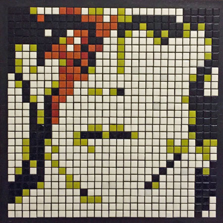
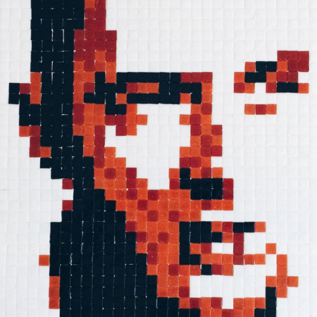
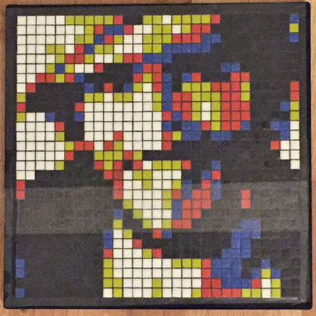
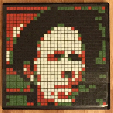
Fredrik Tigerstrom (“T29ART” on Instagram) has made some impressive mosaic portraits of rock icons David Bowie, Bruce Springsteen, Joe Strummer, and Tom Waits. These mosaics are worth sharing for several reasons, and not merely because they are faithful renderings of famous people. Yes, these mosaics are “accurate” in terms of capturing individual likeness, and that is an accomplishment most any artist would be proud of, but what makes them noteworthy is that the artist was able to achieve this verisimilitude in spite of using arbitrary colors (not flesh tones) and using whole uncut tiles in a rigid grid pattern. Also, the total number of tiles in each mosaic is relatively low (29 x 29)! To fully appreciate how successful these mosaics are, look at them at a distance or at low resolution.
David Bowie Aladdin Sane Mosaic

A mosaic design laid up in a plastic mounting grid can be picked up using mounting paper or mounting tape (or clear packing tape if you are on a budget). All of these portraits were made with 10mm (3/8 inch) glass mosaic tile.
Joe Strummer Mosaic

The gridded patterns used in Fredrik’s mosaics are the exact opposite of the flowing contours I like to use in my artwork, but they are successful, and there is plenty of visual interest. The gridded patterns are also very hip because they resemble the pixels of digital images, and this calls attention to the fact that these are contemporary interpretations of an ancient medium.
Bruce Springsteen Mosaic

Note how the black plastic grid lines between the tiles make the colors more vibrant. That is why we recommend medium gray and black grouts instead of white and lighter colors. If you do make a dry indoor mosaic and use a light color grout and are unhappy with it, you can rub artists acrylic paint on the mosaic, which will stick to the porous grout and wipe off the glass tile. Using acrylic paint, you can go from white grout, which makes colors look bleached out, to a dark umber or black, which makes colors look more rich.
Tom Waits Mosaic

Flesh Tones Required?
The mosaics above are successful in spite of not using skin tones, but most portraiture is rendered using natural colors. For that reason, we get many emails from people asking which tile is our best light pink or coffee color for making skin tones, depending on which ethnicity they are trying to portray. My answer usually vexes people because it is not the simple one-color solution they were expecting.
Even if you are trying to work as photorealistically as possible, you don’t need (or want) one color that best approximates a particular person’s skin tone or even their ethnicity in general. The reason you want multiple colors is that uniform color fields are boring, and you want to vary the color to create visual interest and to render light and shadow. The best example we have of this on our website is Harjeet Singh Sandhu’s work at the bottom of our mosaic portraits page. Harjeet’s portraits on that page really are worth studying if you are planning to make a mosaic portrait yourself and have concerns about color accuracy.

Leave a Reply