
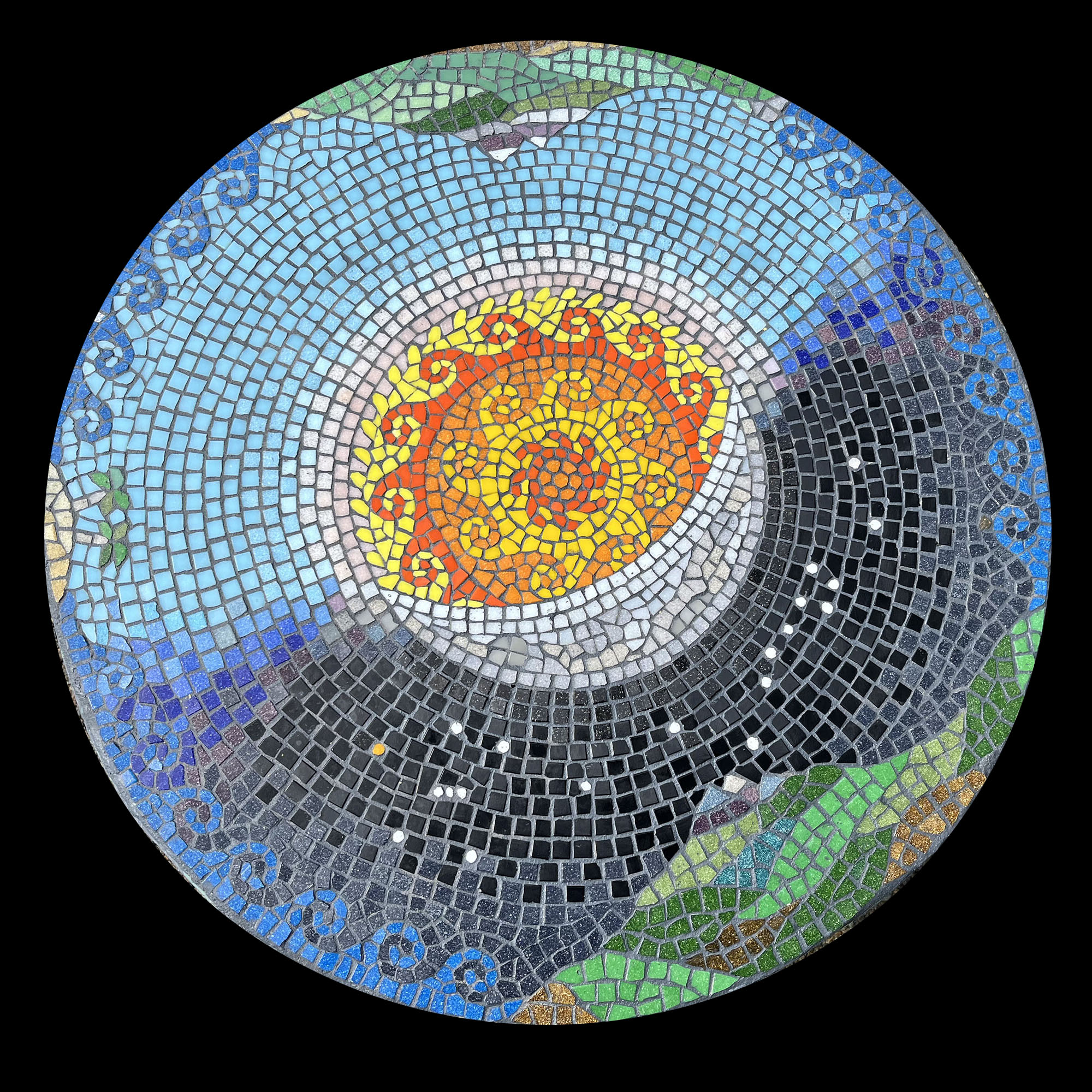
Artist Pete Keller’s Day-&-Night Mosaic Table is an excellent example of incorporating scenic elements into decorative mosaic design.
By “decorative mosaic design,” I mean a mosaic that covers a functional surface such as a table top or floor and is composed so that it is still figuratively meaningful when only a small area is visible.
Decorative Mosaic Design
The best designs for these situations are usually a collection of smaller motifs such as flowers or patterns instead of being one large scene that has to be seen in its entirety to be recognizable.
Good decorative designs take into account that they will be partially obscured by objects and that viewers will be positioned very closely to different areas.
Notice the optimal placement of the wave motifs at the edge. Visual interest is located where the viewer sitting at the table is likely to be able to see it not blocked or covered by dinnerware.
The landmasses positioned around noon and midnight are both “low” and close to the edge as well, which may have been required to keep the sky and horizon circular, but it also keeps the visual detail close to the seated viewers.
I like that the sky is expansive and relatively empty exactly where objects like plates are most likely to be placed.
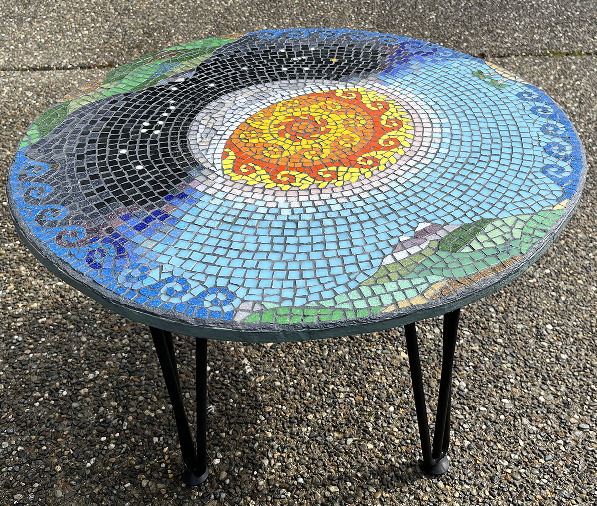
Day-&-Night Table
Pete’s table has several things to teach us about making more interesting mosaic artwork.
I really like how the craters and lava mares of the moon are subtly rendered, more suggested than defined.
I also like how the moon is positioned so that the sun is the natural axis of the circular composition.
Notice the use of the wave motif for the sun’s flaming rays and how they mirror. the waves of the ocean.
Executing the same wave motif in bright contrasting colors is pure eye candy, and it ties the composition together.
Notice the waves of the sun and the waves of the ocean are facing in the opposite direction, which increases the sense of motion they create.
The mountains are “waves” of green with more natural, less-stylized shapes.
The bright green in these mountains is very intense because it is used beside muted greens and browns. Less is more. Contrast.
Notice the color transition of the night sky and how it’s not all black.
Using multiple shades adds depth and visual interest.
Leave a Reply