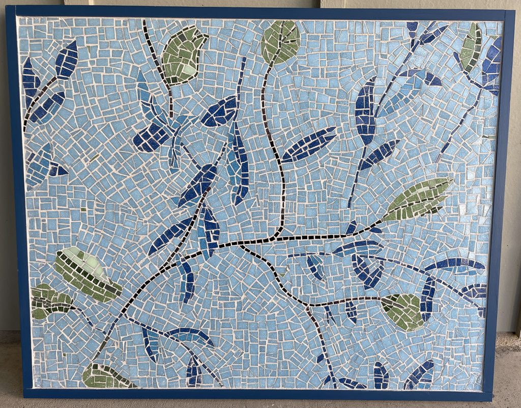
Artist Steve Katzman’s first mosaic is a classic decorative design: sparse floral motifs with sufficient background for showing off interesting andamento.
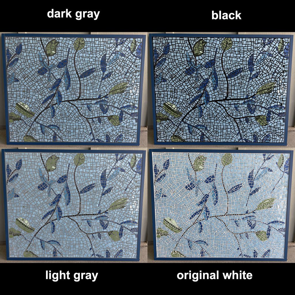
The problem is that Steve wasn’t satisfied with the grout color he used, which was very light, almost an off-white color.
Also, the grout had an overwhelming color impact because a distinct grout gap was used, such as typically used with architectural tiling.
TIP: Minimize the color impact of grouting by using narrow grout gaps. Better yet, use an incidental grout gap where the tiles touch in places, and the only gap is created by slight errors in the shapes of the tiles. If the mosaic isn’t for an outdoor or wet location, a grout gap isn’t required.

Decorative Design
Steve’s mosaic is a really strong design for decorative art projects like table tops where objects typically hide most of the design.
Each small area of the mosaic is an understandable figure with interesting andamento. For functional surfaces, that type of design is more appropriate than a scene that has to be seen as a whole to be understood.
Steve’s design is also abstract enough to make it an easy to use element of an interior.
I like the natural ad-hoc andamento of the background.
I did have to confirm Steve’s suspicions about his grout gap and color:
Mosaics have more verisimilitude when a minimal grout gap is used. A thin grout gap also minimizes the color impact of grouting.
The type of distinct grout gap Steve used is really only required for conventional architectural tiling.
All that being said, what grout color looks best for a decorative mosaic depends on the lighting and colors of the interior where it will be displayed.
Many viewers might prefer the mosaic with the original white grout.
Digital Grout Color Study
If a mosaic’s grout color contrasts all tile colors sufficiently, Photoshop can be used to make quick color studies.
In this case, the white grout was distinct enough from the tiles to be selected using Photoshop’s Magic Wand Tool.
I was able to select all the grout with less than a dozen clicks by adjusting the sensitivity of the Magic Wand Tool.
Once all the grout was selected, I deleted the selection, leaving the rest of the image.
For the new digital grout, I created a separate layer underneath the photo. This layer is visible in the deleted grout gaps.

Easier Way
There is an easier way to find the best color grout for an artistic mosaic.
It takes guesswork out of the equation.
Just don’t have a grout gap, at least not anything more than what accidentally occurs because of slight errors in cutting.
If you place your tiles closely together so that they touch or have only a minimal or incidental grout gap, the empty cracks between the tiles are relatively dark, and so the mosaic looks as it would with dark grout.
Why Grout Gaps?
Grout gaps are only needed for outdoor and wet mosaics.
If glass tiles touch each other in these mosaics, water can seep through and loosen the adhesive on the backsides of the tiles.
Worse yet, the water can freeze and expand and shatter tiles.
Dry indoor mosaic art does not require a grout gap. In these mosaics, grout only serves to fill any incidental gaps.
If your mosaic has tiny incidental gaps, then non-sanded grout is best.
Changing Grout Color
The grout of dry indoor mosaics can be “stained” a different color using artist’s acrylic paint in a wipe-on/wipe-off process.


Leave a Reply