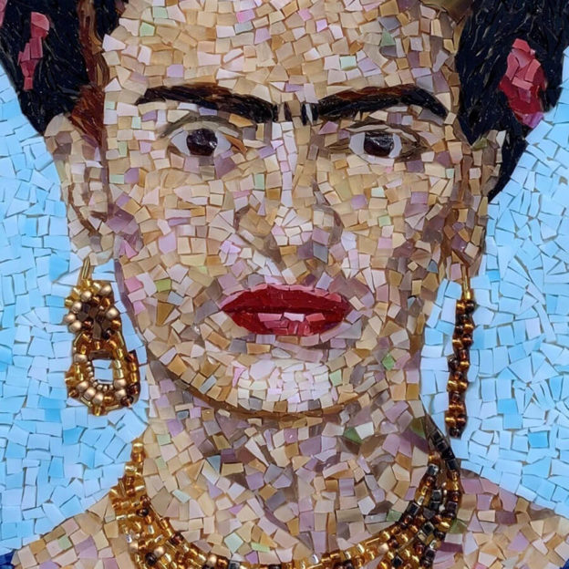
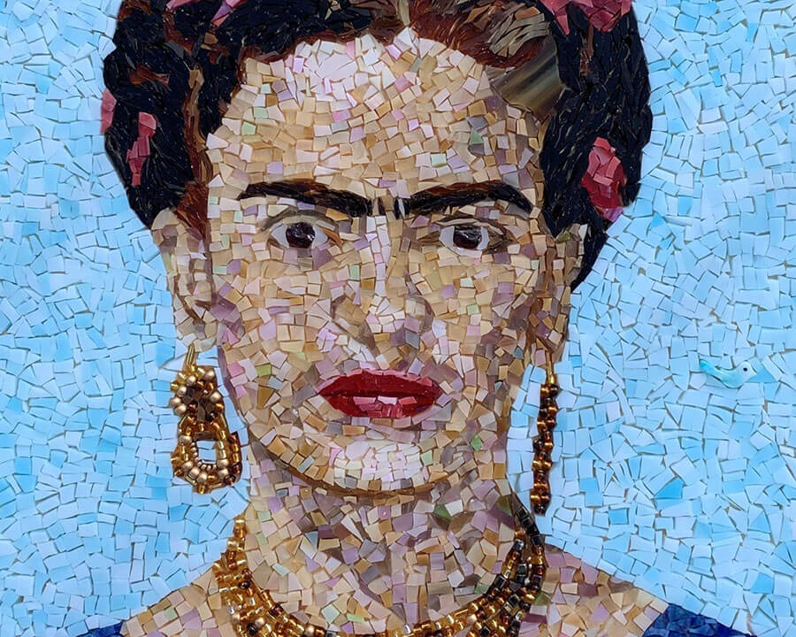
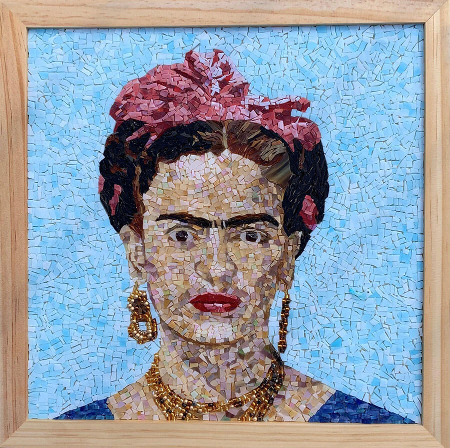
Artist Denise Cook’s mosaic portrait of Frida Kahlo is a great teaching example. It illustrates several important tips for making better mosaic artwork. The background and skin tones are made more visually interesting via variegation of shade and hue respectively. There is also a satisfying andamento in the background, and the use of found objects to represent pictorial elements is done seamlessly.
Visual Interest In Backgrounds
Portraits often have simple “monochromatic” backgrounds so that the central figure is more iconic.
In painting, it is easy to avoid boring uniformity in a nominally “monochrome” color field merely by being a little lazy. If the paint isn’t overmixed to perfect uniformity on the palette, every brushstroke can’t help but have a slightly different shade or hue or both.
In mosaic, you can achieve similar results by using 2 or 3 different tints of the same or similar hue. That is what Denise did in her Frida Kahlo portrait.
Andamento
You can also increase visual interest by putting some thought into the andamento (flow of placement) of your tile and not tiling the background in a retangular grid like a shower stall.
Notice how the background in Denise’s mosaic portrait makes use of both color and andamento variegation. There is a mottling of light cyan blues tints, and the pieces are a mix of triangular, trapezoidal, and rectangular shapes. Think about how much more interesting that is to look at than uniform blue tiles laid out in a square grid.
Visual Interest In Skin Tones
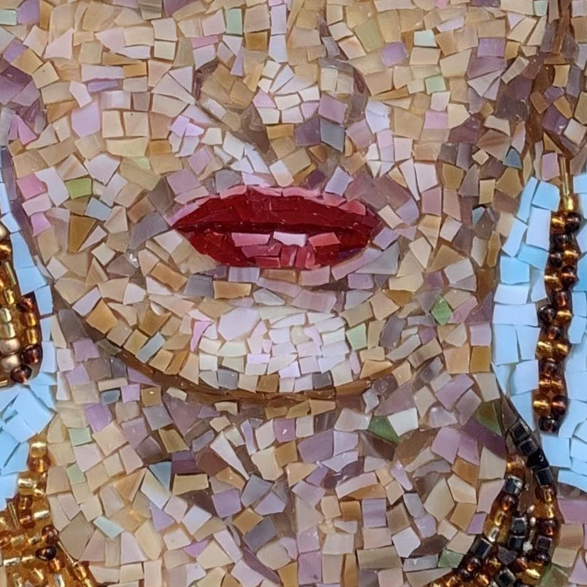
Rendering skin tones in mosaic should not be thought of as finding one particular tile color that most closely resembles the skin of the person being rendered.
Instead, think in terms of highlights and shadows and the variegation of both and how to include flourishes of colors that aren’t intuitively obvious.
Notice how Frida’s face isn’t made exclusively from different tints of cream and beige. There is also a light violet and a light green sprinkled about.
Notice two import how these two non-intuitive colors are opposites in the color wheel. Also notice how they are used in balanced amounts. I think that both of those things (balanced use, complimentary colors) are critical for making non-intuitive color flourishes work.
Seamless Use Of Found Objects
I’ve written about the importance of balance in design and the use of a found object to represent itself in a larger mosaic picture made from conventional tile.
Frida’s jewelry is rendered in metallic-glass beads. It works so well that it is inconspicuous even though they are the only non-tile elements in the image.
About the Artist
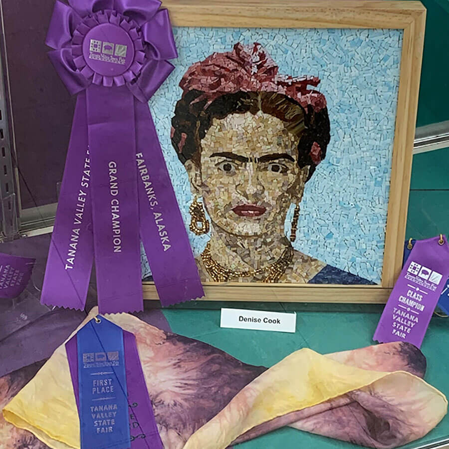
Denise Cook is an engineer in Fairbanks Alaska, She says she hasn’t been doing mosaics for very long and that Frida Kahlo is her very first portrait. As you can see, it turned out well and won the grand prize at the local art fair. Denise says that it was important to get inspired and to push herself beyond her comfort zone. I’m excited to see what Denise makes in the future.
Modules and Stages
Sometimes after I finish a piece of art, I realize later that I have only completed part of a larger piece of art.
When I look at the plane wooden frame that the Frida portrait is in now, I think about what it might look with some carved and painted wood, maybe Mexican Day of the Dead theme or some dream animals or something with the magical feel of Frida’s visions.
The beauty of the situation with this mosaic is that you could hold the frame in progress over the current frame and see if you liked where it was going and what it needed in terms of color to be compatible with the portrait.
You could even make one side of two different frames and hold up each to see which one worked best.
I usually work by trial and error, and I love being in a situation where I can try different things out quicky without commitment or damaging what I already had done.
I also like plugging together different pieces of art that I had previously thought of as separate stand-alone pieces.
Leave a Reply