I have examples throughout this blog illustrating why darker grouts work much better for mosaic artwork than light colored grouts do. I also have examples of using complex color fields of related hues and explanations why they provide more visual interest than monochromatic color fields.
I repeat these two points so often because they are easy ways to make your mosaics look much better.
Artist Kat Hammer recently started making mosaics, and her first two mosaics of sunflowers are great examples of both points. Actually, her second mosaic of sunflowers is a great teaching example of when NOT to use a complex color field for the background and when a simple monochromatic background is preferred.
That last detail is very important, and I haven’t talked enough about it.
First I need to point out how darn good a darker grout looks:
Why Dark Grouts?
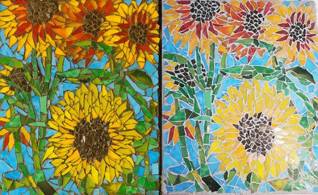
The featured image for this article with the two versions of the same mosaic side by side makes the point better than words can.
Experienced artists use dark grout colors because light grouts make tile colors look washed out and less intense.
White grout is only used for bathroom tiling and summer camp projects -not mosaic art. I don’t think I have ever seen a mosaic that used white grout that looked good and certainly not as good as it would with another color. White grout is like wide grout gaps: both are great ways to sabotage your mosaic.
Tip: to minimize the color impact of grouting, keep your grout gaps small.
Changing Grout Color
Dry indoor mosaics can be “stained” with acrylic paint in a wipe-on/wipe-off process that leaves paint stuck to the rough grout but wiped clean from the smooth glass tile.
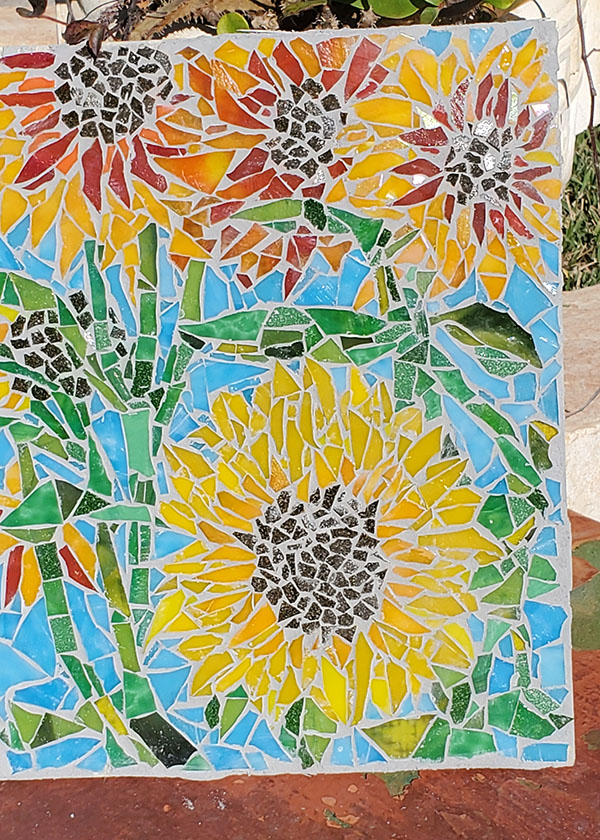
That was how Kat rescued her mosaic. She used a perfect tint of umber instead of absolute black, which would have been too severe in contrast I think.
Variegated Colors
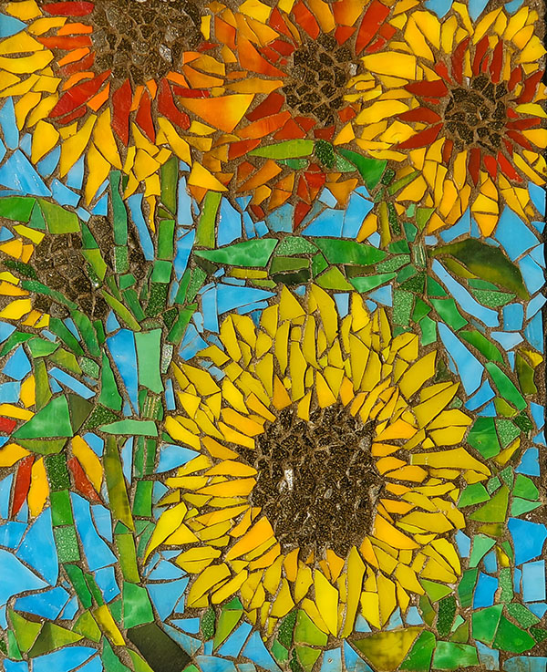
Kat’s first mosaic (shown above) is also a still life of sunflowers. Notice how all the elements (flower petals, stems/leaves, background) are made from multiple related hues instead of being monochromatic. Notice how this creates a lot of visual interest and sophistication in what is a relatively simple composition.
The background is wonderful in it’s own right. There is tons of visual interest in the background to attract the eye and lead it down beautiful paths of abstraction where the representative image is lost.
BUT thankfully those blue hues are cool, and the figure is warm and centered, and so the background still works in creating a sense of being “behind” the flower.
TIP: Keep your compositions relatively simple if you want to experiment in this way and push the envelope as far as having backgrounds as visually complex as the foreground without losing a sense of depth.
When NOT To Variegate
Variegation of color fields is such an easy way to make artwork look better that it can be tempting to use it by default.
While it is good to think in terms of variegation instead monochromatic elements, there are times when it can make elements less distinct from each other or the background and less defined.
This is particularly true of backgrounds when the elements in the foreground are “filigree” so that the background only appears in a few places.
If Kat had used a coarsely variegated background for her second mosaic the same as she did for her first one, it would not have the same sense of depth and foreground elements would not be as discernable from background.
In the second mosaic, the foreground elements are too complex and occupy too much area for a variegated background to “fade to the back visually.” It needs to be simple and monochromatic to do that.
Leave a Reply