What Impressionist painting teaches us is that using the exact colors of the model is much more important than exact rendering. We can draw sloppily, but if we get the colors right, the mind of the viewer can do most of the work and perceive an image easily.
That critical need for exact colors seems to indicate that mosaic is intrinsically handicapped as a medium for impressionist and realistic artwork.
After all, one of the defining characteristics of mosaic is using a limited color palette based on what was available. (Most brands of glass mosaic tile have about 40 to 60 colors total.)
One solution is to use tiles cut from stained glass instead of molded glass tile. One sheet of stained glass can have a broad range of hues and shades available.
Another solution is to work at a larger size and higher resolution so that multiple colors of tile can be used in blended fields of color instead of using one tile color as a monochromatic approximation of that area of color.
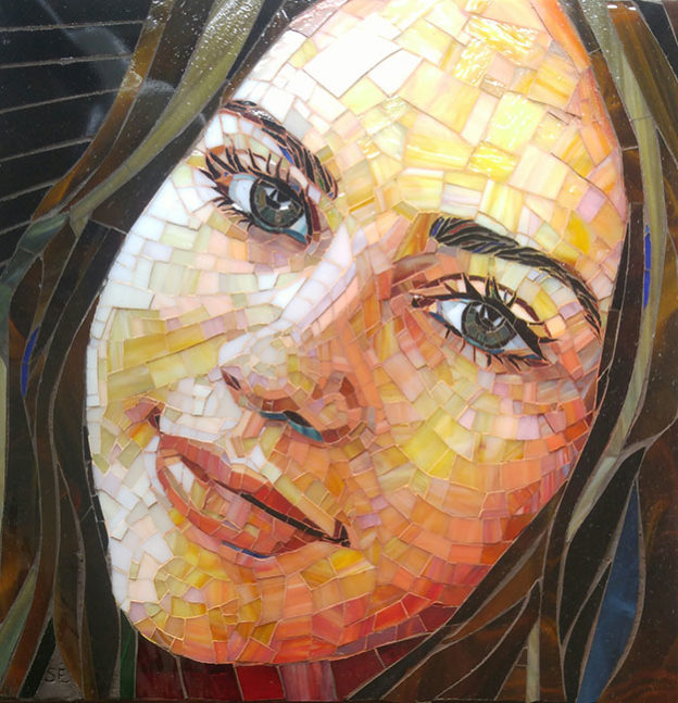
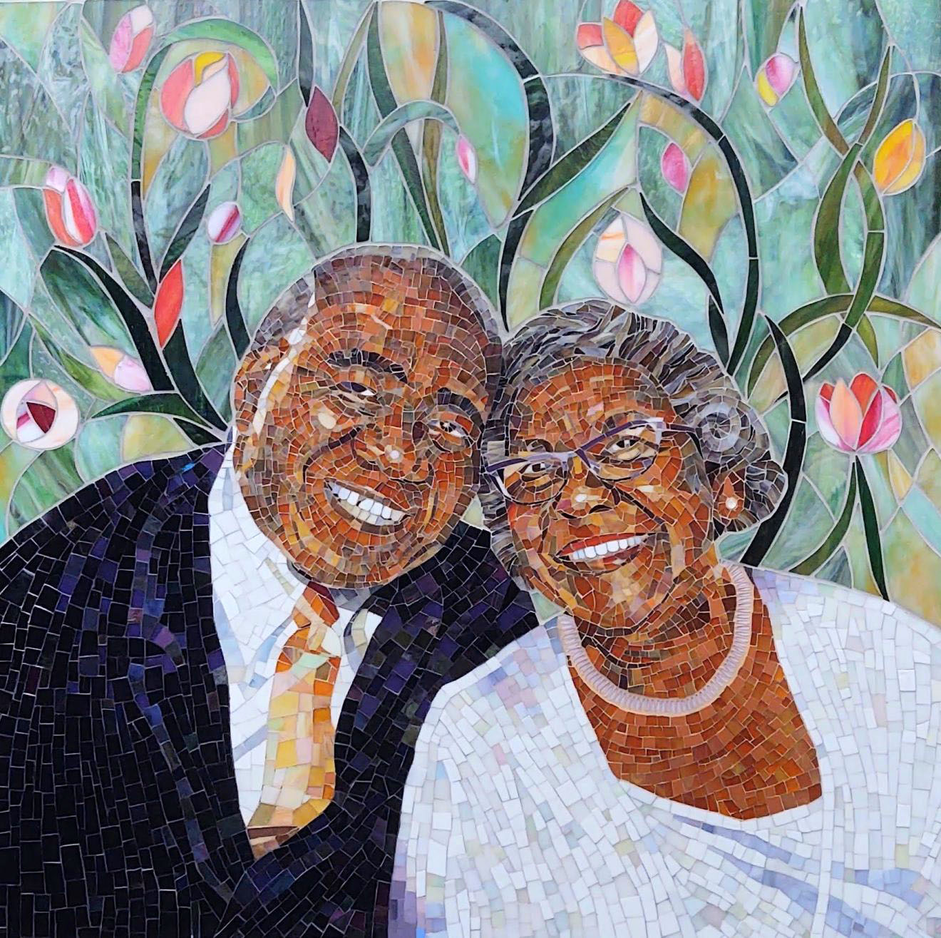
The mosaic portraits illustrating this article do a good job of blended fields of color. Notice that some of these mosaics are made from molded tile and others are made from stained glass. The technique works for both materials.
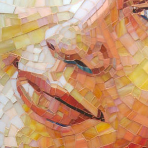
In the portrait below by Suzanne Coverett Earls, notice the use of some very intense yellows to compliment the arguably more “natural” pink tiles:
The Wrong Color
Most people would agree that rendering the model’s skin using only the intense yellow tiles wouldn’t look natural or very appealing.
Many of those same people would be surprised by the fact that rendering the model’s skin only using the more “natural” pink tones would have the same problem.
The point is that two inadequate colors used together (including one color that many would describe as the “wrong” color for the job) manage to do a great job of rendering the model’s skin tone.
Unexpected Combinations
Getting the colors right is half the battle of creating natural-looking artwork, but oversimplifying this principle when ordering materials can seriously handicap your ability to create satisfying mosaics.
As discussed above, skin tones are a prime example of where this issue can bite you, but the concept applies to any element in a mosaic where the artist is striving for natural depiction or enhanced visual interest.
For these mosaics, you can’t simply look for THE best color for a northern-European skin tone or a pink sunset or a purple cloud.
You have to think in terms of visually sophisticated color fields.
This means you have to consider unexpected color combinations.
Consider contrasts and compliments with more obvious colors.
You might start with an obvious pink for a Northern European skin tone, but then consider less obvious colors for the contrast.
Consider the greens in Sue Hague’s Christ Icon mosaic:
Out of Sight
The appearance of a color depends on the colors around it.
That means you can’t tell if a tile color is correct until you arrange tile of other colors around it.
This is not possible with a sample board.
This creates an incentive to have less obvious colors in your studio. If you don’t have those tiles on hand, you aren’t able to consider them in a trial-and-error way.
Out of sight is out of mind.
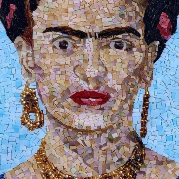
Flourishes of Unexpected Colors
You can create visual interest using flourishes of unexpected colors such as seen in Denise Cook’s Frida Kahlo Mosaic above.
Incorrect Colors
There is an environmental cost in returning retail merchandise, especially when the materials are heavy or fragile, such as glass.
There is also a societal cost. Notice that the large corporate retailers who offer free shipping for returns are the same companies who are notorious for underpaying their employees and sourcing goods from factories that use child labor.
Before you return any art supply, consider not just how you might use the material in your current project. Also think about how the material might be used in future projects.
The color that is wrong for one project might be the exact color needed for something else.
Leave a Reply