Background colors for mosaics should be chosen based on how well they contrast with the colors used in figures. For this reason, most mosaic artists will tile their figures first and then choose their background colors by a trial-and-error process of placing tiles on the mosaic backer and just seeing how they look.
The same approach can be used to decide what pattern of placement (andamento) you should use for the background. You look at what you have in the figures in the foreground and choose a background pattern that is compatible.
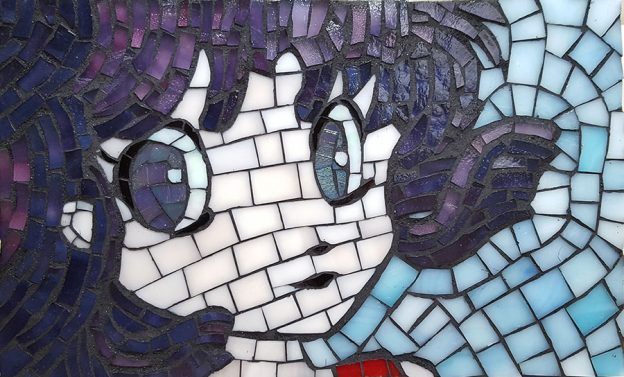
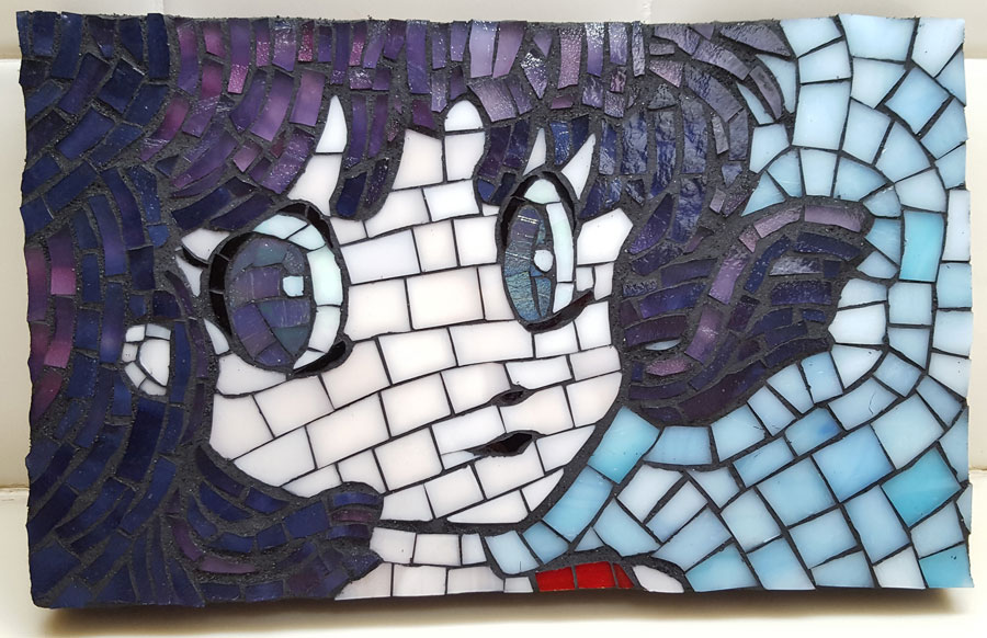
That is how I work, and it was how Natalija Moss chose the background colors and pattern for her recent Anime Girl mosaic, which was made from stained glass.
The light sky blue colors that Natalija used for the background and the pink tile used in the face are compliments from the color wheel. They also have the same value (shade) as each other.
Orange-pink sunset colors were also considered, but these did not contrast with the pink flesh tones of the face. Medium teals of various hues were also considered, but these did not look as good as the light sky blue. We didn’t know that the sky blue would look better than the teals until we actually laid them on the mosaic backer and compared.
Use Two Colors Instead of One
IMPORTANT TIP: Natalija made another good decision that really improved the mosaic. Instead of using one color of light sky blue for the background, she used two colors (same hue but different lightness) mixed together to create added visual interest. In my opinion, this is one the most easy and effective ways of making your mosaic art more interesting to look at.
People often think that the best way to make their mosaic art look more sophisticated is to use hand-cut smalti instead of molded glass tile, but this isn’t true. An element (such as a sky) made from multiple shades of blue in ordinary vitreous glass tile will look more sophisticated than the same sky rendered in one shade of blue smalti.
Background Andamento
Another decision that needs to be made for the background is how to arrange the tile in working lines (andamento), and this is more important than most beginners think.
Many amateur mosaic artists treat the background as an after thought and race to complete it as quickly as possible, usually using a straight grid arrangement that isn’t harmonious with the working lines of the figures.
This is a real tragedy and a real opportunity lost because an a decent background can really make the difference between a great mosaic and a mediocre mosaic. Why make your background look like bathroom tiling in a grid when you can make it look as interesting as your figures?
Note that Natalija used concentric work lines that wrap around the outline of the figure, which is a classic mosaic technique and a favorite of mine.
If I could recommend any improvement for this mosaic, it MIGHT be to make the work lines of the face concentric with the eyes and the outline of the face, but I’m not sure about that. I like how the work lines of the face point to the lock of hair, and how that lock of hair looks like a focal point due to the concentric lines of the background.
Work lines can totally change the look of a mosaic, almost as much as the colors. They are an important element of mosaic art, perhaps its defining feature. Consider that carefully the next time you feel tempted to rush through a background just to complete your mosaic sooner.
Leave a Reply