Interpreting a work of art in a different medium is a matter of capturing the essence of the original without being an exact copy, although most people would prefer to see a copy that had no departures than something that was unrecognizable. With that in mind, the first step in creating an interpretation of an existing work is to identify what features are most important about it, what things define it in essence. It depends on the work of art. It isn’t always a particular detail or figure. It isn’t always the colors.
A Case Study
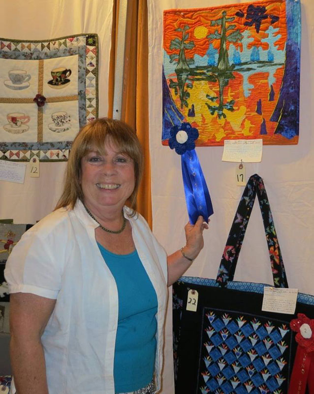
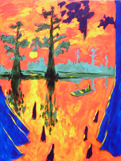
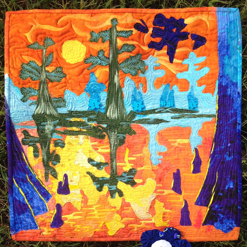
Recently, artist Jackie Iglehart created a quilt panel interpretation of my painting “Cypress Bayou” and won this year’s quilting challenge at the Valley Forge Homestead Quilters Guild in King of Prussia, Pennsylvania. I was blown away by the results. Jackie’s quilt panel captures the look and feel of my painting to an extent that I doubted was possible in that medium.
Notice how intensely similar the two works are in spite of the different proportions and the fact that no lines or details are copied slavishly. Notice the differences in the size and placement of the sun and the absence of the john boat in Jackie’s quilt. Notice how the trees in Jackie’s quilt are of different proportion, yet the works are virtually identical in essence. The take away lesson is that you can go a long way toward creating likeness merely by using the same colors and the same general composition. But that isn’t always the case.
Key Details and Motifs
For some works of art, there is no choice but to render certain details more or less the way they were rendered in the original. For instance, think of all the parodies you have seen of Michelangelo’s Sistine Chapel Ceiling detail where Adam’s hand and God’s hand reach out to touch and transfer the spark of life. Adam and God can be replaced with celebrities or politicians in modern clothing in front of modern backgrounds, but as long as the hands reaching toward each other and the bodies and faces are arranged like the original, the work is recognizable.
In the Same Style
In other images, there may not be a specific set of details or figures that need to be rendered closely as long as the composition as a whole is in keeping with the original. I have seen interpretations and parodies of Van Gogh’s “Starry Night” where the landscape and stars were completely rearranged or substituted with city skylines, but the look and feel of the work was that of the original because the artist used the same colors and the same type of brush strokes as Van Gogh did (like tiles arranged in concentric andamento).
Color Accuracy
One of the most effective ways of keeping true to your model is to keep the colors accurate. That is how Impressionistic paintings look “realistic” in spite of being rendered loosely. If the painter gets the colors right, the brain can do the rest and interpret the image as being “soft focus” or slightly blurry yet still distinctly recognizable.
Mosaic As A Special Case
Mosaic is frequently used to create interpretations of paintings and photographs, but the short cut of using identical colors isn’t usually available. A particular manufacturer’s product line only comes in in so many distinct colors, and even mixing and matching between brands will usually leave you wanting several key colors.
In this situation, the artist has to decide between using a premium line of smalti (and still coping with some missing colors) or making simplifications and other modifications to the original design. I prefer the later because it is a more advanced artistic exercise that teaches the artist something about style. To me, rendering lines and colors slavishly might be more efficient at producing results that people would describe as professional, it is still paint-by-numbers when it comes down to it. Art in its highest function is about taking risks and learning something.
The next time you go to a museum that includes ancient Roman mosaics, count how few colors are used to render elaborate compositions and notice how much charm is added by the simplifications the artists had to use to render certain details. Mosaic is an exercise in using a limited color palette and is better off as a medium because of it.
The Artist

In addition to producing her own quilts, Jackie is what is known as a longarm quilter. Her clients at Silver Forest Quilts bring in quilt tops they have made or vintage quilts they have inherited or purchased, and Jackie quilts or reworks the quilting. Jackie says that it is a wonderful business to be in because each quilt is unique and has its own story, and she gets to see a lot of original artwork.


Leave a Reply