In my previous post, I wrote about Peggy Pugh’s excellent use of color variegation and the potential for this technique to cause figures to lose definition when there is variegation in both the figure and the background.
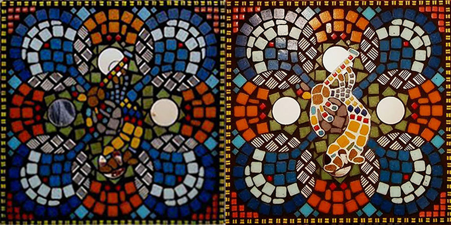
In response, artist Jill Gatwood emailed me photos of a student’s work where the problem had caused the central figure to lose all definition and disappear into the background.
My apologies for the low resolution of the photo, but I was glad to receive it because it is a great illustration of the problem:
Notice that even though the figure has lost definition, the mosaic still works as a colorful abstract. I have a lot of happy little mistakes in my own portfolio.
Dark Grout
Like most professional mosaicists, Jill uses dark grout as her default choice for mosaic images, but she is also a big advocate for exceptions where white and light-colored grouts prove useful.
I should note that these exceptions tend to be stylized images and symbols instead of images that attempt to be lifelike.
TIP: Our eyes/minds expect the cracks between objects to be dark as seen in nature and not bright or white, and that is why dark grouts are preferred for realistic images.
Grout Color by Zone
For several reasons, I discourage people from designing mosaics where different colored grouts are used for different figures or areas.
First, grouting is inherently messy. It’s a lot more work to gout by zone because there is a clean up for each color and the problem of making sure you don’t get the grout into other gaps where you don’t want it.
Second, grouting tends to change the look of mosaics, and most novices are blindsided by the color impact of grouting, and usually they are disappointed because their grout gaps are wider than they realized.
Third, if you are using grout as a source of color or to differentiate figures, then you probably haven’t spent enough time thinking about tile colors and color contrasts.
I think it makes more sense to encourage best practices from the very beginning:
TIP: Keep your grout gaps small. Small gaps produce more colorful mosaics with less surprises after grouting. They are also MUCH easier to grout.
Jill to the Rescue
While it might not be best to design mosaics around multiple grout colors, grouting by zone can be a great way to rescue situations that are noticed after all the tiles are mounted.
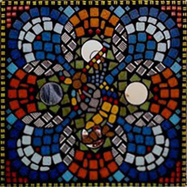
This Kokopelli mosaic is a prime example.
The problem wasn’t addressed until after the mosaic was grouted.
Fortunately, Jill is very experienced and knew what to do.
She and the student scraped out the black grout in the Kokopelli figure and regrouted with a light-colored grout:
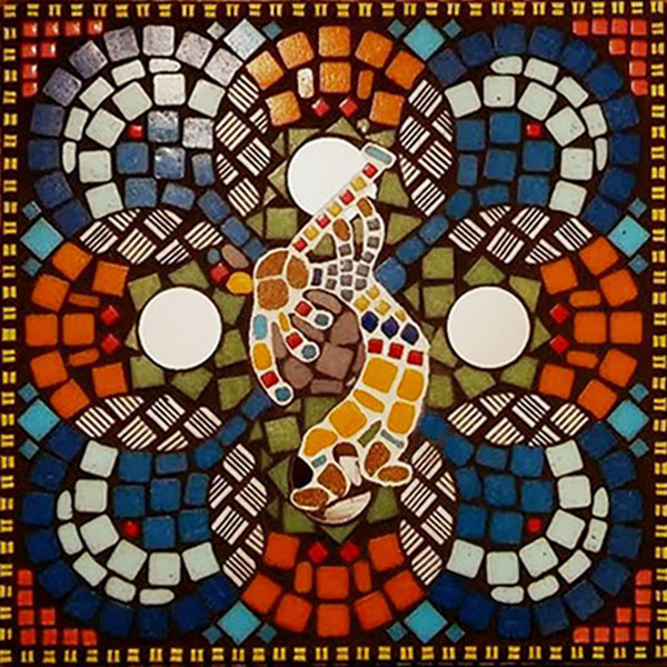
This problem could have also been fixed with acrylic paint if the mosaic is installed in a dry indoor location.
TIP: I’ve noticed that many novices think that grouting will “pull things together” or somehow resolve issues with definition of figures, but that isn’t the case. If your grout gaps are wide, problems noticed before grouting tend to look worse after grouting. Use small gaps and think in terms of tile colors not grout color.
Break the Rules
Sometimes you make a “mistake” and it turns out to be a great insight. Art is about paying attention and seeing.
By seeing, I mean seeing things as they really are and not perceiving the image according to intentions.
That is why we all do things like step back and squint or take a photo and look at the art as a thumbnail, anything to see the composition as a whole with fresh eyes.
TIP: I recommend going to bed and looking at the art first thing in the morning and trusting your first reaction instead of talking yourself into an opinion.
I’m sure that Jill’s student made deliberate use of upside-down tile to show the embossing on the back side, and I really like it, especially with the dark grout in the crevices of the embossing. It adds a lot of texture and pattern, and the design is much stronger because of it.
BUT, I have received emails from people who thought they made a disastrous mistake by using upside-down tiles and wanted to scrap the whole project.
I am thinking of one particular email from the first few years of the business. I can’t remember anything about it other than I talked the person into completing and grouting the mosaic instead of throwing it away, and the results were fantastic.
Before you decide you have made a mistake in your artwork, look at it with fresh eyes and avoid judging it completely in terms of your original idea. Artwork takes on a life of its own. Listen to it. Don’t force it.
Leave a Reply