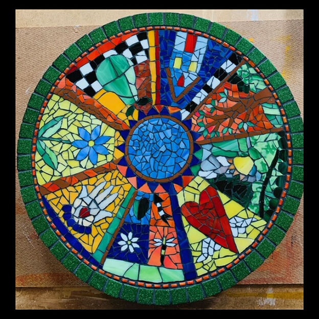
Artist Kim Wilkowich emailed me a picture of the mosaic lazy susan she recently completed, and I think any artist would be justifiably proud to have made it merely because it is so well-balanced and harmonious in multiple ways. It is a great teaching example for several fundamentals of art and composition.
Looking for instructions for making your own mosaic on a wooden lazy susan? My previous blog article uses a coaster for demonstrating how to lay up a complex design over a pattern and to be able to edit the design before you actually glue it to the wood. For a lazy susan, you would use the lazy susan to trace a large circle on some butcher paper or pieces of printer paper taped together. I would not try to wrap a circular board with contact paper. Remove paints or sealants from the wood before gluing tiles to it.
Why does this mosaic look like it could have only been made by an experienced competent artist if not a professional? Of course there is the tight execution and consistent grout gap and strong iconic designs, but for me what sets it apart more than anything else is the consistency between the different panel designs.
- Similar levels of complexity and tesserae size between panels.
- Colors and design elements distributed between panels.
- Harmony of color intensity.
- Balance amount of cool colors and warm colors.
- Pairs of color wheel opposites used throughout the mosaic.
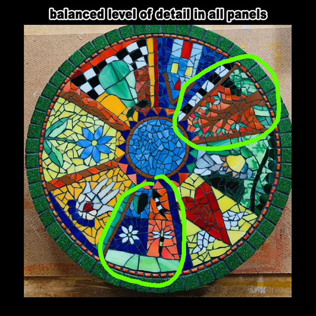
Harmony of Piece Size
Novices are rightfully preoccupied with the details of each design to have much bandwidth for thinking about how the different panels or icons will look together –especially when working in a new medium where simplifying assumptions have to be made constantly.
Most novices would have at least one panel where the detail was rendered in pieces that were significantly smaller than the pieces used anywhere else in the mosaic.
In Kim’s mosaic, notice how the two most-detailed icons don’t have any piece smaller than a piece used in the other panels where the icon is larger and less detailed.
Yes there are some panels where the piece size is larger than in some of the other panels, but not to an extent that is conspicuous because there are just as many panels with these larger piece as there are panels without them.
That is the next point: don’t use any color or element in only panel.
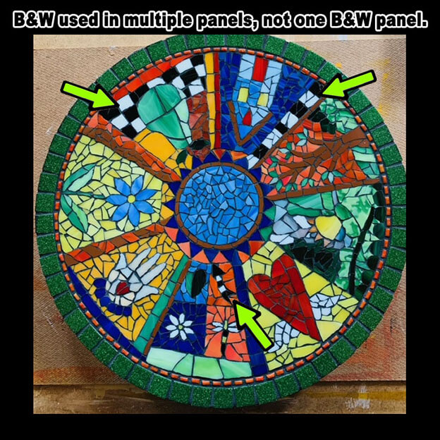
Distributed Colors and Elements
Don’t let one panel be the “odd man out” just to render a particular object. If you think a panel needs some color or design element, then make sure you use it more than one icon.
In this example, we have some bold icons with intense primary-ish colors all around the wheel. If only one of the icons had elements of alternating black and white tiles, imagine how much that icon would stand out from the other panels.
Instead, Kim has multiple panels with elements made from alternating black and white tiles, and all panels have black grout and tesserae where the color at least approaches white.
Harmony of Color Intensity
If one of the panels was rendered in light-tint pastel colors, think about how badly it would stick out from the rest of the panels. Also notice how the level of contrast is consistently high throughout the mosaic.
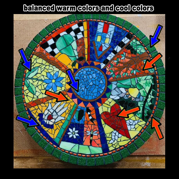
Contrast Warm and Cool Colors
Kim makes use of light and dark contrast and contrasting warm and cool colors. Again, the same level and types of contrast are distributed and shared throughout the mosaic.
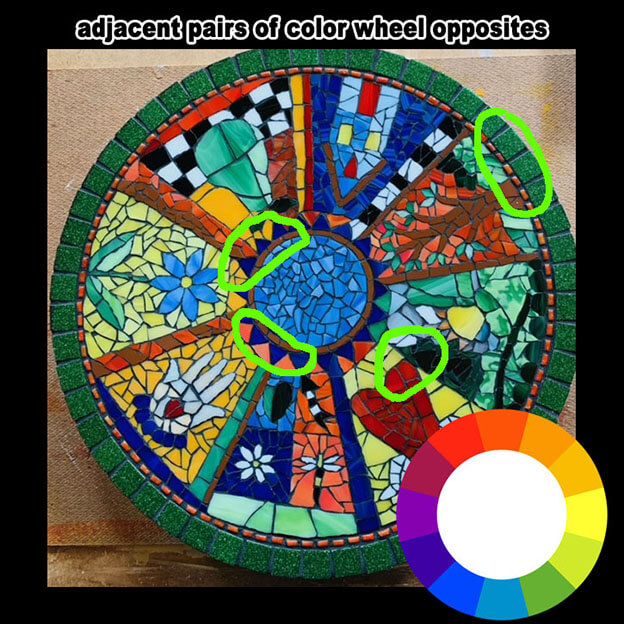
Color Wheel Opposites
Complementary colors are opposite from each other on the color wheel and give one another maximum contrast. Kim has these paired up rather nicely all over the mosaic.

Leave a Reply