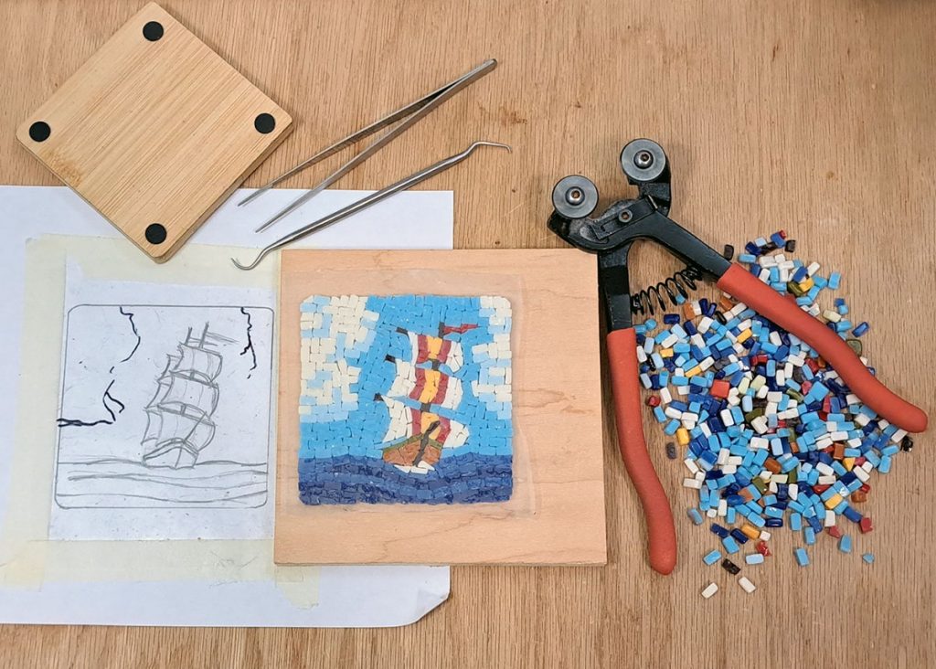
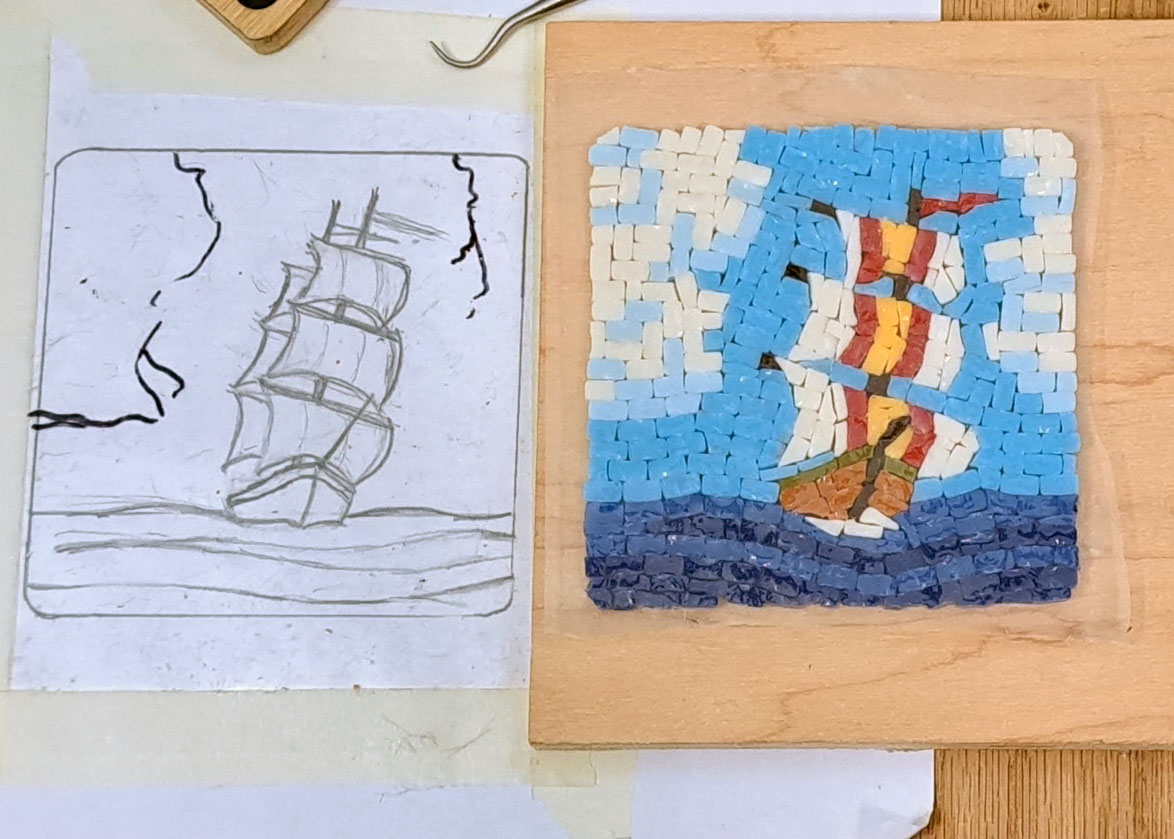
I thought I would share this particular studio photo because it shows the evolution of an improvised mosaic design, in this case a sailing ship.
It also showed ad hoc changes to the pattern after it was already taped beneath clear contact paper.
A mosaic is not a drawing, and we call rendering an existing image into a new medium “an interpretation” even when executed by the same artist because different artistic mediums have different languages.
You can create a mosaic pattern by placing tracing paper over an existing image and merely tracing it, but there is still a lot of artistic decisions to be made.
When you start laying tile, you may find that your design has to change is some way and that the pattern was just a starting point.
First, you have to render the image in the colors available, and that often requires some simplification of details or “posterizing” or some sort of modification.
If your resolution is small and tiles can’t be used like pixels, then you will need to make many simplifications to the details of the original image.
PRO TIP: Don’t work small like this. If you want to do a series of smalls, make 12-inch x 12-inch mosaics. That is small enough to be quick, but not tediously small like what I am doing here.
I have some thoughts on creating mosaic patterns for iconic images.
Iconic Images
All of the small mosaic insets for the magic door project need to be iconic: a single object or figure that is an archetype and instantly recognizable.
Whenever I need to create an iconic images that captures the essence of something, I look at many different photos to get an idea of what features are the most iconic about whatever it is. For example, petals and flowers.
Sure there are flowers which have evolved small or needle-shaped petals, but those aren’t the flowers you render when you want to capture flowers as an archetype that resonates with people’s ideas of a flower.
Then there is the question of which perspective to use, and there usually is one that is better than all others when instant iconic recognition is the driving concern.
For example, some objects are best “captured” when viewed from the side, such as a fish. Others such as the human face are most completely captured when viewed from the front.
Of course, it’s usually more interesting to render at slightly oblique perspective and show more of the depth of the object.
I often think of the stylized and rigidly posed figures in Egyptian Hieroglyphs, particularly human figures, which are always shown in profile but with legs striding and hands lifted in salute/blessing.
Original Mosaic Pattern
The original mosaic pattern (cartoon) for my mosaic was sketched after looking at many online images of sailing ships followed my many more online images of sailing ships approaching the viewer.
When I started positioning tiles on the pattern, it instantly became obvious that I didn’t have the resolution needed to show the second mast and sails, which required shading be used selectively on the sails to differentiate sails in front from the sails behind.
On this small 4-inch coaster, I could have a colored pattern on the sails or I could have some scheme of shading in the sails, but I couldn’t have both.
Design Evolution
I decided that the red and gold pattern on the sails were more essential to the composition and went with that.
After the sails and ship were completely set with tiles, I realized that I had been so preoccupied with figuring out how to do that part that I had forgotten to render the other details.
I didn’t want the vast area of the sky to be conspicuously empty, but I also didn’t want to add anything that might compete with the central figure.
For that reason, I rejected my original idea to have the silhouette of a frigate bird or albatross soaring in the left foreground.
Instead, I added tall cumulus clouds on either side, framing the central figure.

Side by Side
Here the mosaic has been covered with Mosaic Mounting Tape and lifted off the contact patten.
Actually the contact paper/pattern was peeled off the bottom of the mosaic when it was flipped upside down for that purpose.
To flip a loose/unmounted mosaic like that, make sure it is sandwiched between two small boards.


Leave a Reply